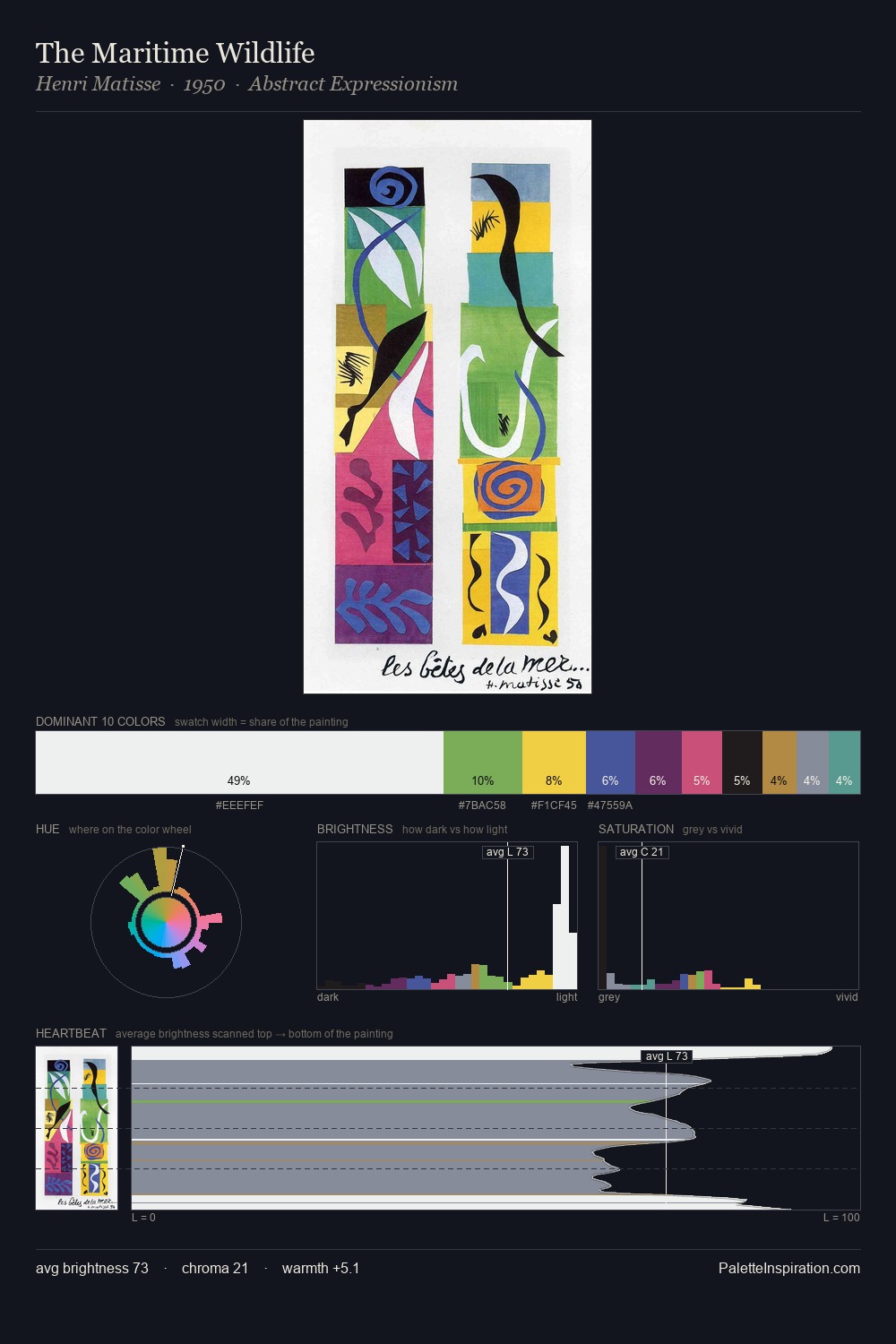
Janos Mattis-Teutsch Palette 9

Palette Analysis
Janos Mattis-Teutsch distributes its values across the middle register, creating harmony without high contrast. Temperature is cool-dominant, with blue and green families claiming the largest areas. A restrained, mid-chroma palette: every hue is present and legible, but nothing shouts. The saturated accent, #CD385B, registers at 7.5% - sparse enough to feel like a deliberate surprise. The value range spans 62 units across the palette, providing the full gamut from deep shadow to near-white and ensuring clear tonal hierarchy. The mid-to-high key, cool bias, and moderate chroma point to outdoor observation - sky and diffused daylight as the dominant light source. Palette 9 sits within the larger chromatic argument that Janos Mattis-Teutsch's complete body of work advances.
Example use cases
- publishing
- corporate identity
- consumer apps
- hospitality
- design agencies
I Love This!
Copy, export, or download for your project