Janos Mattis-Teutsch Palette 7

Palette Analysis
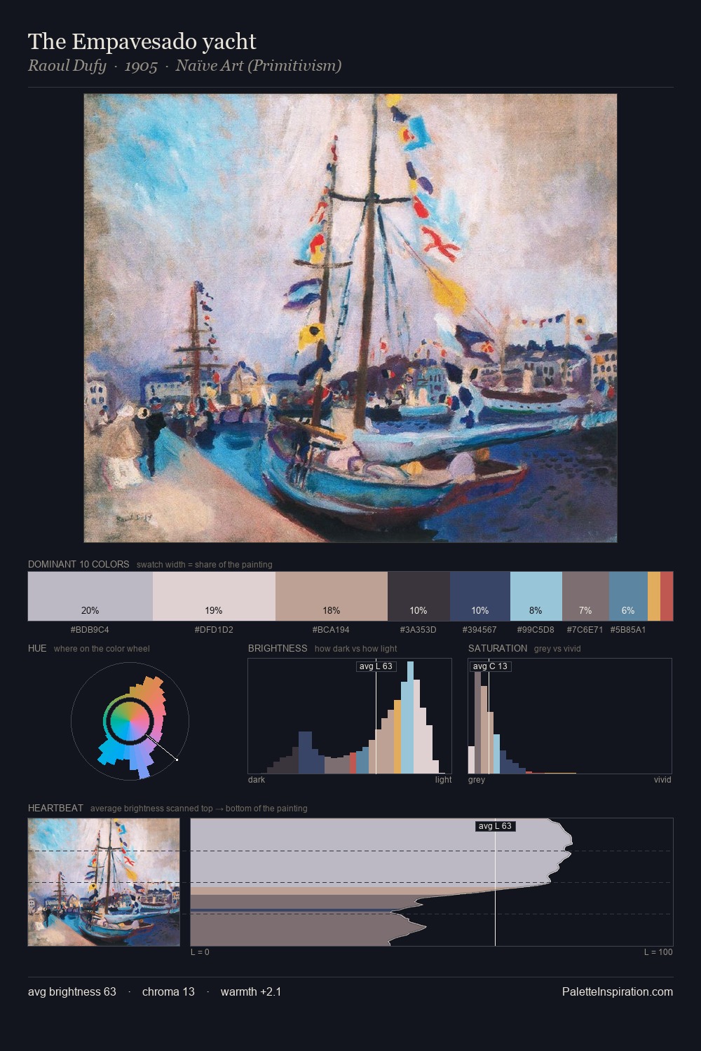
Janos Mattis-Teutsch sits in the centre of the value range, lending the palette a sense of even, sustained light. Cool tones set the register here - the blues and greens easily outweigh any warm accents. Mid-saturation across the board: the palette has colour character without chromatic excess. At 8.1%, #C96C7E carries the palette's sharpest chromatic charge: an accent that earns its place precisely because it is withheld. 41 units of value spread create a palette that is varied but unified - contrast in the service of harmony. The mid-to-high key, cool bias, and moderate chroma point to outdoor observation - sky and diffused daylight as the dominant light source. Palette 7 sits within the larger chromatic argument that Janos Mattis-Teutsch's complete body of work advances.
Example use cases
- publishing
- corporate identity
- consumer apps
- hospitality
- design agencies
I Love This!
Copy, export, or download for your project