Janos Mattis-Teutsch Palette 3

Palette Analysis
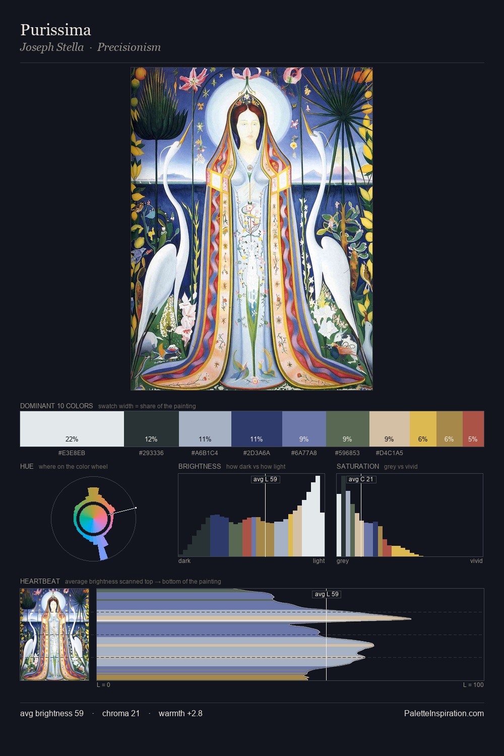
Janos Mattis-Teutsch works in the upper reaches of the value scale, creating an atmosphere of brightness and expansiveness. Cool tones set the register here - the blues and greens easily outweigh any warm accents. Chroma is kept low across all colours, producing the soft, enveloping quality that characterises tonal painting. The dominant colour, #E7DCD7, takes 27.0% of the total area, establishing the overall mood before any other hue is introduced. The most saturated colour, #D2BF6D, is reserved to 6.6% of the surface, where it acts as a focal punctuation. The value range spans 58 units across the palette, providing the full gamut from deep shadow to near-white and ensuring clear tonal hierarchy. High luminosity and cool temperature suggest the plein-air condition: unfiltered daylight and open sky. This is palette 3 of Janos Mattis-Teutsch's sequence - a single chapter in a chromatic story told across many works.
Example use cases
- ceramics & pottery
- boutique hospitality
- menswear
- heritage food brands
- craft & artisan brands
I Love This!
Copy, export, or download for your project