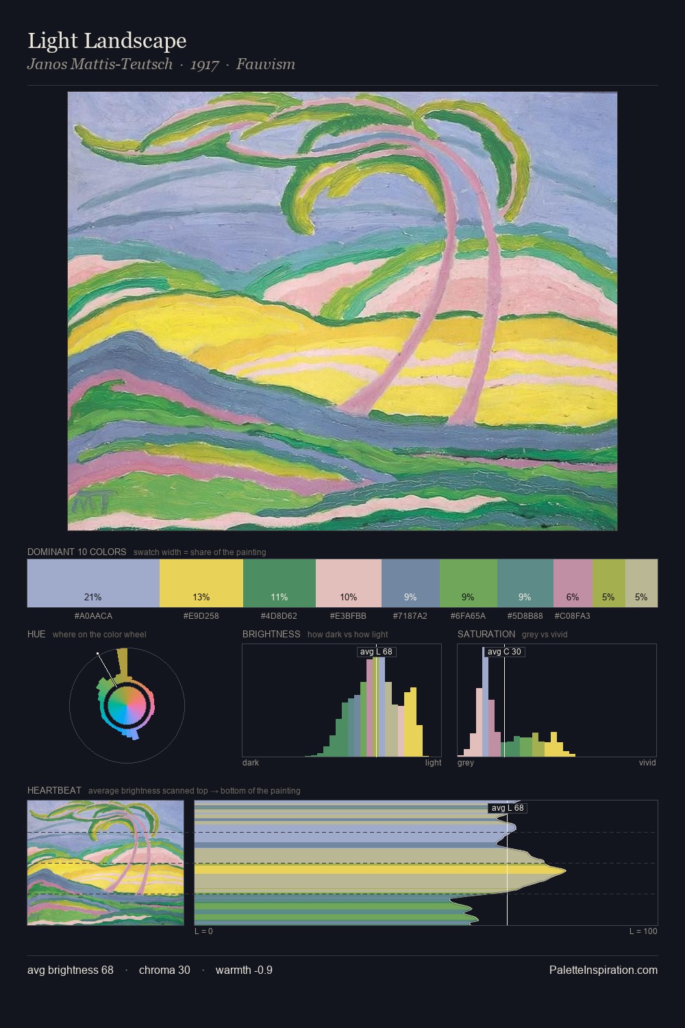
Janos Mattis-Teutsch Palette 1
Gleaming Aureolin
Gleaming Bright and polished - high-key, often warm, suggesting reflective or luminous surfaces.
Aureolin Bright transparent yellow - a clear, luminous lemon-gold pigment hue.

Palette Analysis
Janos Mattis-Teutsch is high in key: pale, luminous, and filled with optical air. Cool tones set the register here - the blues and greens easily outweigh any warm accents. Colours are neither washed out nor blazing; they occupy the productive middle ground of the chroma scale. The chromatic peak belongs to #E0C52E, and at 29.8% it dominates, not decorates. Spanning 45 units on the value axis, the palette achieves the balance between tonal flatness and fragmentation. The palette has the character of outdoor light: cool, mid-bright, with colour rendered faithfully rather than expressively. This is palette 1 of Janos Mattis-Teutsch's sequence - a single chapter in a chromatic story told across many works.
Example use cases
- publishing
- corporate identity
- consumer apps
- hospitality
- design agencies
I Love This!
Use This Palette
Copy, export, or download for your project
Copy, export, or download for your project
Copy:
Download:
Share: