Jan Toorop Palette 5
Palette Analysis
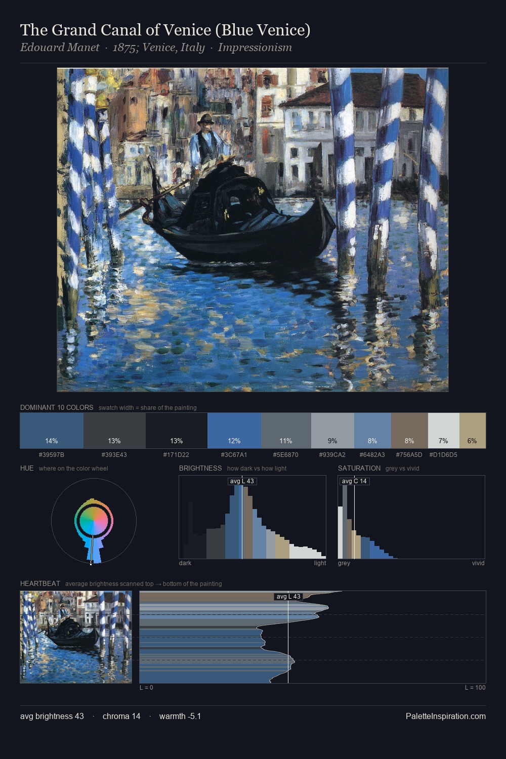
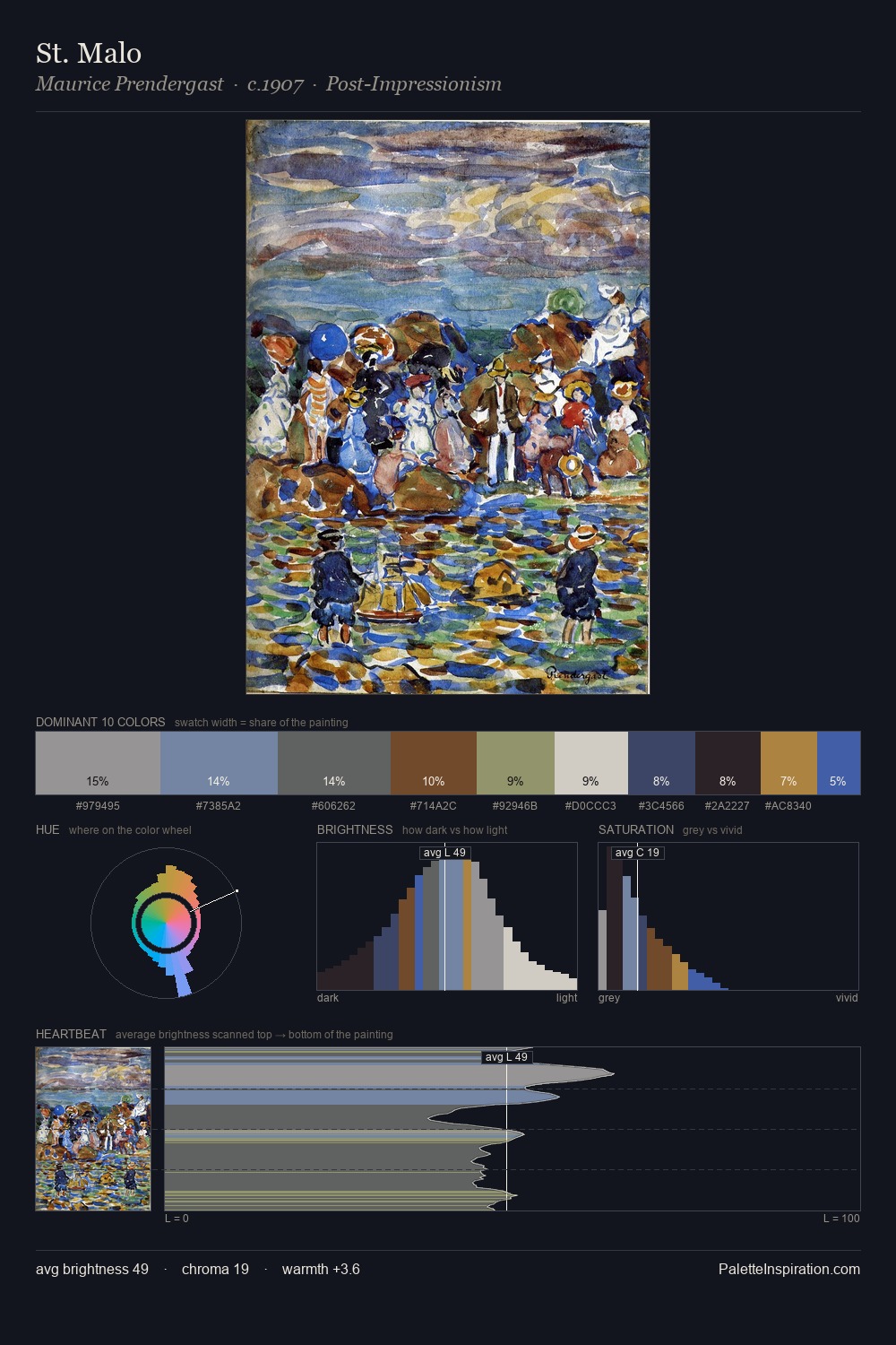
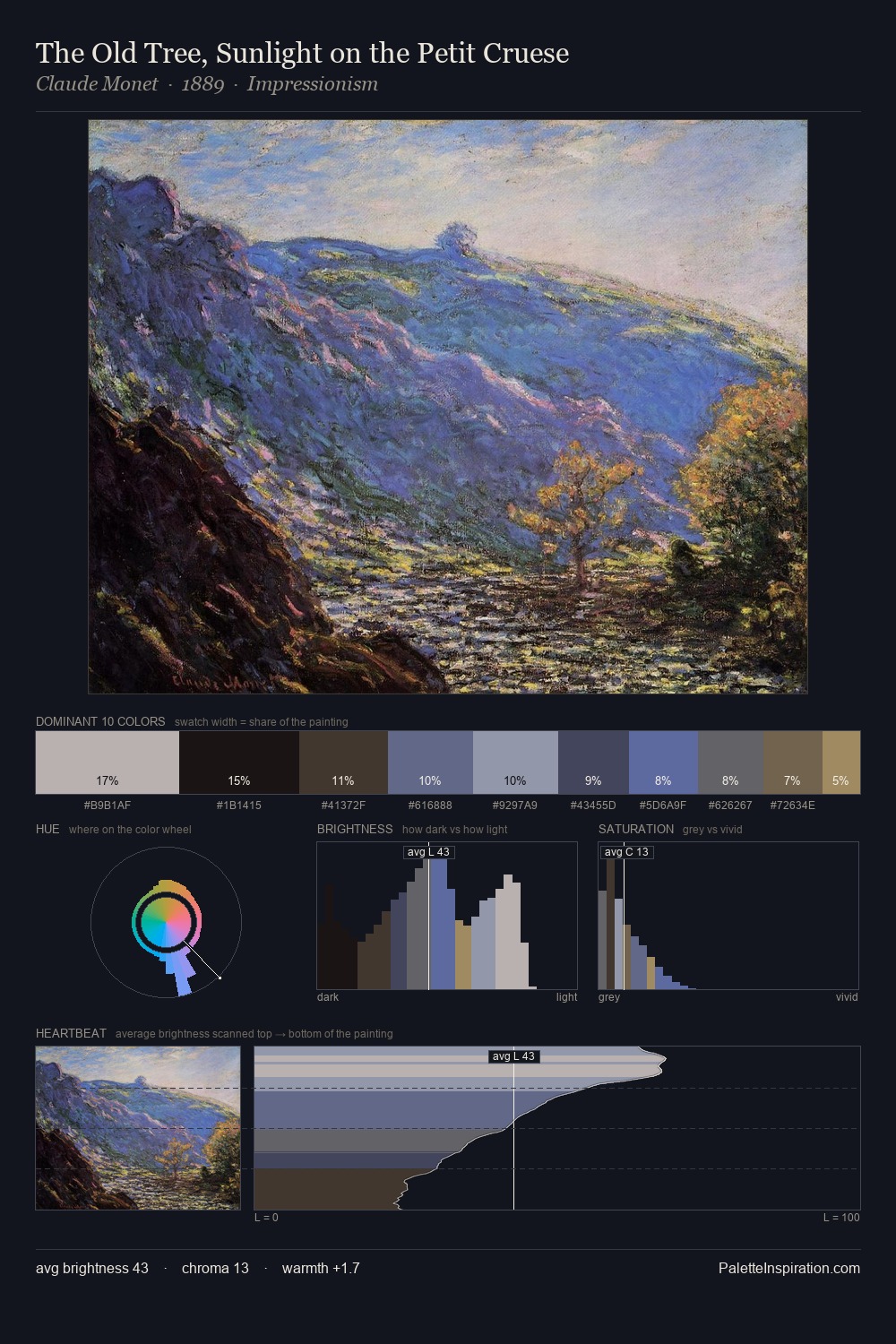
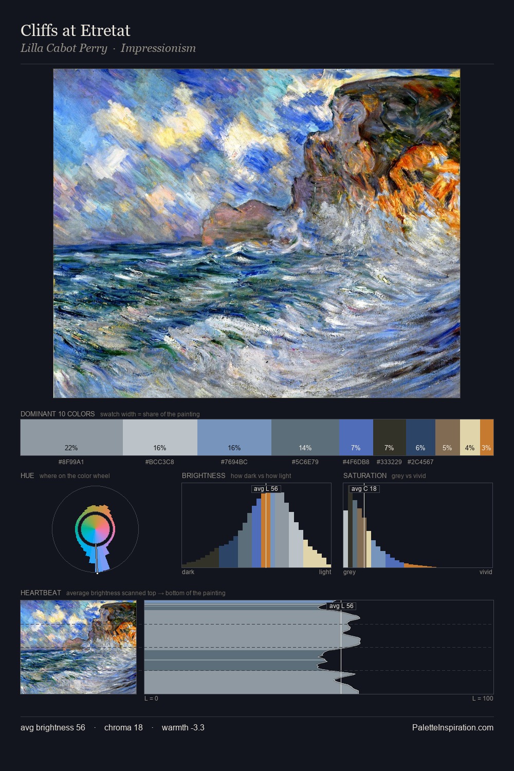
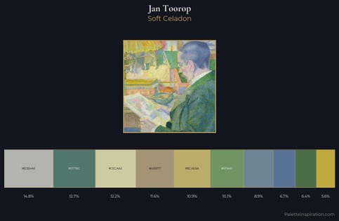
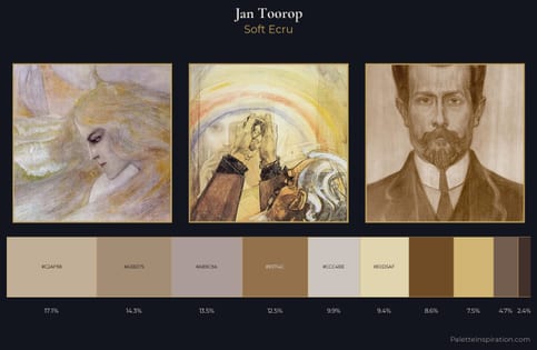
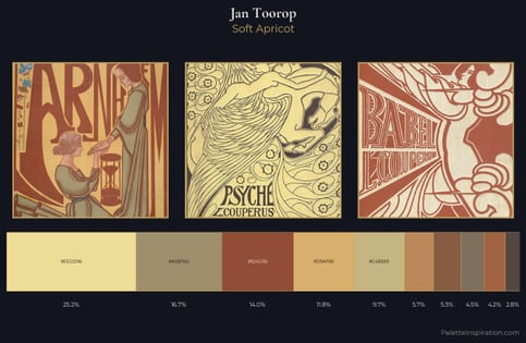
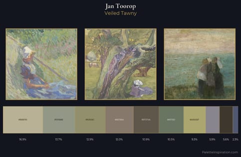
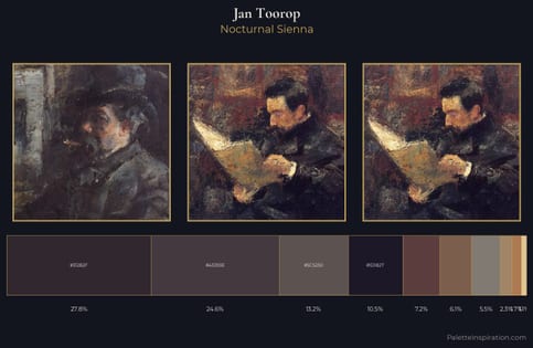
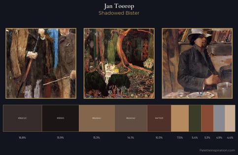
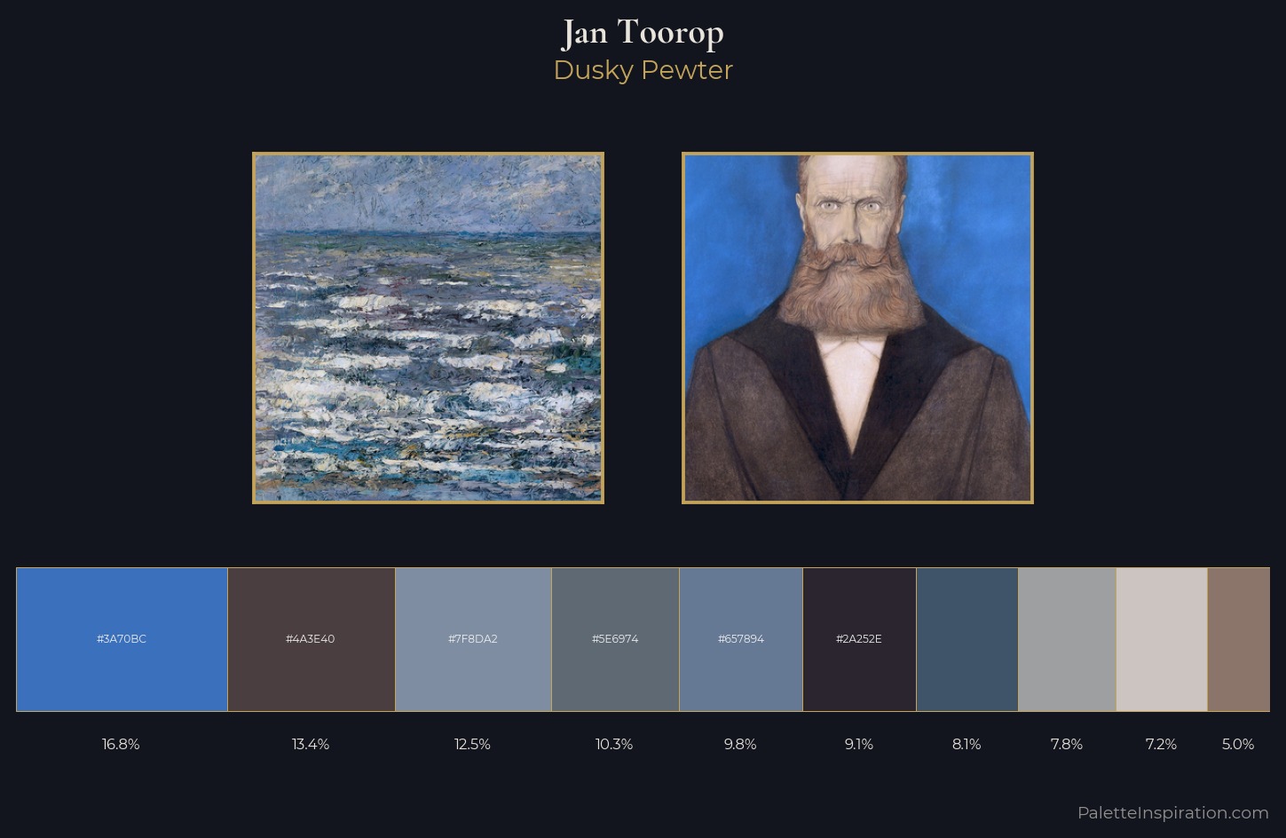
Jan Toorop occupies the comfortable middle of the value scale, avoiding both extremes to hold the eye in a sustained middle grey. Jan Toorop builds on cool foundations: the palette favours the blue-cyan-green arc. Muted throughout, the palette achieves its effects through value and temperature rather than chromatic force. #3F5369 is not a small accent - at 8.1% it qualifies as a major presence and gives the palette its chromatic identity. From deepest dark to palest light, the palette traverses 56 units of the value scale - a span that creates natural depth. The mid-to-high key, cool bias, and moderate chroma point to outdoor observation - sky and diffused daylight as the dominant light source. This is palette 5 of Jan Toorop's sequence - a single chapter in a chromatic story told across many works.
Example use cases
- exhibition design
- foundation branding
- estate management
- art education
- museums & galleries
I Love This!
Copy, export, or download for your project