Jan Toorop Palette 3

Palette Analysis
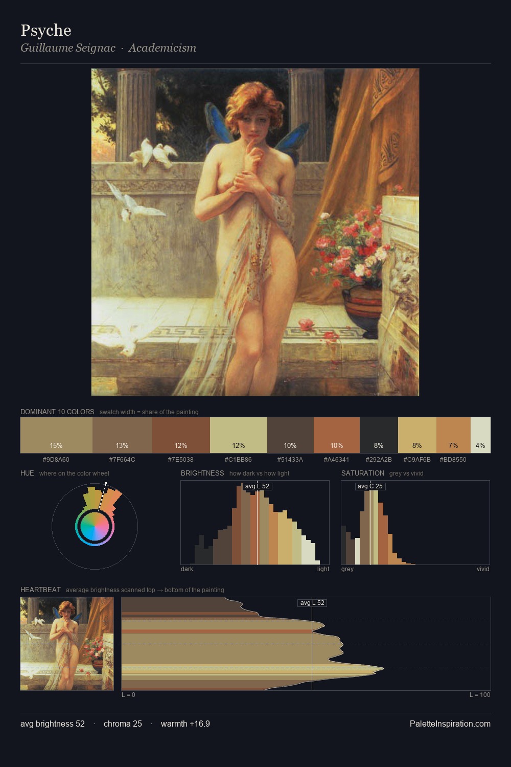
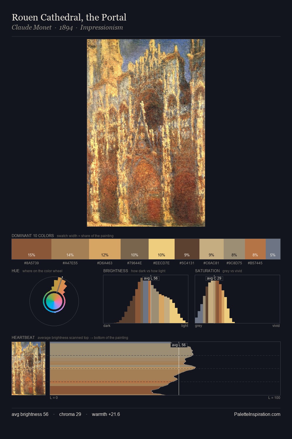
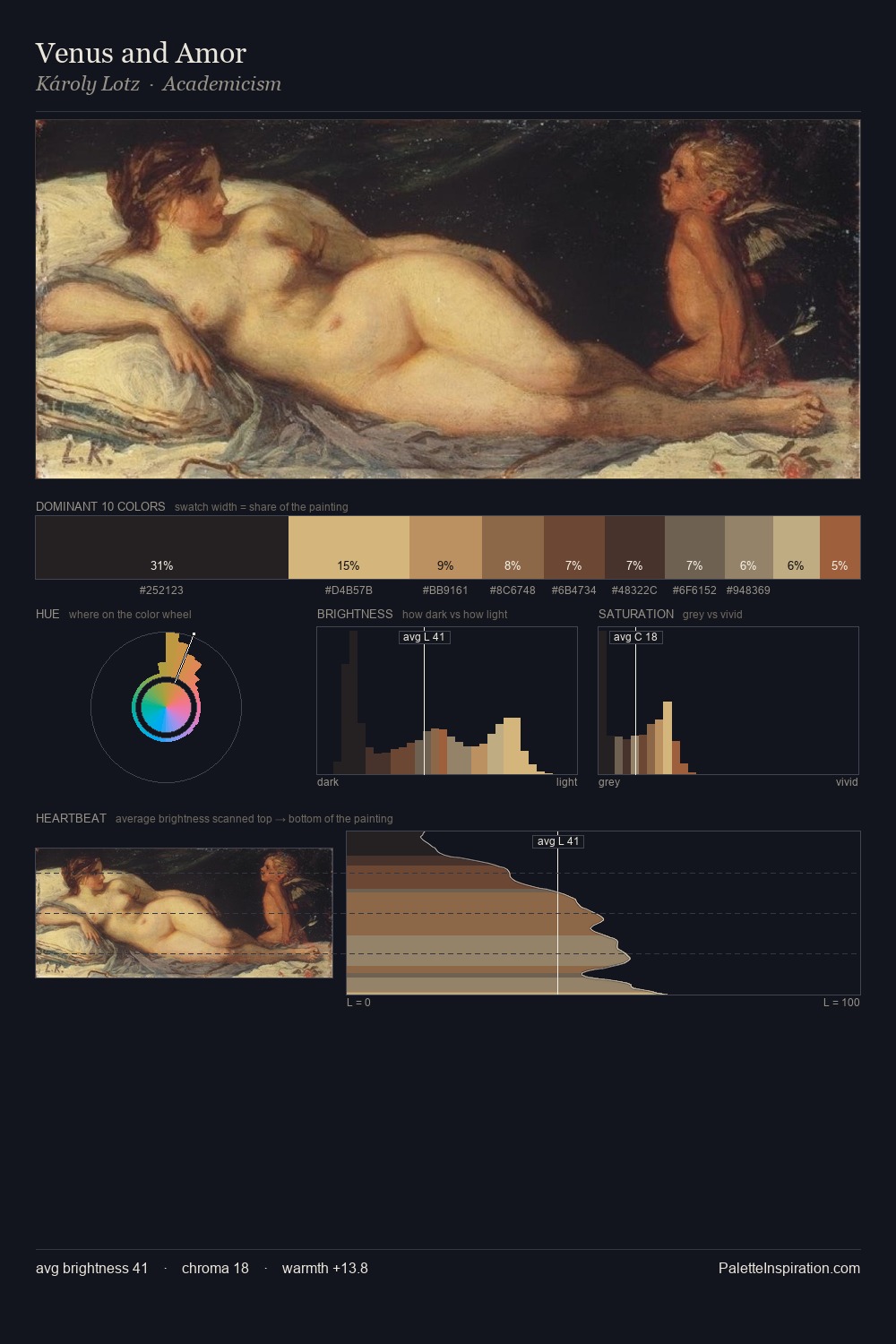
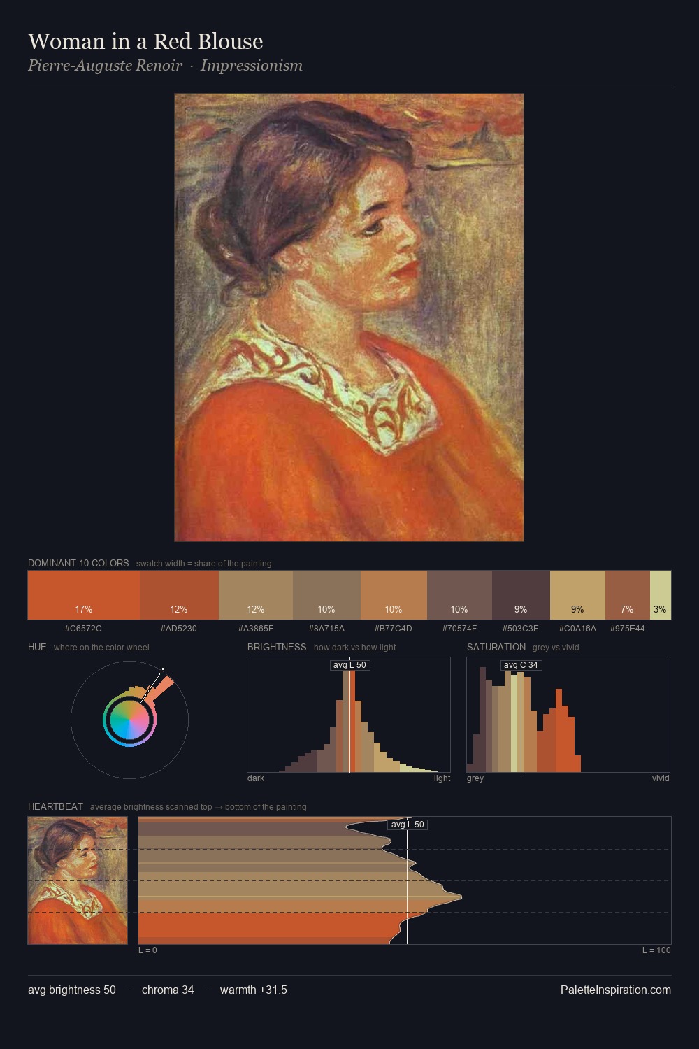
Jan Toorop is high in key: pale, luminous, and filled with optical air. A distinctly cool atmosphere runs through this palette: sky, water, and mist given colour form. Chroma is moderate: colours carry enough saturation to be read as colour, but the palette stops well short of garish intensity. 25.2% of the palette belongs to #EEDD96, a concentration that makes it the unmistakable visual centre. At 5.7%, #BC8759 carries the palette's sharpest chromatic charge: an accent that earns its place precisely because it is withheld. Spanning 49 units on the value axis, the palette achieves the balance between tonal flatness and fragmentation. The mid-to-high key, cool bias, and moderate chroma point to outdoor observation - sky and diffused daylight as the dominant light source. Palette 3 sits within the larger chromatic argument that Jan Toorop's complete body of work advances.
Example use cases
- publishing
- corporate identity
- consumer apps
- hospitality
- design agencies
I Love This!
Copy, export, or download for your project