Jan Toorop Palette 1
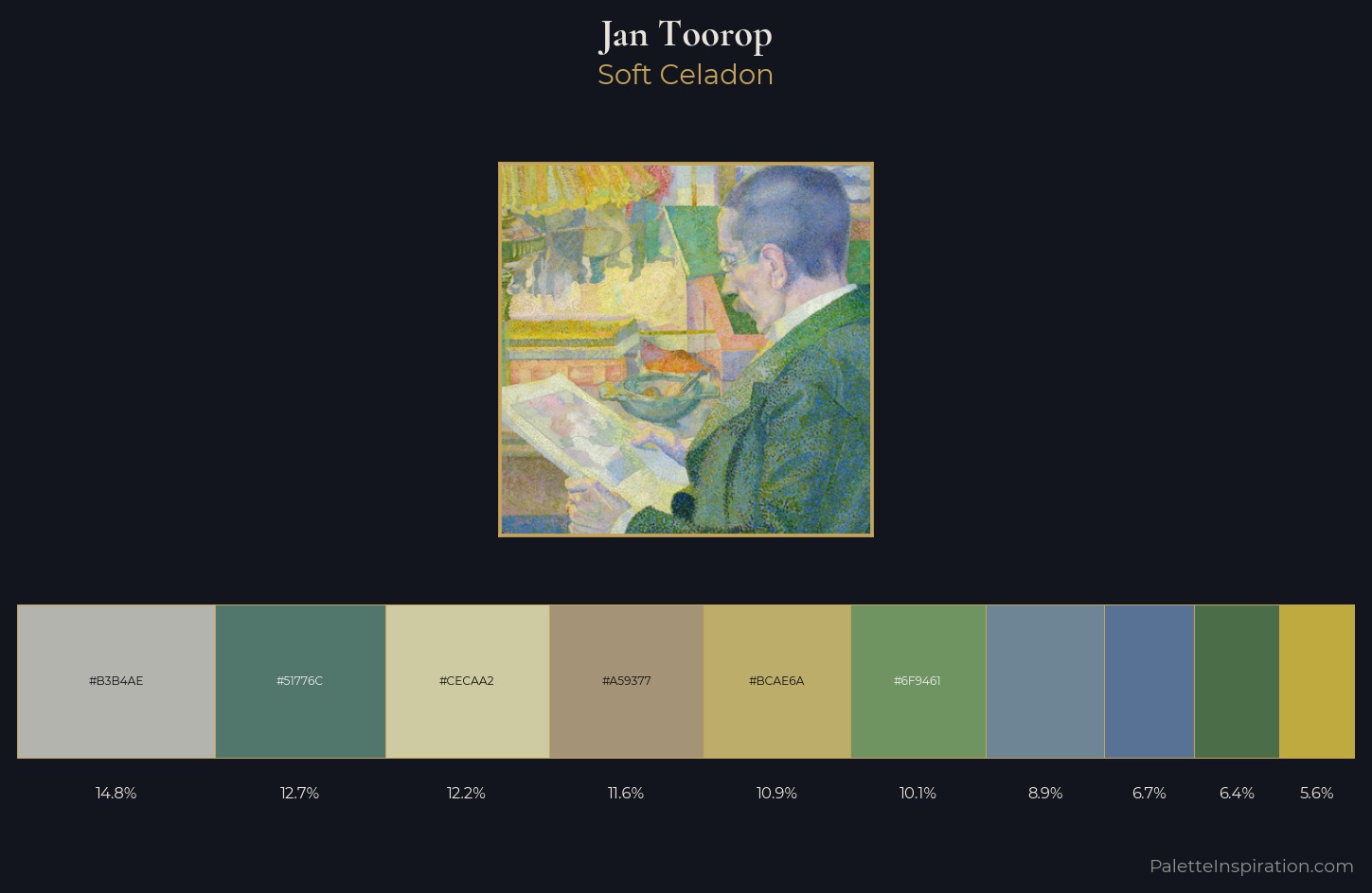
Palette Analysis
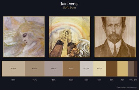
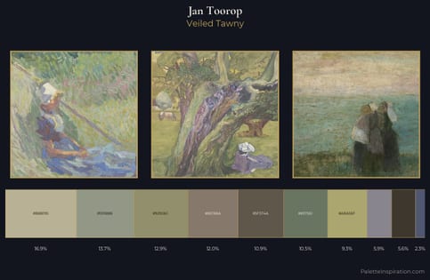
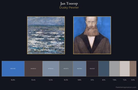
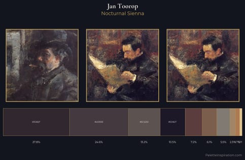
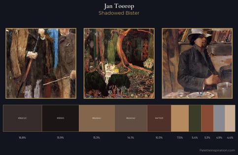
Jan Toorop is high in key: pale, luminous, and filled with optical air. Blues and teal-greys govern the palette, lending it an aquatic or atmospheric quality. Saturation is deliberately withheld - the beauty here lies in the near-monochromatic gradations rather than colour difference. Only 10.9% is devoted to #BCAE6A, yet that small allocation delivers the palette's entire chromatic tension. Spanning 33 units on the value axis, the palette achieves the balance between tonal flatness and fragmentation. The mid-to-high key, cool bias, and moderate chroma point to outdoor observation - sky and diffused daylight as the dominant light source. This is palette 1 of Jan Toorop's sequence - a single chapter in a chromatic story told across many works.
Example use cases
- garden centers
- natural beauty
- park & rec design
- sustainable fashion
- sustainability
I Love This!
Copy, export, or download for your project