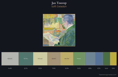
Jan Toorop Palette 2
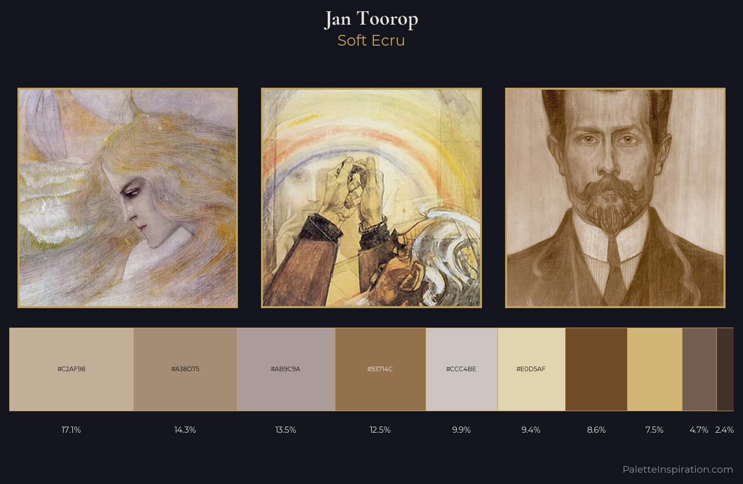
Soft Ecru
Soft Low-contrast, gentle chroma - mid-key values and low saturation, approachable and calm.
Ecru Unbleached linen - warm mid-neutral, slightly grayed, raw and natural.
Palette Analysis
Jan Toorop is strongly light-biased - shadow is suggested rather than declared. Warmth dominates - the palette of Jan Toorop leans heavily on the yellow-orange-red arc of the colour wheel. Every colour is desaturated; the palette proceeds through near-neutrals and gently-coloured greys. Only 9.4% is devoted to #E0D5AF, yet that small allocation delivers the palette's entire chromatic tension. 54 units of value spread create a palette that is varied but unified - contrast in the service of harmony. Jan Toorop's palette 2 carries its own internal logic while remaining in conversation with the artist's broader colour intelligence.
Example use cases
- ceramics & pottery
- boutique hospitality
- menswear
- heritage food brands
- craft & artisan brands
I Love This!
Use This Palette
Copy, export, or download for your project
Copy, export, or download for your project
Copy:
Download:
Share:
![[Unkown] palette card](/cards/0000163.jpg)