Jan Brueghel the Elder Palette 10

Palette Analysis
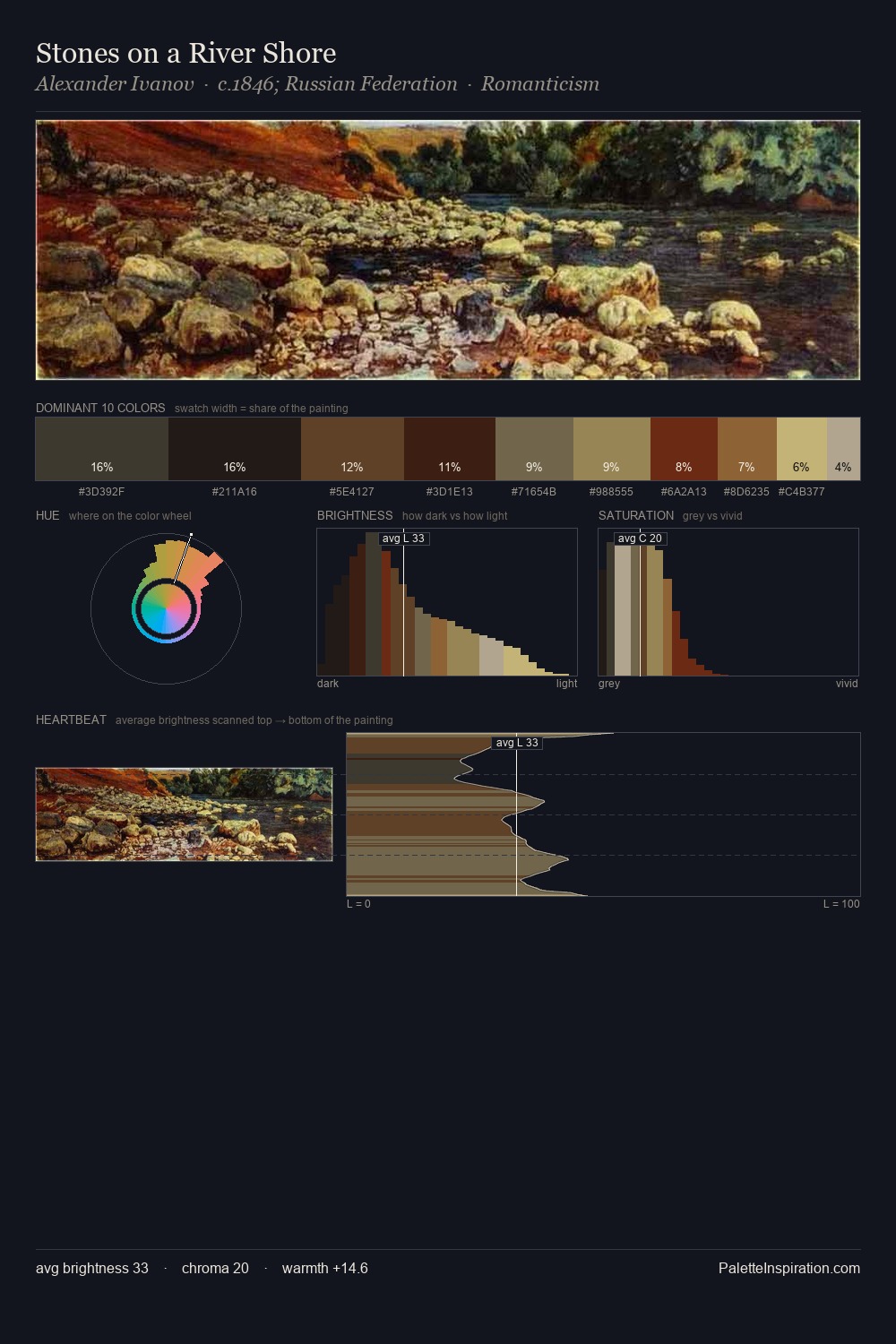
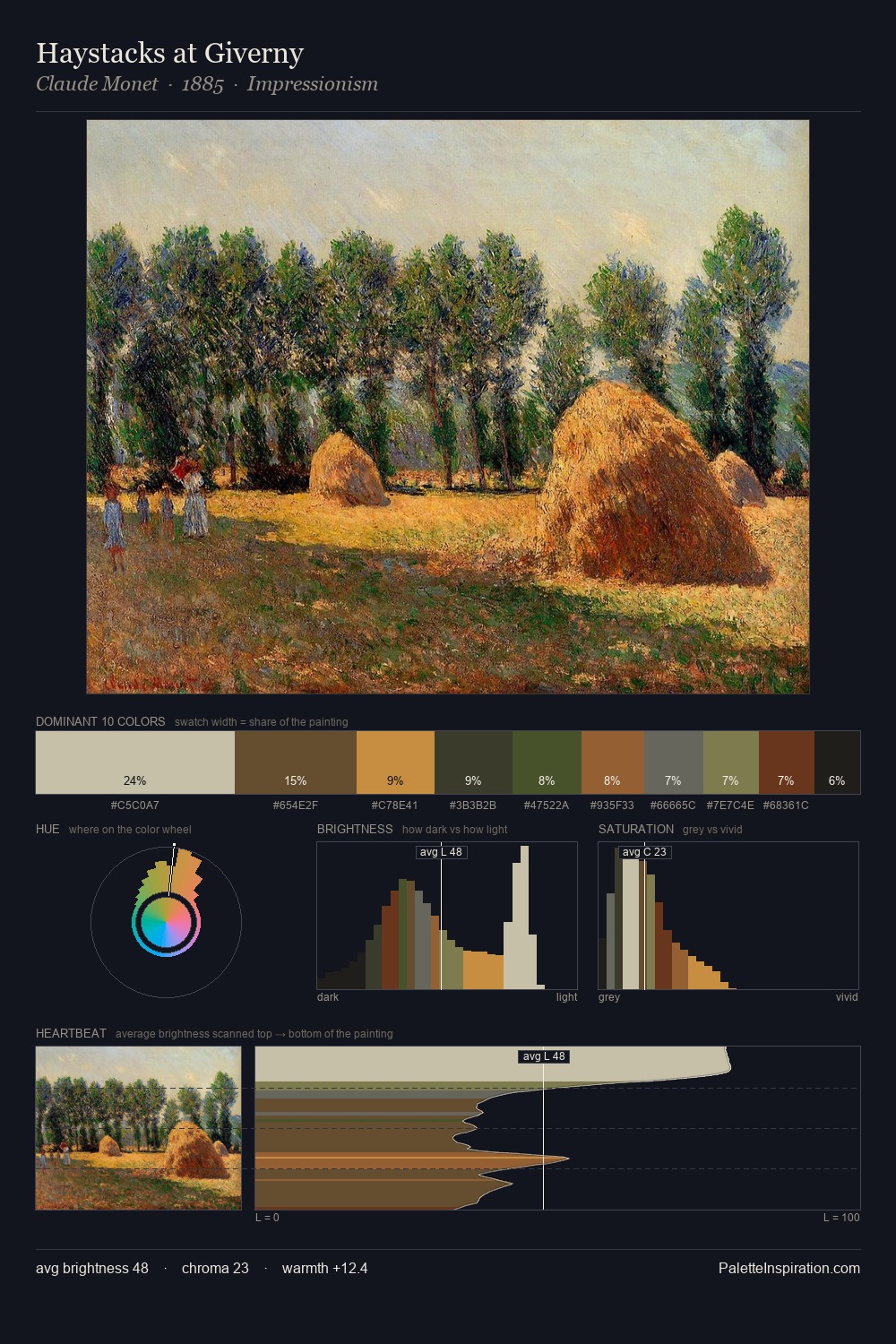
Values in Jan Brueghel the Elder rest in the mid-range - neither dramatically lit nor steeped in shadow. Jan Brueghel the Elder tilts toward cool - blues and silver-greys carry the structural weight. All colours lean toward grey, building depth through value rather than colour punch. Jan Brueghel the Elder gives 25.8% of the composition to a single #342D1D - a decisive chromatic anchor. #513B21 functions as the palette's exclamation mark: highest chroma, lowest percentage (10.5%). Spanning 54 units on the value axis, the palette achieves the balance between tonal flatness and fragmentation. The palette has the character of outdoor light: cool, mid-bright, with colour rendered faithfully rather than expressively. This is palette 10 of Jan Brueghel the Elder's sequence - a single chapter in a chromatic story told across many works.
Example use cases
- theater design
- jewelry brands
- tobacco-adjacent retail
- event branding
- film & entertainment
I Love This!
Copy, export, or download for your project