Jan Brueghel the Elder Palette 8

Palette Analysis
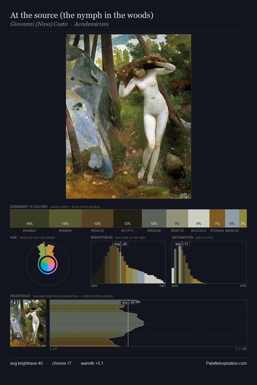
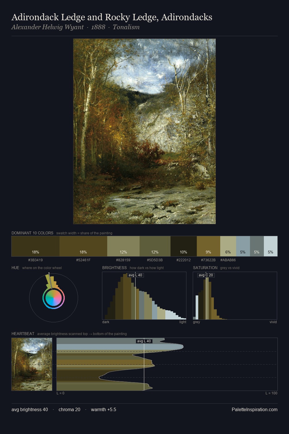
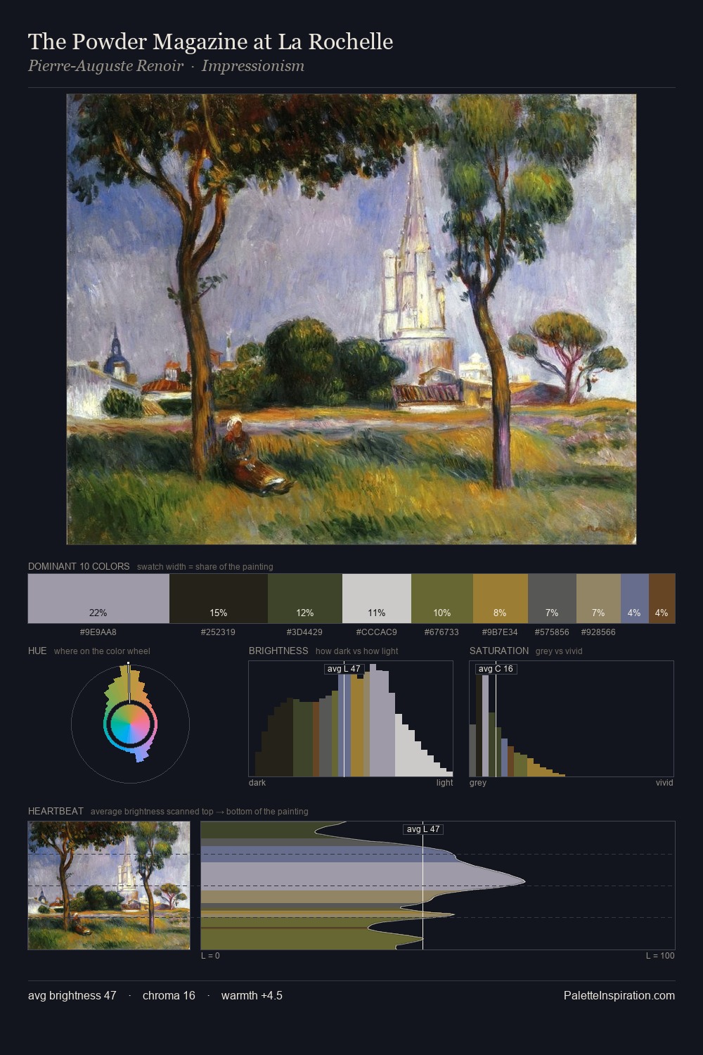
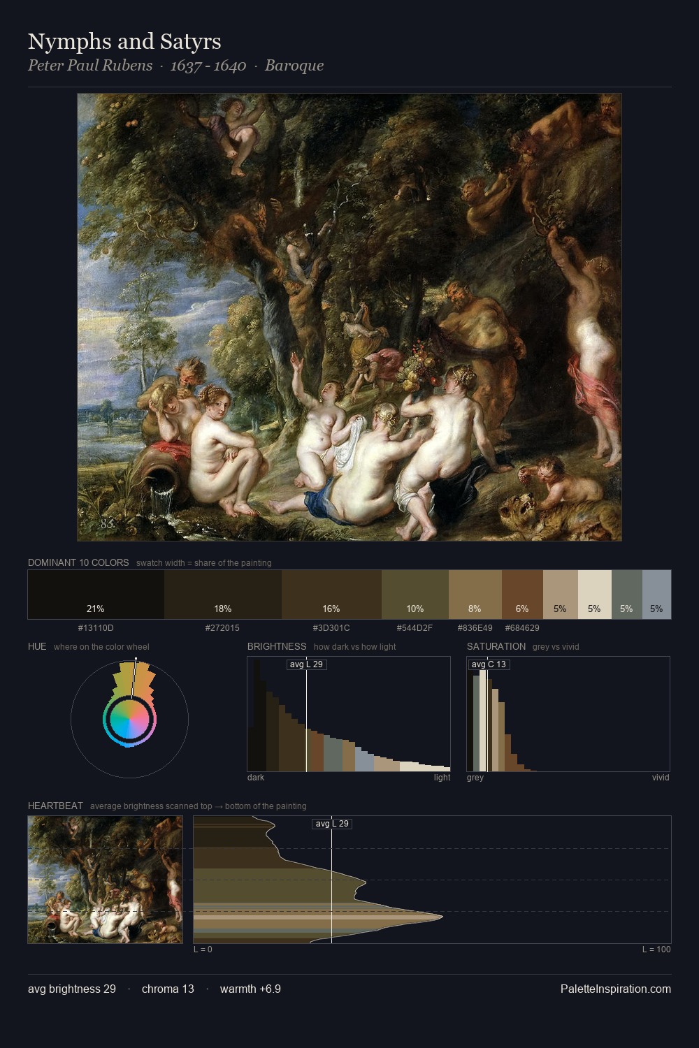
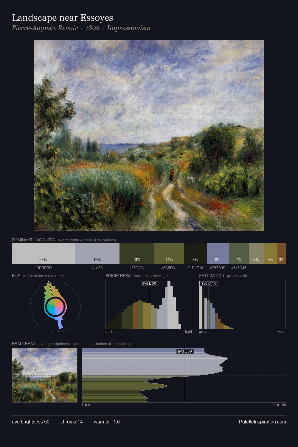
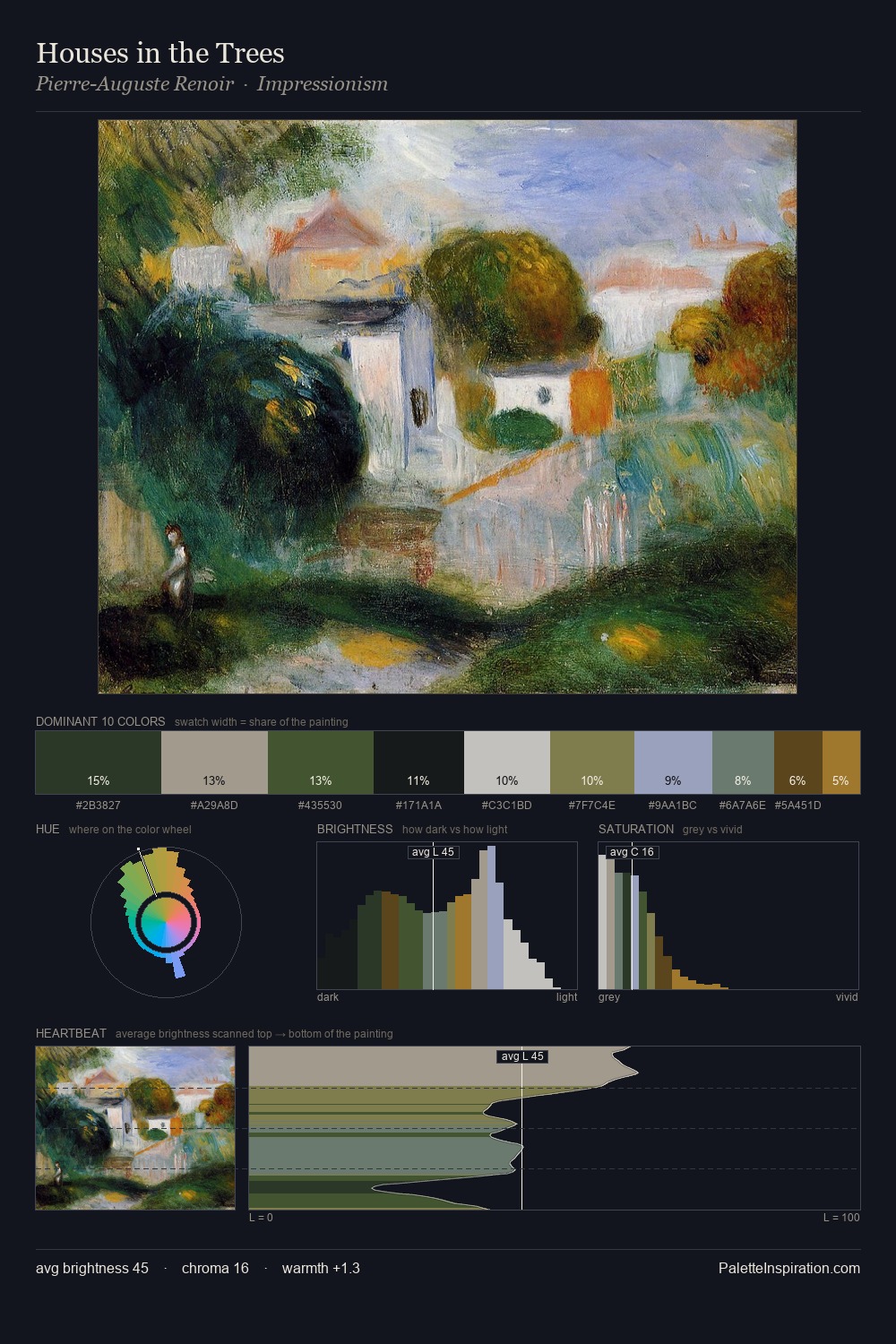
Jan Brueghel the Elder occupies the comfortable middle of the value scale, avoiding both extremes to hold the eye in a sustained middle grey. Temperature is cool-dominant, with blue and green families claiming the largest areas. Every colour is desaturated; the palette proceeds through near-neutrals and gently-coloured greys. Jan Brueghel the Elder gives 25.0% of the composition to a single #182013 - a decisive chromatic anchor. At 5.6%, #634618 carries the palette's sharpest chromatic charge: an accent that earns its place precisely because it is withheld. A value spread of 62 units gives the palette both depth and air - shadows are genuinely dark, lights genuinely light. The palette has the character of outdoor light: cool, mid-bright, with colour rendered faithfully rather than expressively. Jan Brueghel the Elder's palette 8 carries its own internal logic while remaining in conversation with the artist's broader colour intelligence.
Example use cases
- theater design
- jewelry brands
- tobacco-adjacent retail
- event branding
- film & entertainment
I Love This!
Copy, export, or download for your project