James Ward Palette 6

Palette Analysis
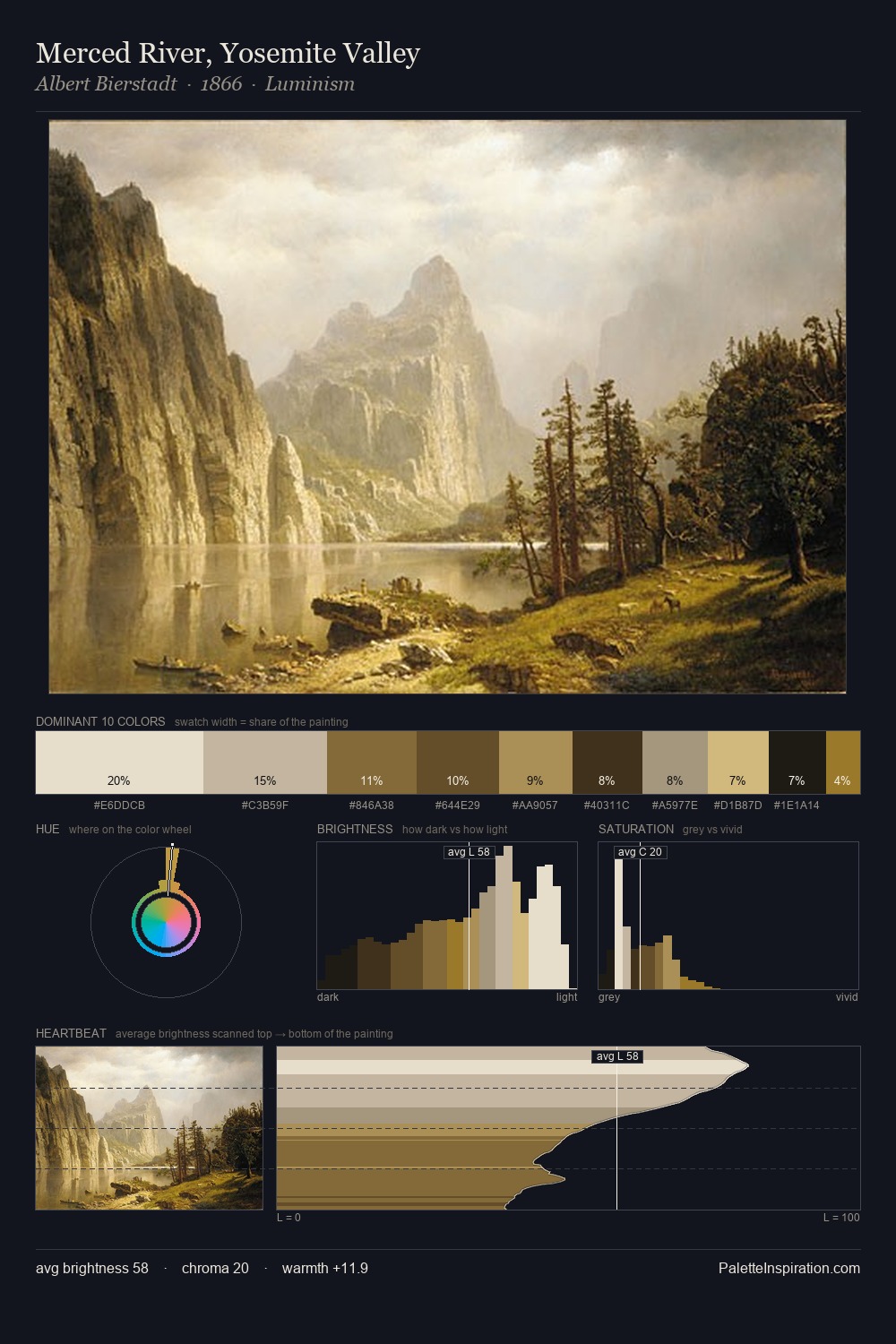
James Ward is strongly light-biased - shadow is suggested rather than declared. Cool tones set the register here - the blues and greens easily outweigh any warm accents. Every colour is desaturated; the palette proceeds through near-neutrals and gently-coloured greys. At 27.0%, #D8CFAD functions less as a colour accent and more as a complete atmospheric environment. The saturated accent, #170F07, registers at 1.9% - sparse enough to feel like a deliberate surprise. The full value range is 67 units: broad enough to build convincing three-dimensional form. The mid-to-high key, cool bias, and moderate chroma point to outdoor observation - sky and diffused daylight as the dominant light source. In the context of James Ward's full range of palettes, group 6 represents one movement in an ongoing chromatic dialogue.
Example use cases
- ceramics & pottery
- boutique hospitality
- menswear
- heritage food brands
- craft & artisan brands
I Love This!
Copy, export, or download for your project