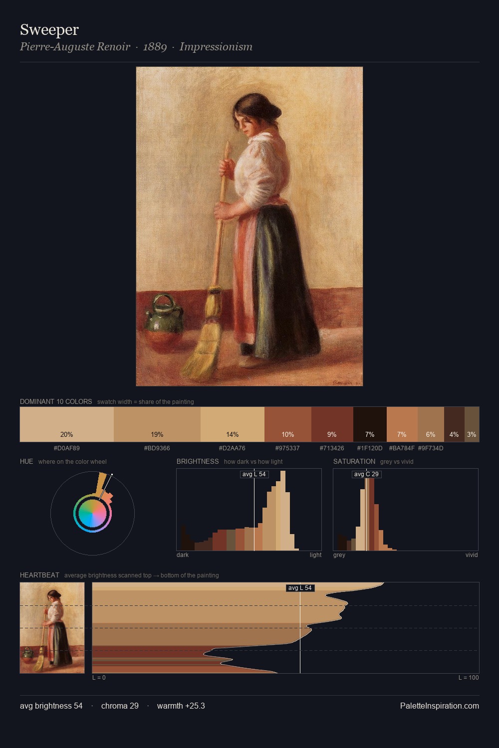
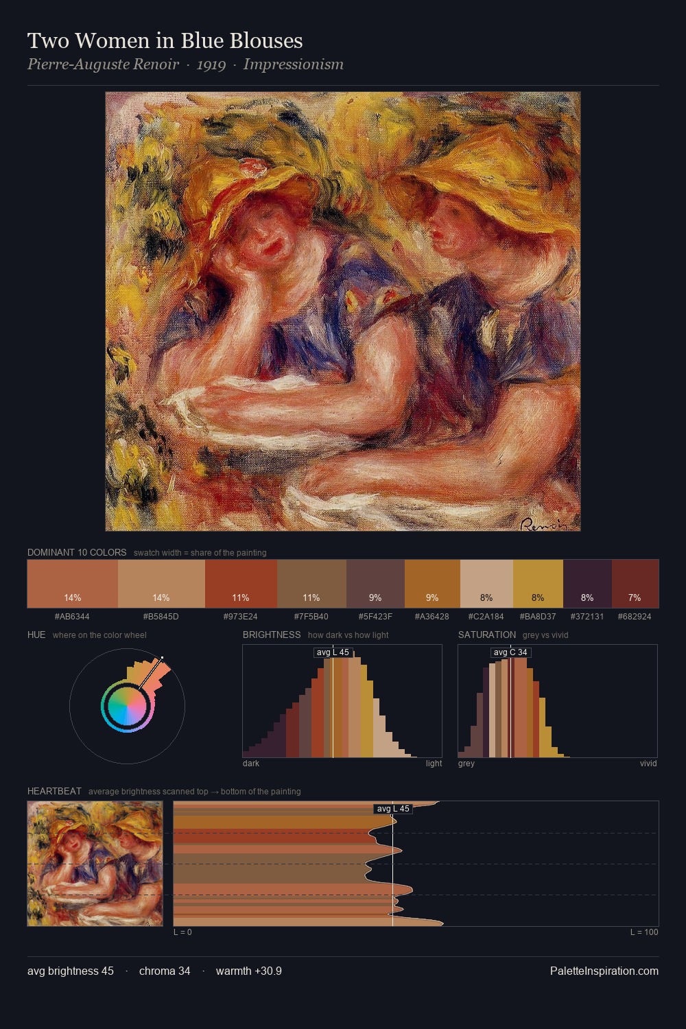
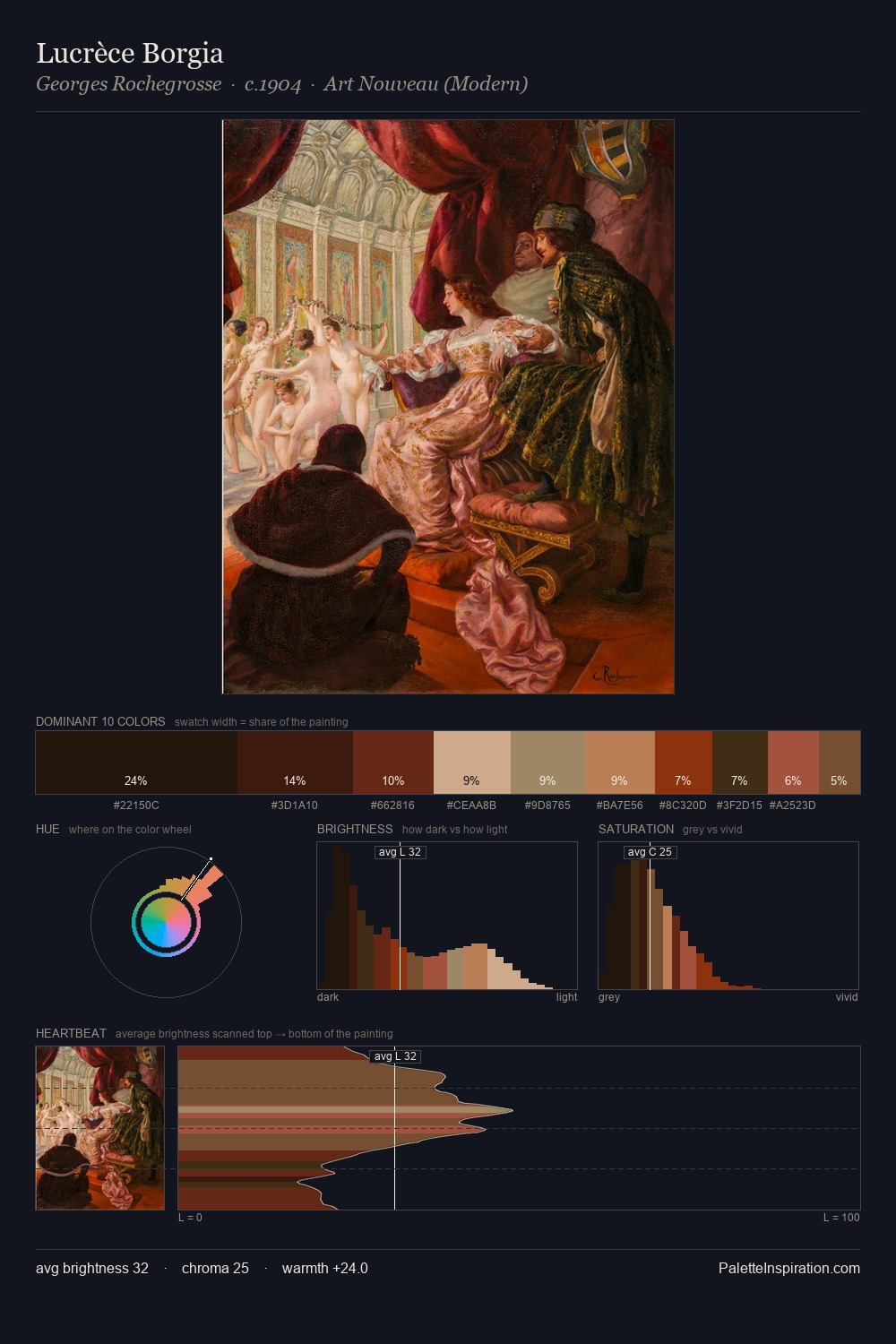
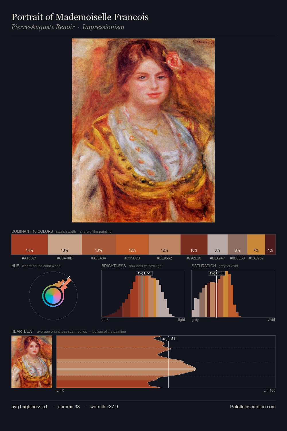
Johann Anton de Peters Palette 1

Palette Analysis
The high-key values of Johann Anton de Peters give it an effulgent, almost bleached quality. Warmth dominates - the palette of Johann Anton de Peters leans heavily on the yellow-orange-red arc of the colour wheel. Saturation is measured and controlled, giving the palette presence without visual aggression. #C4B090 at 27.7% of the palette: an overwhelming presence that pulls all other colours into its gravitational field. At 1.8%, #6C2618 carries the palette's sharpest chromatic charge: an accent that earns its place precisely because it is withheld. The value range of 40 units sits in the comfortable middle: enough depth, enough light, neither extreme. This is palette 1 of Johann Anton de Peters's sequence - a single chapter in a chromatic story told across many works.
Example use cases
- ceramics & pottery
- boutique hospitality
- menswear
- heritage food brands
- craft & artisan brands
I Love This!
Copy, export, or download for your project