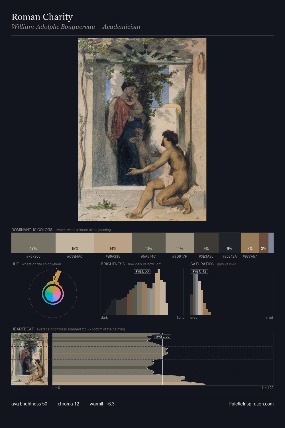
James Ensor Palette 3
Soft Parchment
Soft Low-contrast, gentle chroma - mid-key values and low saturation, approachable and calm.
Parchment Aged warm neutral - the color of old manuscript parchment, tan and slightly yellowed.

Palette Analysis
James Ensor sits in the centre of the value range, lending the palette a sense of even, sustained light. Warm and cool are kept in productive tension, creating the kind of chromatic harmony that sustains the eye. Muted throughout, the palette achieves its effects through value and temperature rather than chromatic force. #A57653 functions as the palette's exclamation mark: highest chroma, lowest percentage (3.5%). Spanning 43 units on the value axis, the palette achieves the balance between tonal flatness and fragmentation. This is palette 3 of James Ensor's sequence - a single chapter in a chromatic story told across many works.
Example use cases
- exhibition design
- foundation branding
- estate management
- art education
- museums & galleries
I Love This!
Use This Palette
Copy, export, or download for your project
Copy, export, or download for your project
Copy:
Download:
Share: