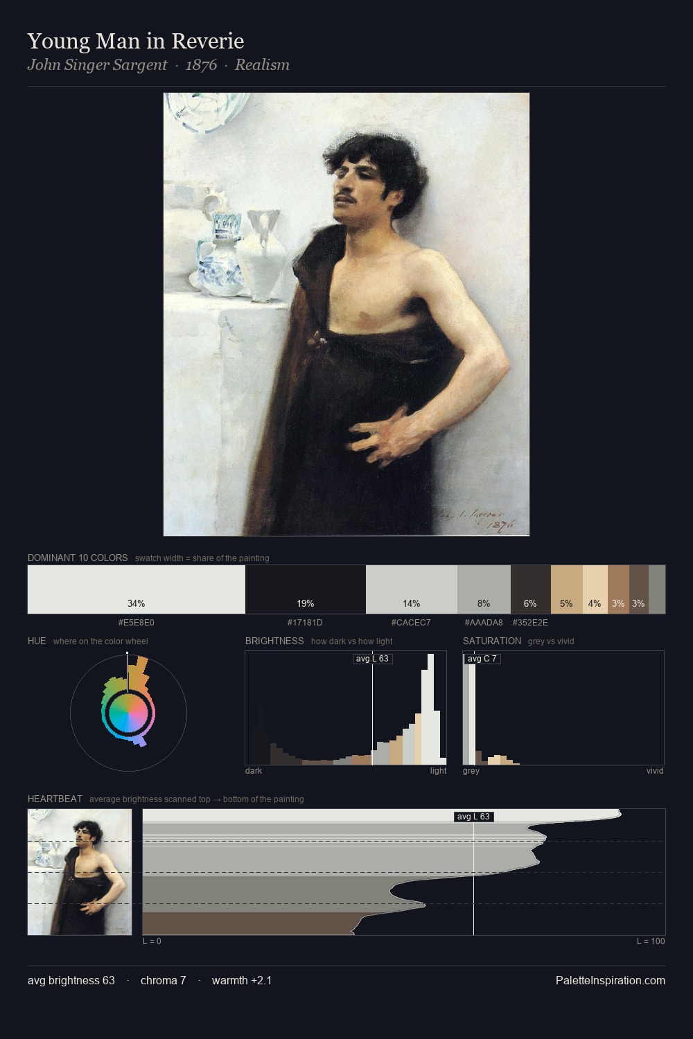
Andrei Rublev Palette 1
Soft Ivory
Soft Low-contrast, gentle chroma - mid-key values and low saturation, approachable and calm.
Ivory Warm creamy white - the color of natural ivory, warmer than pure white.

Palette Analysis
The high-key values of Andrei Rublev give it an effulgent, almost bleached quality. Cool hues prevail: blues, greens, and greys anchor the palette's emotional temperature. Chroma hovers near zero; colour declares itself through subtle shifts in hue rather than outright saturation. The most saturated colour, #C0AA95, is reserved to 11.9% of the surface, where it acts as a focal punctuation. At 59 units of value range, the palette has the tonal breadth to sustain complex spatial readings. The mid-to-high key, cool bias, and moderate chroma point to outdoor observation - sky and diffused daylight as the dominant light source. This is palette 1 of Andrei Rublev's sequence - a single chapter in a chromatic story told across many works.
Example use cases
- exhibition design
- foundation branding
- estate management
- art education
- museums & galleries
I Love This!
Use This Palette
Copy, export, or download for your project
Copy, export, or download for your project
Copy:
Download:
Share: