James Ensor Palette 4

Palette Analysis
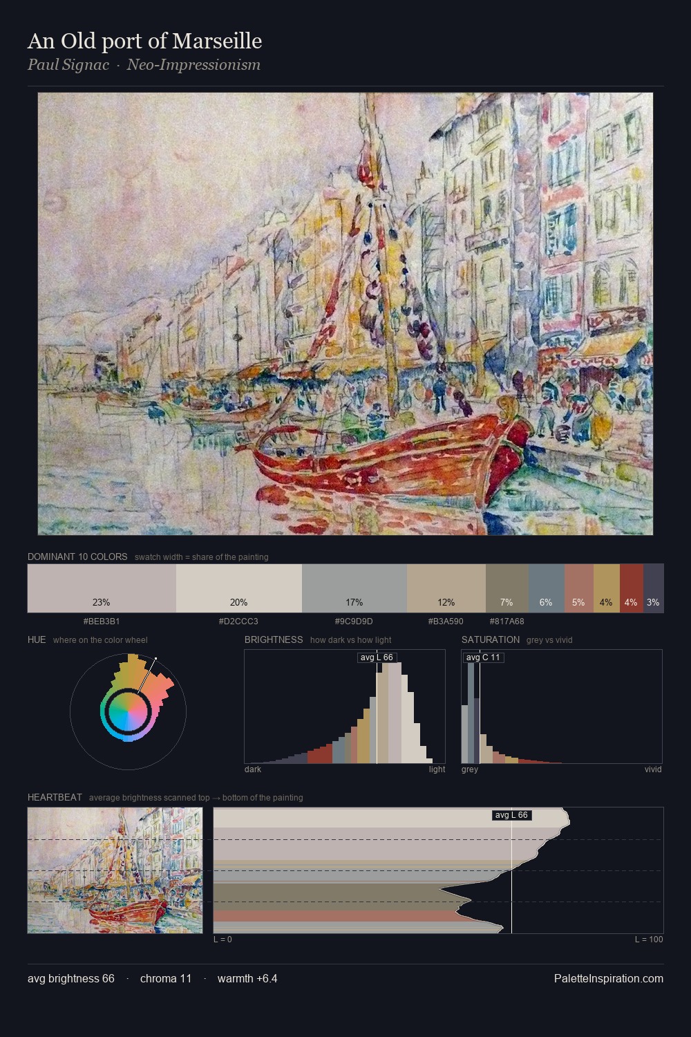
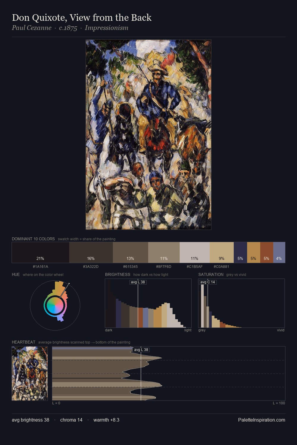
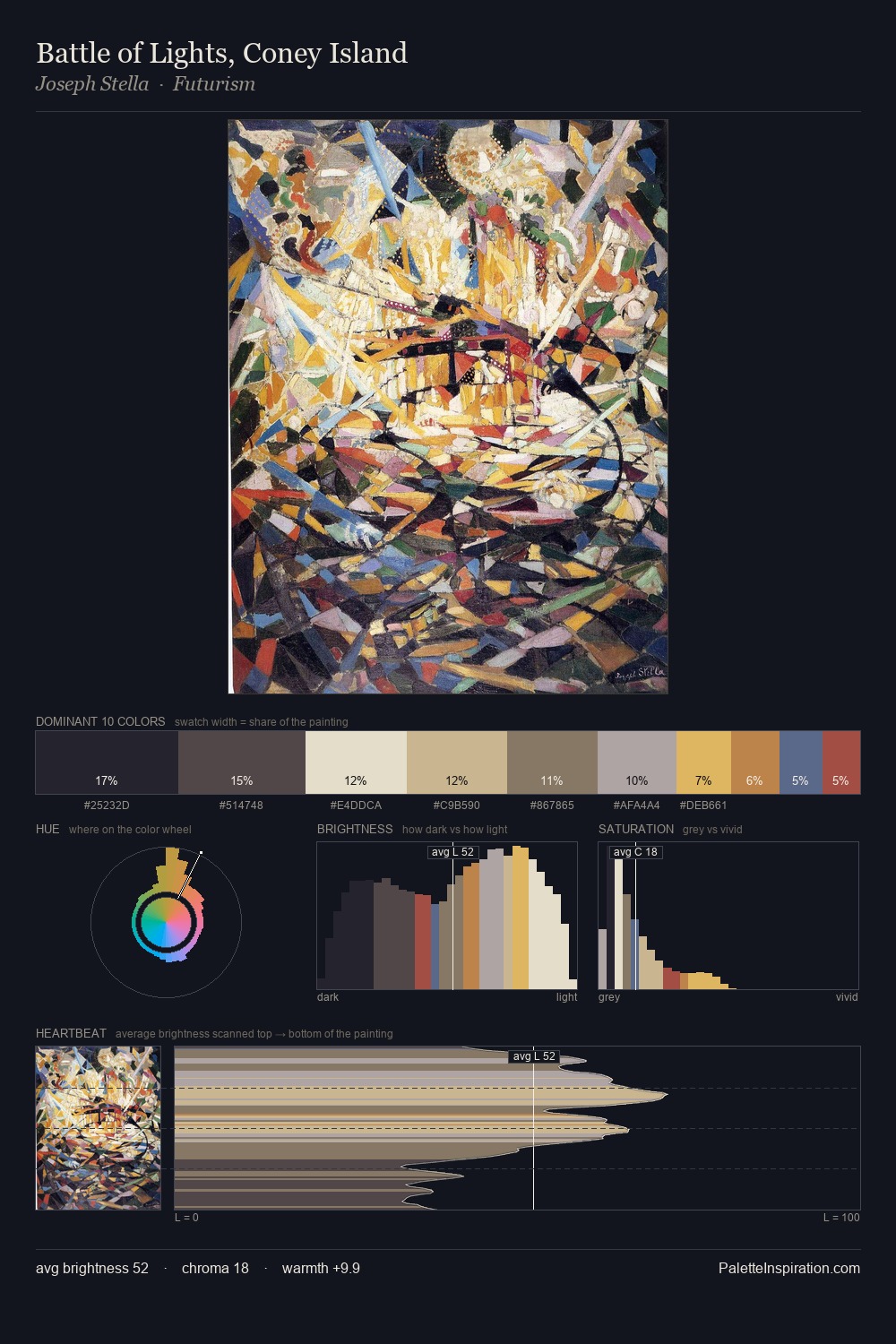
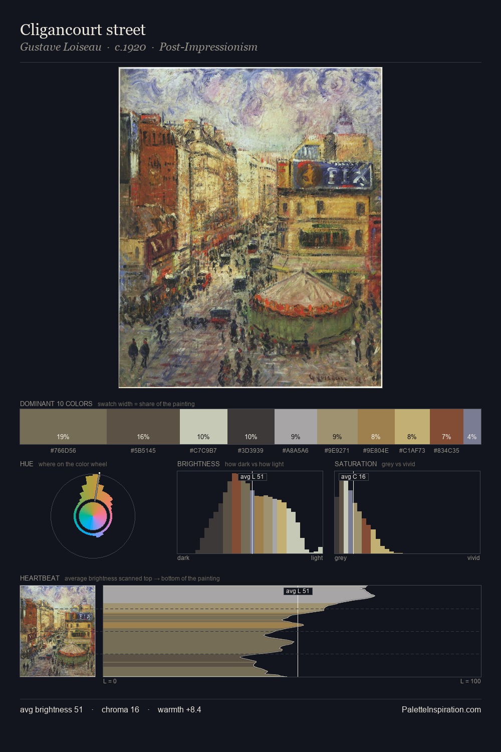
Values in James Ensor tilt decisively toward white, giving the palette its luminous character. A distinctly cool atmosphere runs through this palette: sky, water, and mist given colour form. All colours lean toward grey, building depth through value rather than colour punch. The dominant colour, #C6C6BF, takes 27.2% of the total area, establishing the overall mood before any other hue is introduced. The most saturated colour, #5A728C, is reserved to 2.8% of the surface, where it acts as a focal punctuation. Spanning 45 units on the value axis, the palette achieves the balance between tonal flatness and fragmentation. High luminosity and cool temperature suggest the plein-air condition: unfiltered daylight and open sky. Palette 4 sits within the larger chromatic argument that James Ensor's complete body of work advances.
Example use cases
- exhibition design
- foundation branding
- estate management
- art education
- museums & galleries
I Love This!
Copy, export, or download for your project