James Campbell Noble Palette 1

Palette Analysis
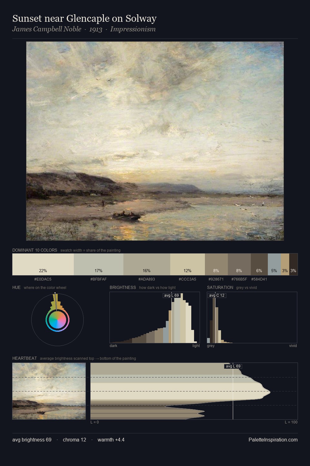
Values in James Campbell Noble tilt decisively toward white, giving the palette its luminous character. Temperature is cool-dominant, with blue and green families claiming the largest areas. Muted throughout, the palette achieves its effects through value and temperature rather than chromatic force. James Campbell Noble gives 25.2% of the composition to a single #ACA98A - a decisive chromatic anchor. The most saturated colour, #948A65, is reserved to 6.7% of the surface, where it acts as a focal punctuation. From deepest dark to palest light, the palette traverses 59 units of the value scale - a span that creates natural depth. The palette has the character of outdoor light: cool, mid-bright, with colour rendered faithfully rather than expressively. James Campbell Noble's palette 1 carries its own internal logic while remaining in conversation with the artist's broader colour intelligence.
Example use cases
- exhibition design
- foundation branding
- estate management
- art education
- museums & galleries
I Love This!
Copy, export, or download for your project