James Campbell Noble Master Palette

Palette Analysis
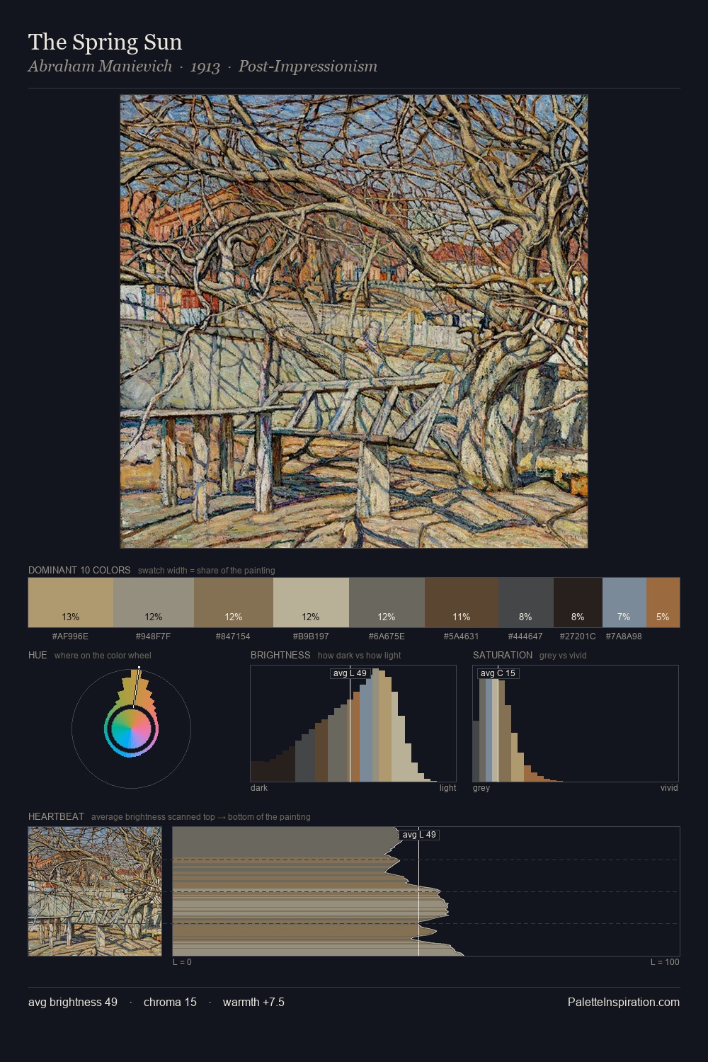
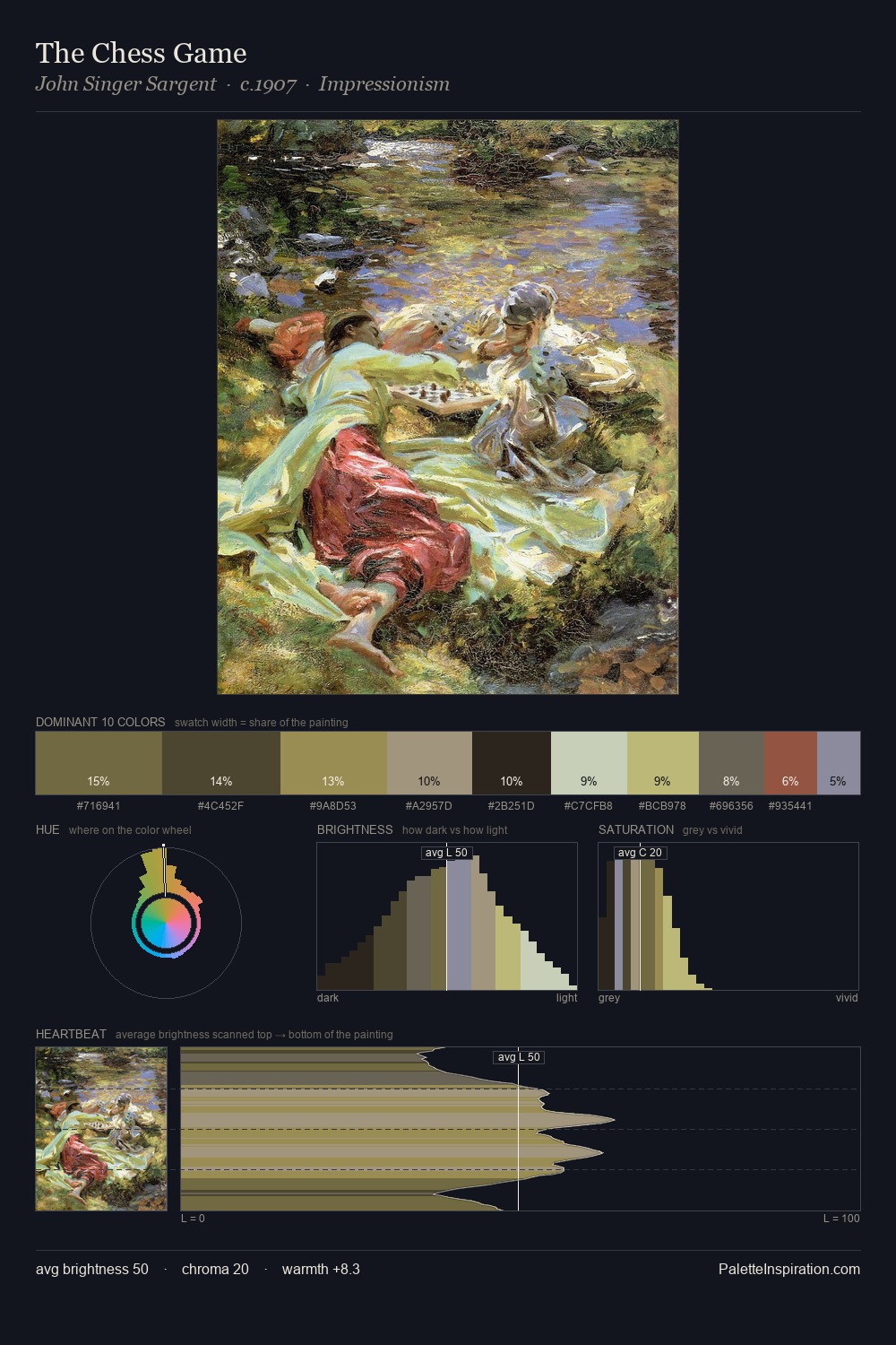
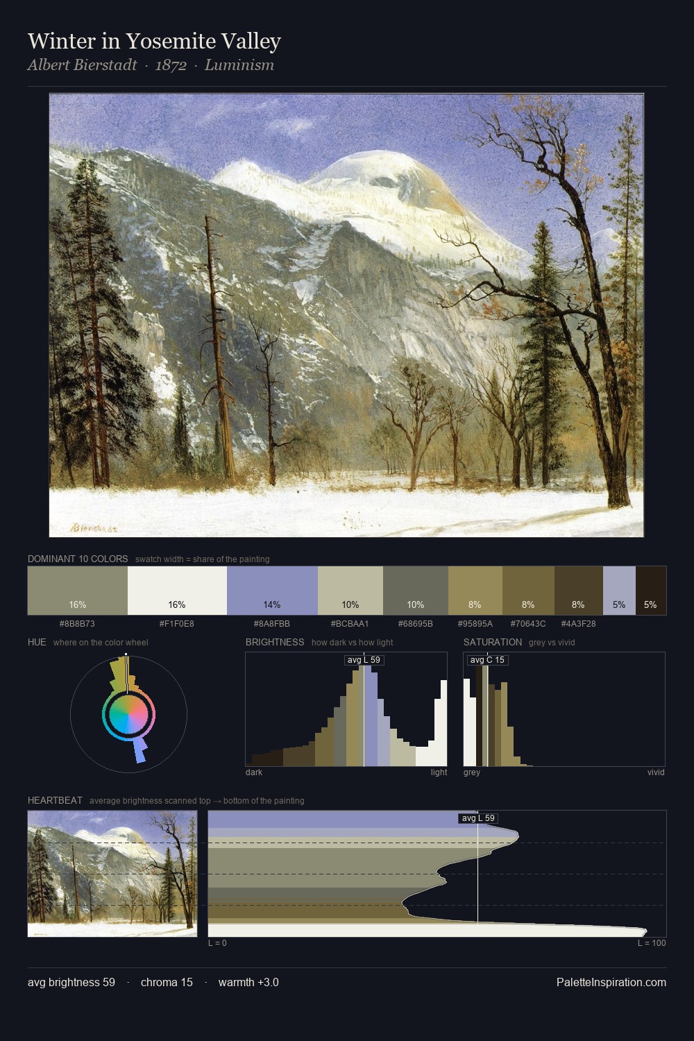
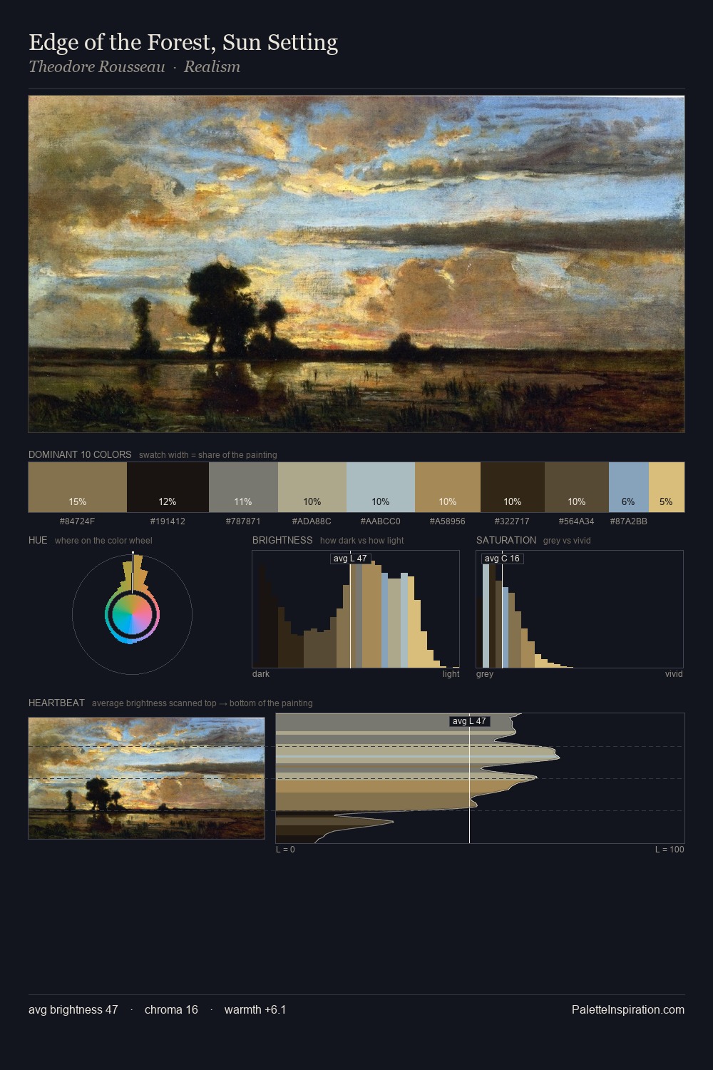
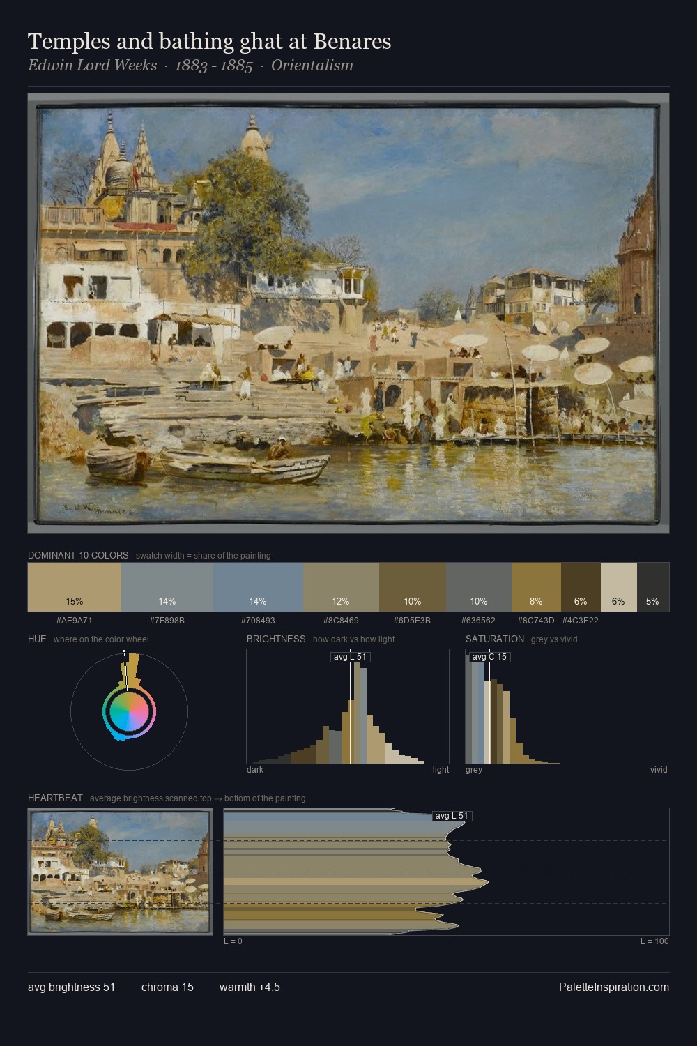
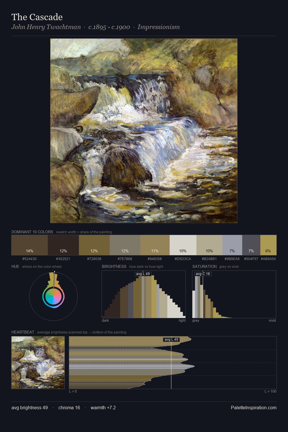
James Campbell Noble occupies the comfortable middle of the value scale, avoiding both extremes to hold the eye in a sustained middle grey. Cool hues prevail: blues, greens, and greys anchor the palette's emotional temperature. The absence of saturated colour is itself an expressive choice: this is a palette of restraint and atmosphere. The most saturated colour, #706A45, is reserved to 7.8% of the surface, where it acts as a focal punctuation. The palette spans 54 value units: a measured range that delivers coherence over drama. The mid-to-high key, cool bias, and moderate chroma point to outdoor observation - sky and diffused daylight as the dominant light source. Taken together, these qualities constitute James Campbell Noble's chromatic voice - distinctive enough to be read across an entire body of work.
Example use cases
- archival print
- university identity
- rare books
- cultural institutions
- nonprofit identity
I Love This!
Copy, export, or download for your project