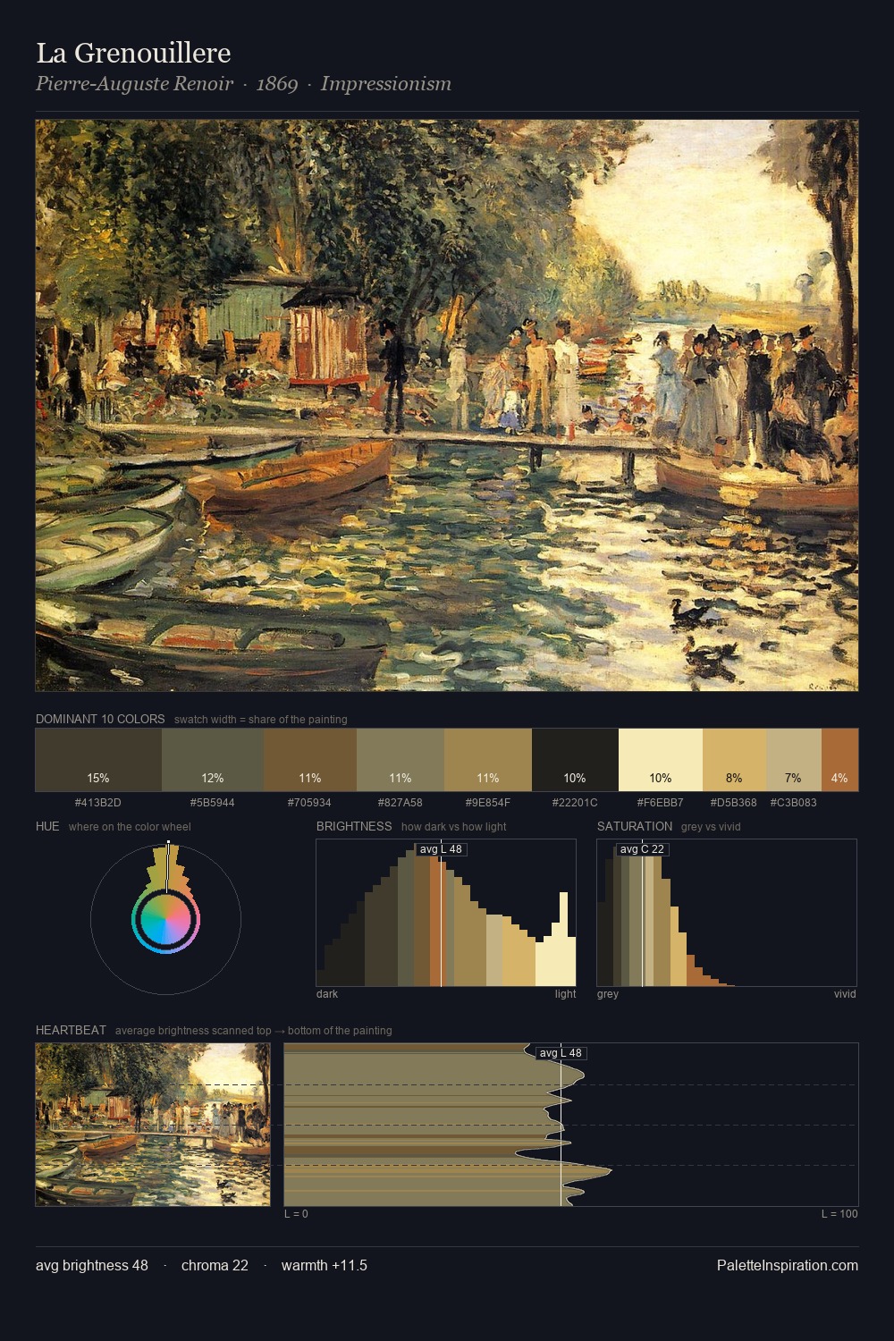
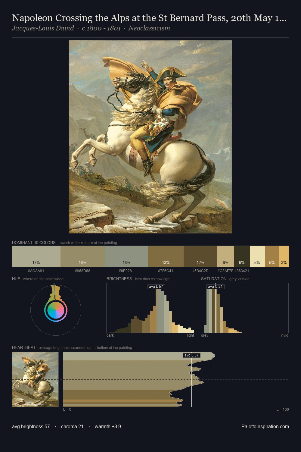
Julius van de Sande Bakhuyzen Palette 1

Palette Analysis
Julius van de Sande Bakhuyzen is strongly light-biased - shadow is suggested rather than declared. Cool tones set the register here - the blues and greens easily outweigh any warm accents. Saturation is deliberately withheld - the beauty here lies in the near-monochromatic gradations rather than colour difference. Only 14.0% is devoted to #D3C398, yet that small allocation delivers the palette's entire chromatic tension. At 66 units of value range, the palette has the tonal breadth to sustain complex spatial readings. The palette has the character of outdoor light: cool, mid-bright, with colour rendered faithfully rather than expressively. This is palette 1 of Julius van de Sande Bakhuyzen's sequence - a single chapter in a chromatic story told across many works.
Example use cases
- publishing
- corporate identity
- consumer apps
- hospitality
- design agencies
I Love This!
Copy, export, or download for your project
Related Palettes

James Campbell Noble Palette 1
Soft Ecru

Julius van de Sande Bakhuyzen Palette 2
Veiled Tawny

Julius van de Sande Bakhuyzen Palette 3
Penumbral Tawny

Julius van de Sande Bakhuyzen Palette 4
Veiled Tawny

Julius van de Sande Bakhuyzen Palette 5
Veiled Apricot

Julius van de Sande Bakhuyzen Master Palette
Veiled Tawny