Jacob Jordaens Palette 14

Palette Analysis
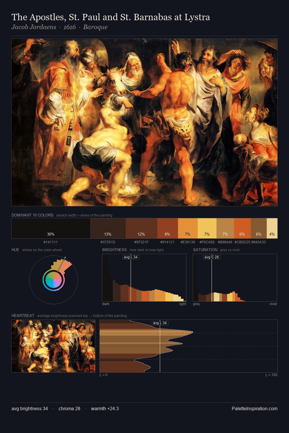
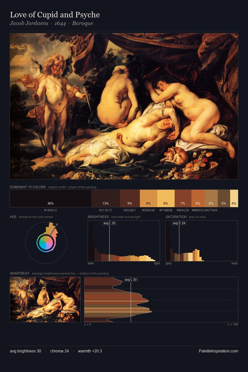
Jacob Jordaens is built on dark foundations, with values clustered toward shadow. Yellow, ochre, sienna: warm hues that Jacob Jordaens deploys as the palette's primary energy. Chroma hovers near zero; colour declares itself through subtle shifts in hue rather than outright saturation. #0E090B at 32.0% of the palette: an overwhelming presence that pulls all other colours into its gravitational field. The highest-chroma note - #883B1E - appears at just 7.0%, deployed as a precision accent against the quieter ground. A value spread of 67 units gives the palette both depth and air - shadows are genuinely dark, lights genuinely light. This tonal restraint is characteristic of the Jacob Jordaens approach: colour serves light, not the reverse. Jacob Jordaens's palette 14 carries its own internal logic while remaining in conversation with the artist's broader colour intelligence.
Example use cases
- theater design
- jewelry brands
- tobacco-adjacent retail
- event branding
- film & entertainment
I Love This!
Copy, export, or download for your project