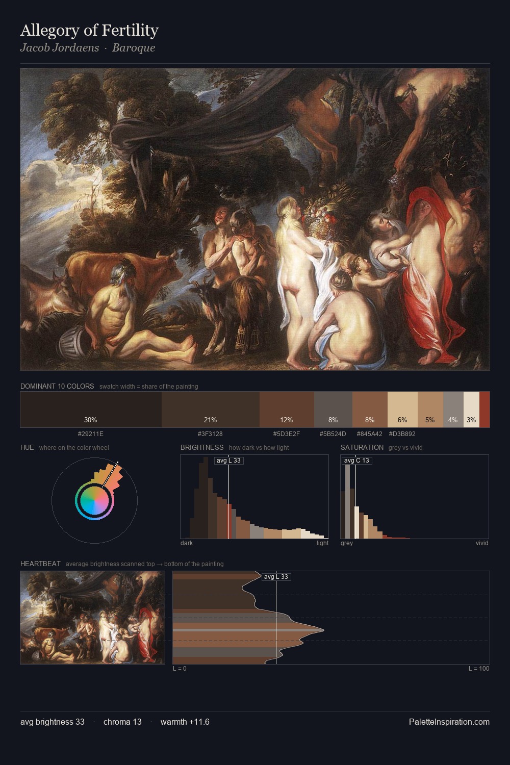
Jacob Jordaens Palette 10
Nocturnal Sienna
Nocturnal Night-register palette - very low values, the world after dark.
Sienna Warm red-brown earth - named after the Sienese pigment, a fundamental artist earth color.

Palette Analysis
Jacob Jordaens occupies the comfortable middle of the value scale, avoiding both extremes to hold the eye in a sustained middle grey. Heat pervades this palette; warm chromatic identities outweigh cool ones at almost every weight. Chroma hovers near zero; colour declares itself through subtle shifts in hue rather than outright saturation. Only 6.1% is devoted to #AF8D5D, yet that small allocation delivers the palette's entire chromatic tension. At 59 units of value range, the palette has the tonal breadth to sustain complex spatial readings. Palette 10 sits within the larger chromatic argument that Jacob Jordaens's complete body of work advances.
Example use cases
- theater design
- jewelry brands
- tobacco-adjacent retail
- event branding
- film & entertainment
I Love This!
Use This Palette
Copy, export, or download for your project
Copy, export, or download for your project
Copy:
Download:
Share: