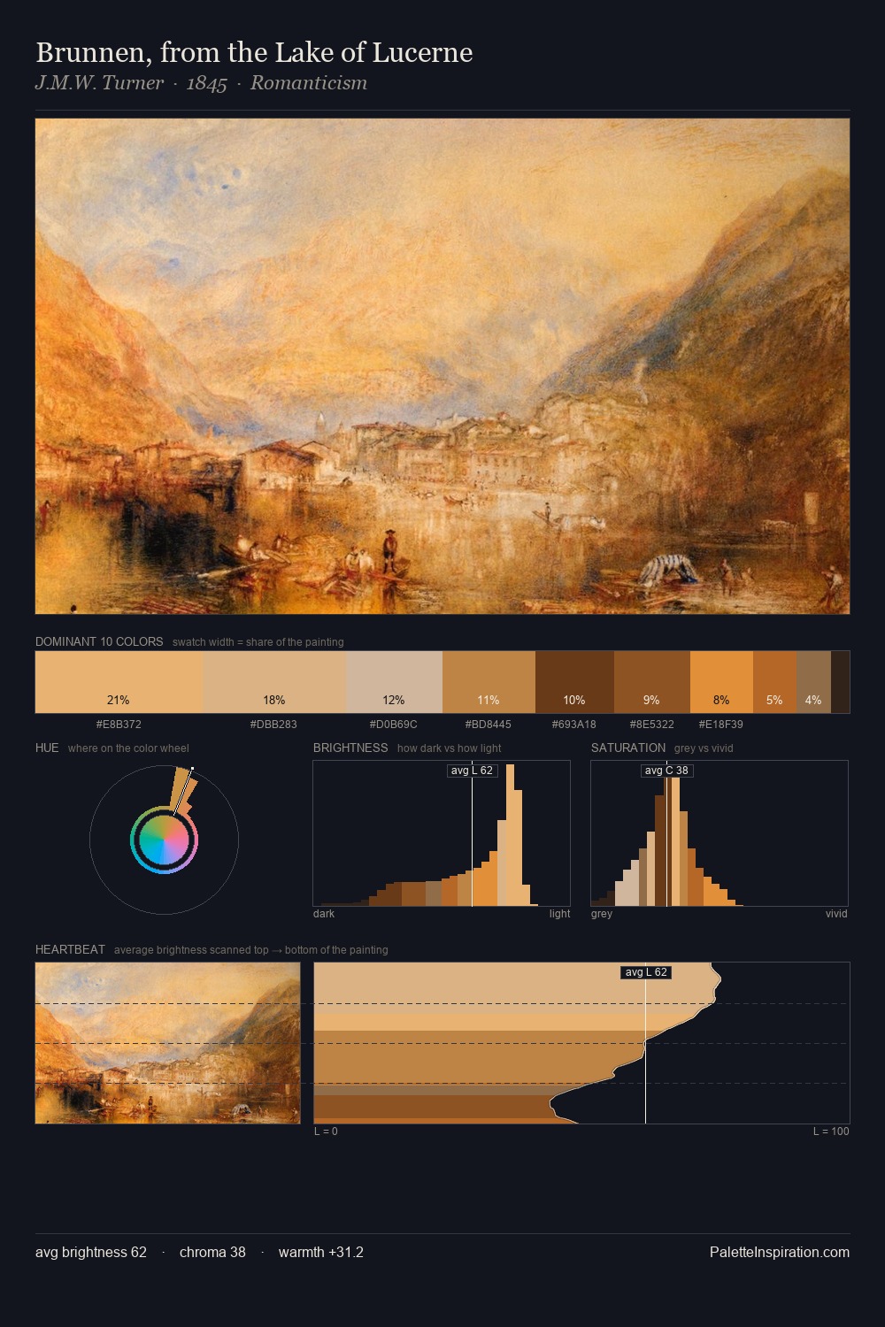
J.M.W. Turner Palette 10
Pale Vermillion
Pale High-key and low-chroma - delicate, bleached, washed with light.
Vermillion Brilliant red-orange - the classic mercury sulfide pigment, vivid and warm.

Palette Analysis
J.M.W. Turner is high in key: pale, luminous, and filled with optical air. Heat pervades this palette; warm chromatic identities outweigh cool ones at almost every weight. Colours are neither washed out nor blazing; they occupy the productive middle ground of the chroma scale. The most saturated colour, #9A5B22, is reserved to 7.0% of the surface, where it acts as a focal punctuation. 61 units of value range underpin the palette's structural clarity: the eye always knows where light falls. In the context of J.M.W. Turner's full range of palettes, group 10 represents one movement in an ongoing chromatic dialogue.
Example use cases
- publishing
- corporate identity
- consumer apps
- hospitality
- design agencies
I Love This!
Use This Palette
Copy, export, or download for your project
Copy, export, or download for your project
Copy:
Download:
Share: