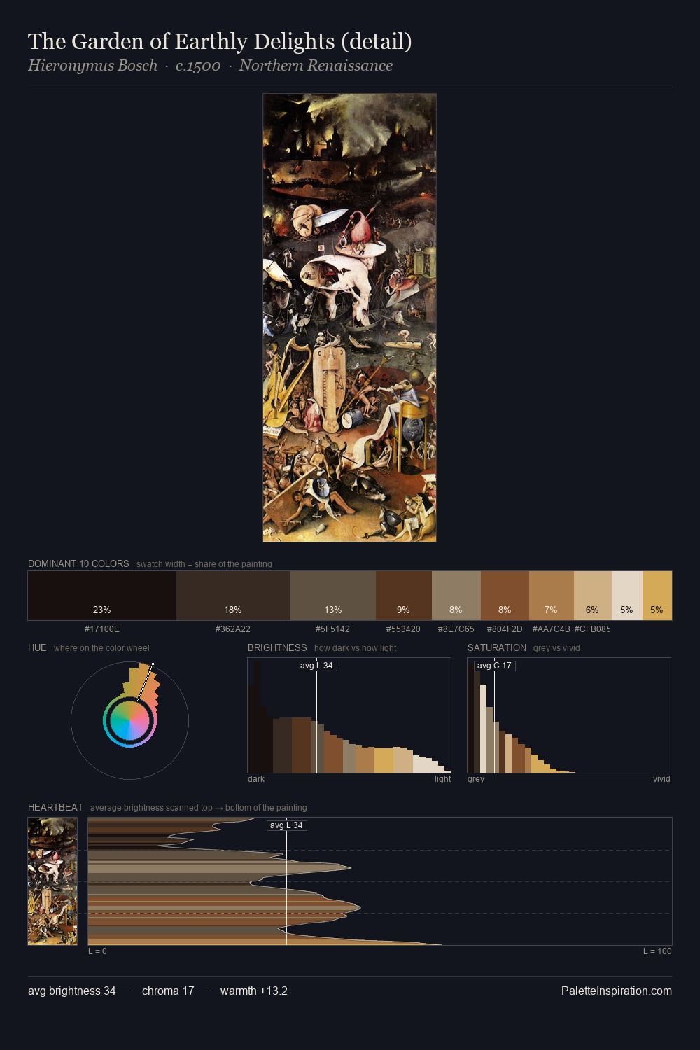
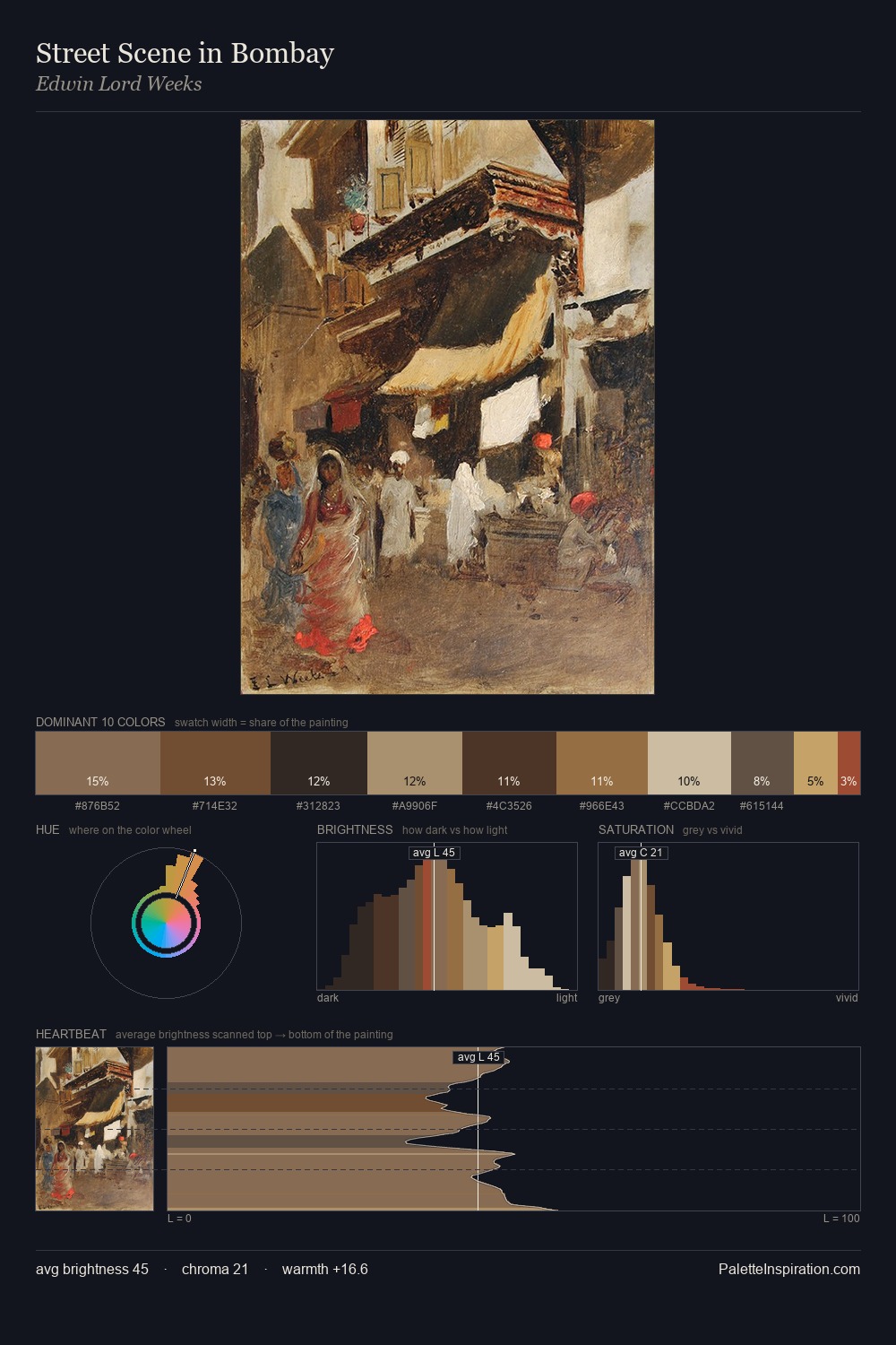
History Painting Palette 33
Shadowed Gamboge
Shadowed Low-key - values weighted toward shadow, the palette of dim interiors and overcast skies.
Gamboge Deep golden yellow - a traditional warm pigment, rich amber-gold.

Palette Analysis
history painting occupies the comfortable middle of the value scale, avoiding both extremes to hold the eye in a sustained middle grey. Warmth dominates - the palette leans heavily on the yellow-orange-red arc of the colour wheel. All colours lean toward grey, building depth through value rather than colour punch. The most saturated colour, #CDA254, is reserved to 5.3% of the surface, where it acts as a focal punctuation. From deepest dark to palest light, the palette traverses 60 units of the value scale - a span that creates natural depth.
Example use cases
- theater design
- jewelry brands
- tobacco-adjacent retail
- event branding
- film & entertainment
I Love This!
Use This Palette
Copy, export, or download for your project
Copy, export, or download for your project
Copy:
Download:
Share: