History Painting Palette 3
Soft Ivory
Soft Low-contrast, gentle chroma - mid-key values and low saturation, approachable and calm.
Ivory Warm creamy white - the color of natural ivory, warmer than pure white.

Palette Analysis
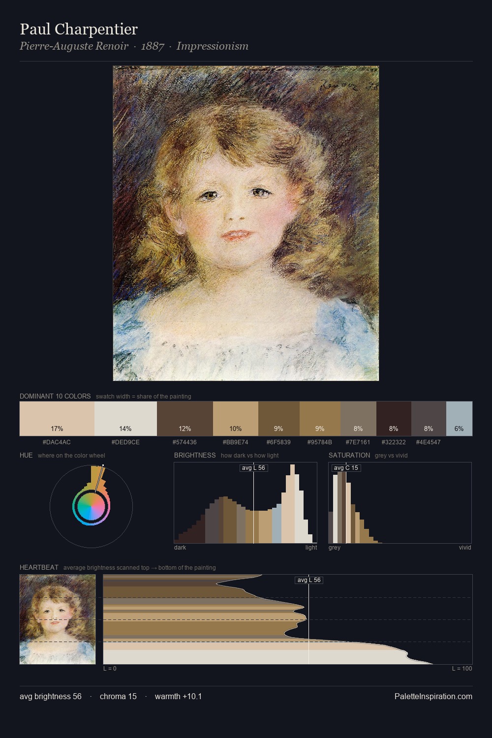
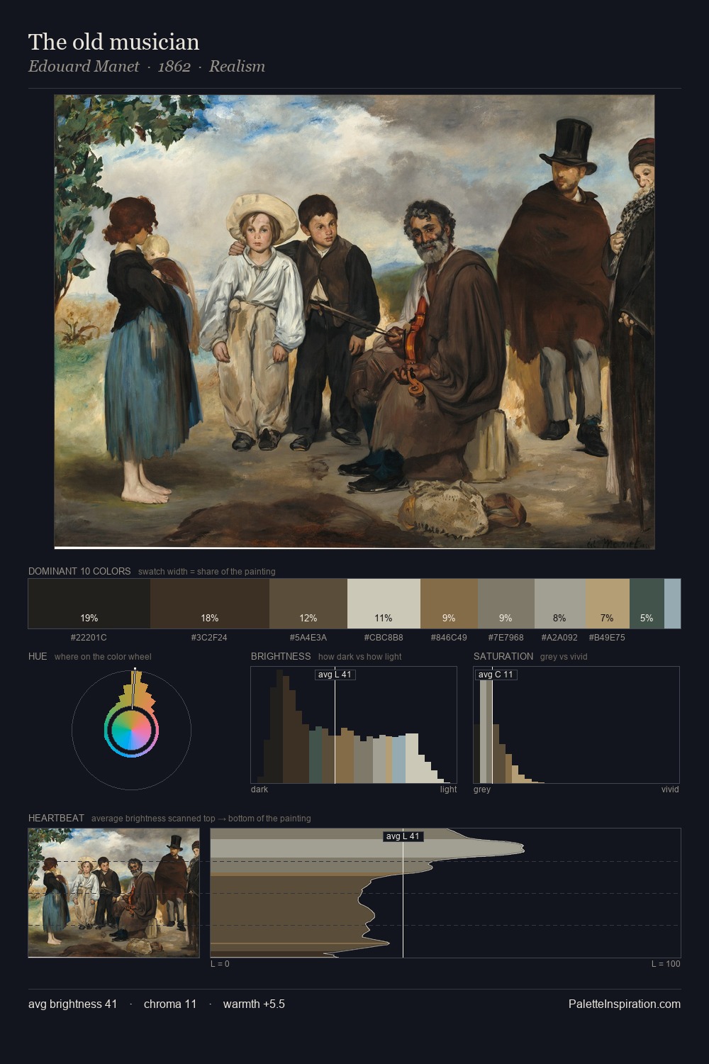
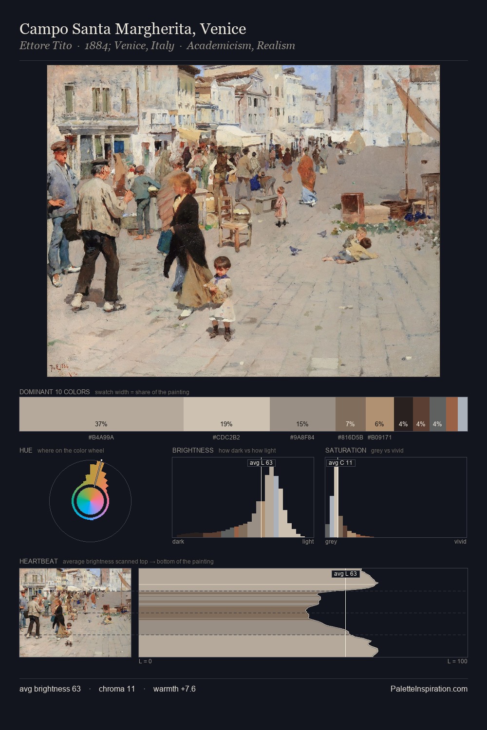
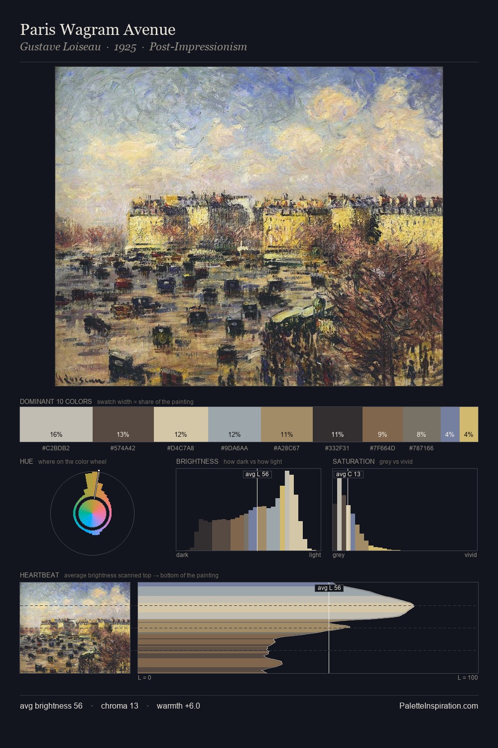
history painting occupies the comfortable middle of the value scale, avoiding both extremes to hold the eye in a sustained middle grey. Warmth dominates - the palette leans heavily on the yellow-orange-red arc of the colour wheel. Muted throughout, the palette achieves its effects through value and temperature rather than chromatic force. At 9.5%, #5F4933 carries the palette's sharpest chromatic charge: an accent that earns its place precisely because it is withheld. The value range spans 56 units across the palette, providing the full gamut from deep shadow to near-white and ensuring clear tonal hierarchy.
Example use cases
- exhibition design
- foundation branding
- estate management
- art education
- museums & galleries
I Love This!
Use This Palette
Copy, export, or download for your project
Copy, export, or download for your project
Copy:
Download:
Share: