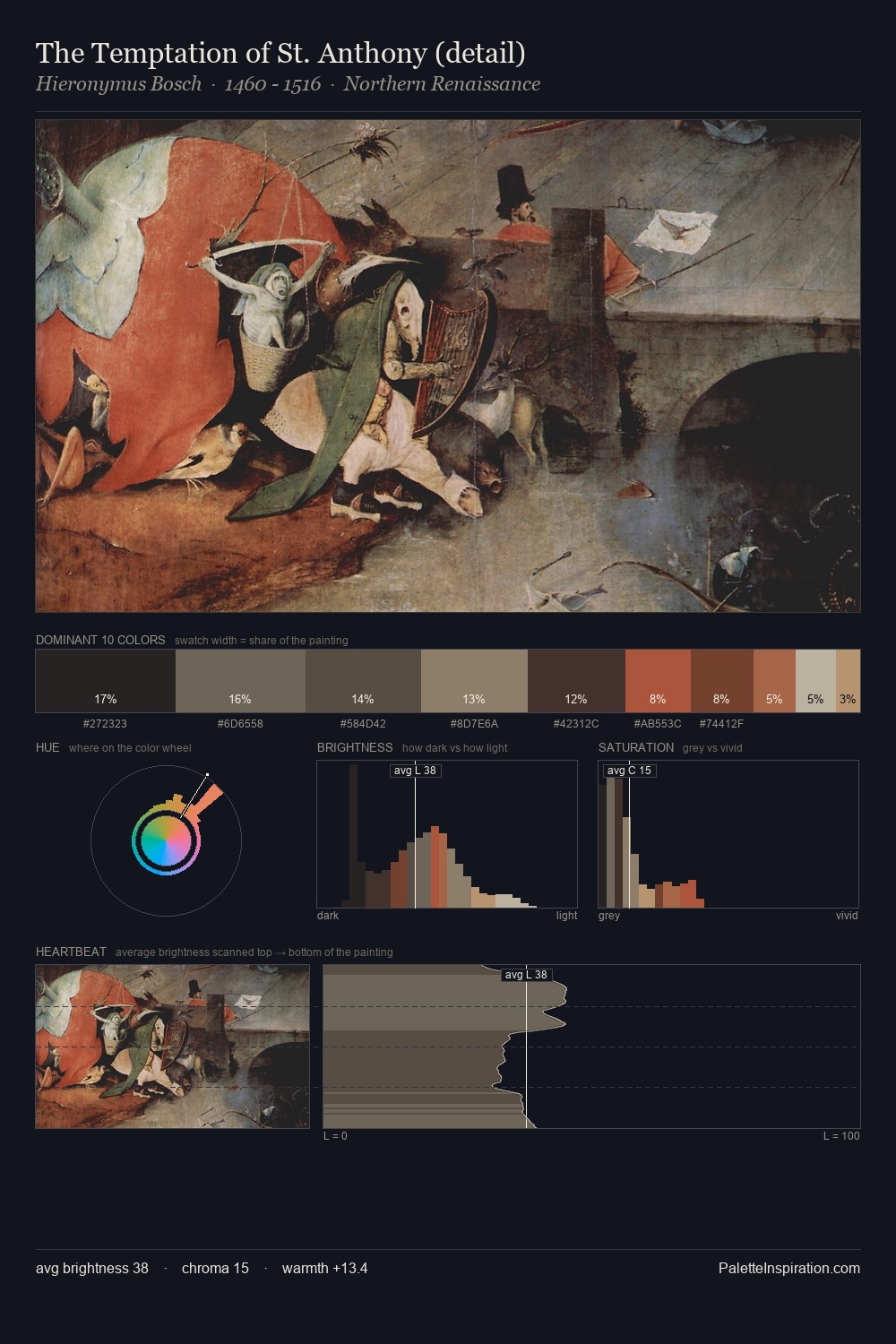
History Painting Palette 27
Shadowed Bister
Shadowed Low-key - values weighted toward shadow, the palette of dim interiors and overcast skies.
Bister Dark warm brown - a traditional ink and wash pigment made from wood soot.

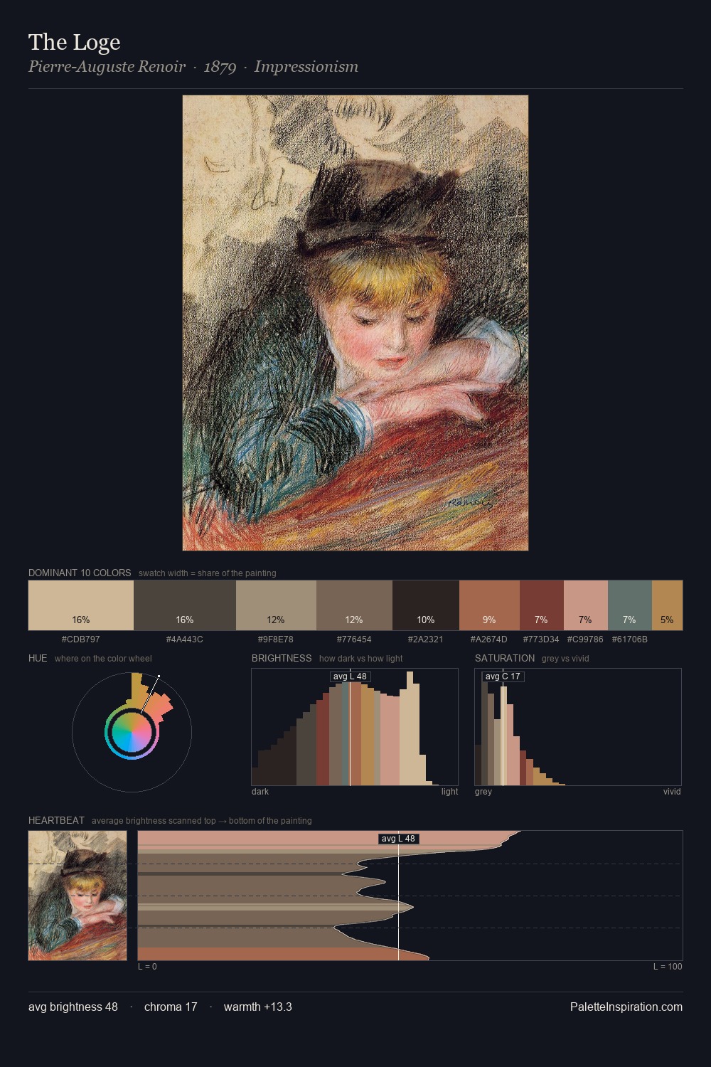
Palette Analysis
Values in history painting rest in the mid-range - neither dramatically lit nor steeped in shadow. Warm and cool are kept in productive tension, creating the kind of chromatic harmony that sustains the eye. All colours lean toward grey, building depth through value rather than colour punch. Only 3.7% is devoted to #A06E4E, yet that small allocation delivers the palette's entire chromatic tension. From deepest dark to palest light, the palette traverses 64 units of the value scale - a span that creates natural depth.
Example use cases
- film & entertainment
- fine dining
- spirits branding
- menswear
- theater design
I Love This!
Use This Palette
Copy, export, or download for your project
Copy, export, or download for your project
Copy:
Download:
Share: