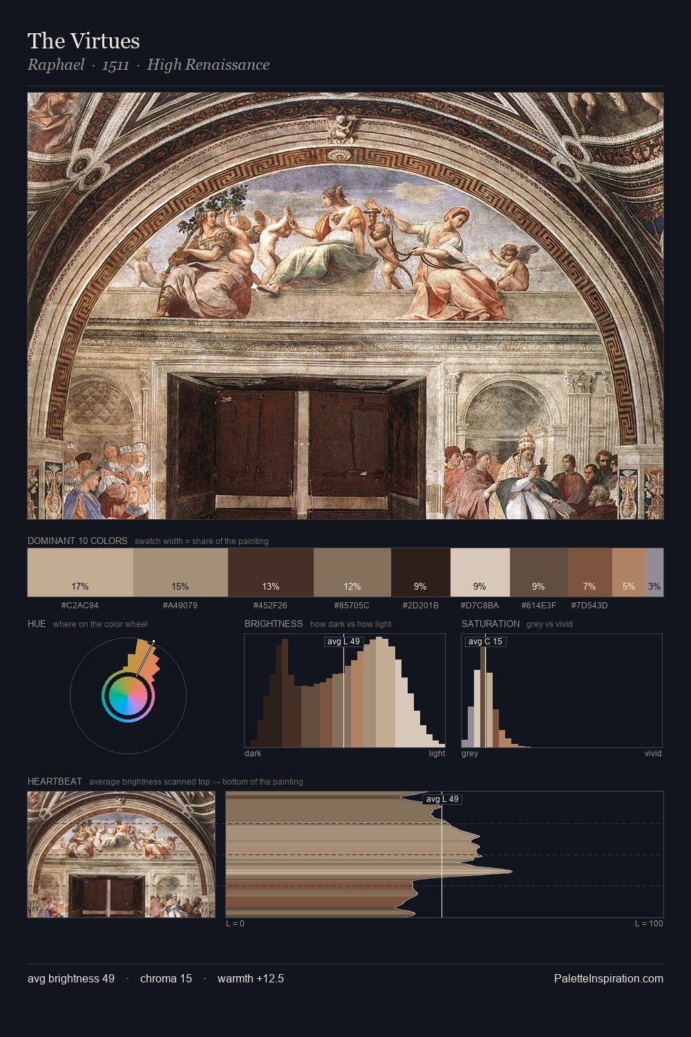
High Renaissance Palette 8
Muted Tawny
Muted Deliberately desaturated - chroma pulled toward gray, the restraint of tonal painting.
Tawny Warm orange-brown - a traditional term for the color of tanned leather or lion fur.

Palette Analysis
High Renaissance distributes its values across the middle register, creating harmony without high contrast. The palette orchestrates warmth above all else - reds, ambers, and siennas take the lead. All colours lean toward grey, building depth through value rather than colour punch. The saturated accent, #B47F5B, registers at 8.0% - sparse enough to feel like a deliberate surprise. From deepest dark to palest light, the palette traverses 56 units of the value scale - a span that creates natural depth.
Example use cases
- ceramics & pottery
- boutique hospitality
- menswear
- heritage food brands
- craft & artisan brands
I Love This!
Use This Palette
Copy, export, or download for your project
Copy, export, or download for your project
Copy:
Download:
Share: