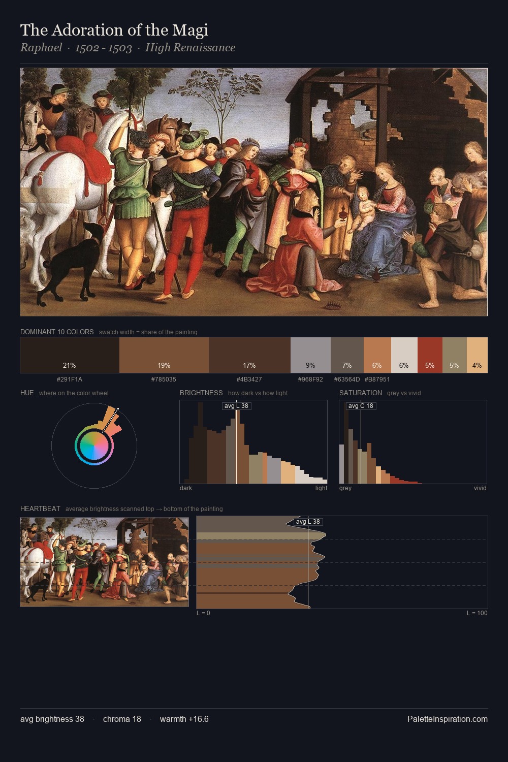
High Renaissance Palette 34
Shadowed Bister
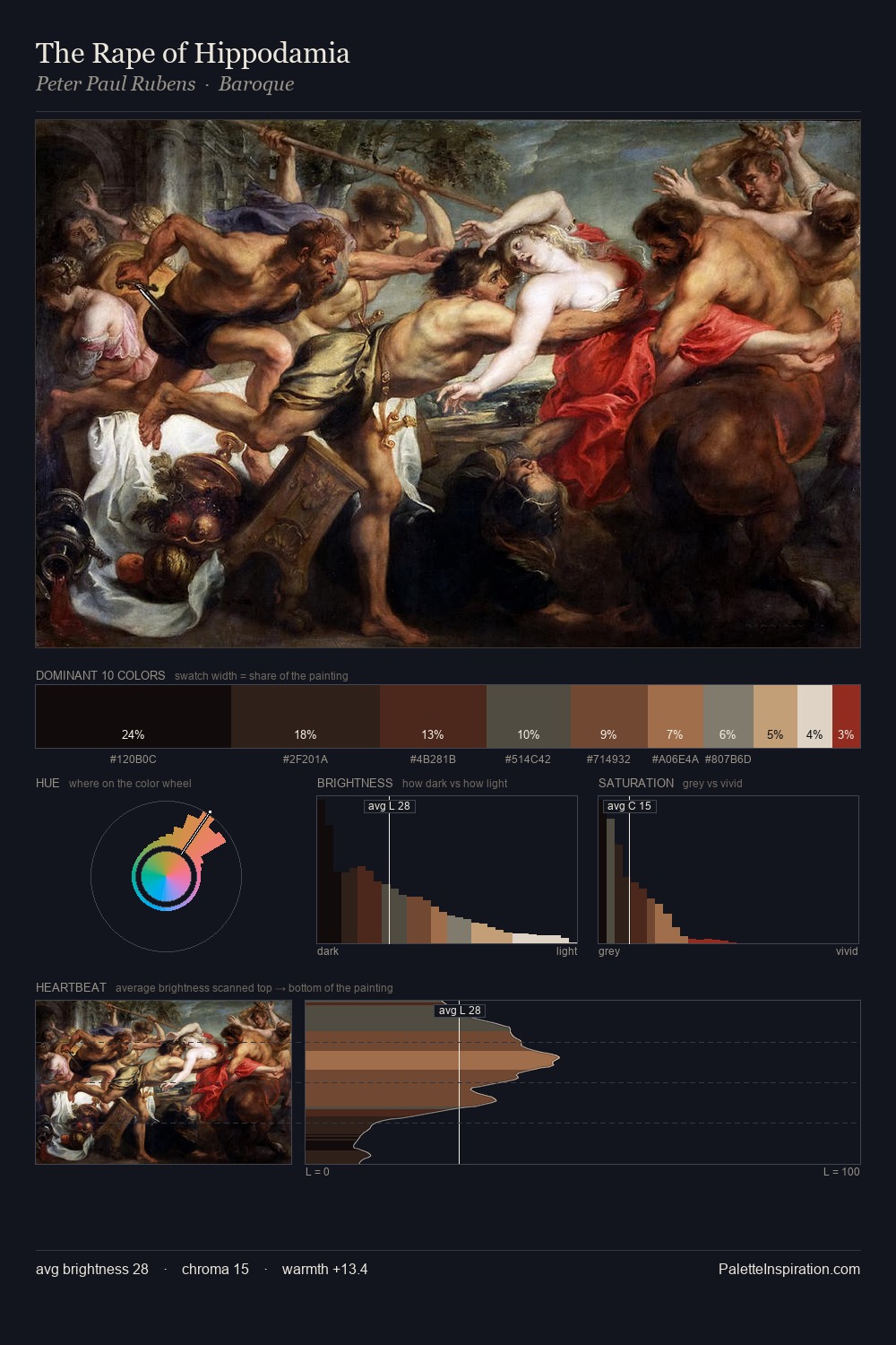
Shadowed Low-key - values weighted toward shadow, the palette of dim interiors and overcast skies.
Bister Dark warm brown - a traditional ink and wash pigment made from wood soot.

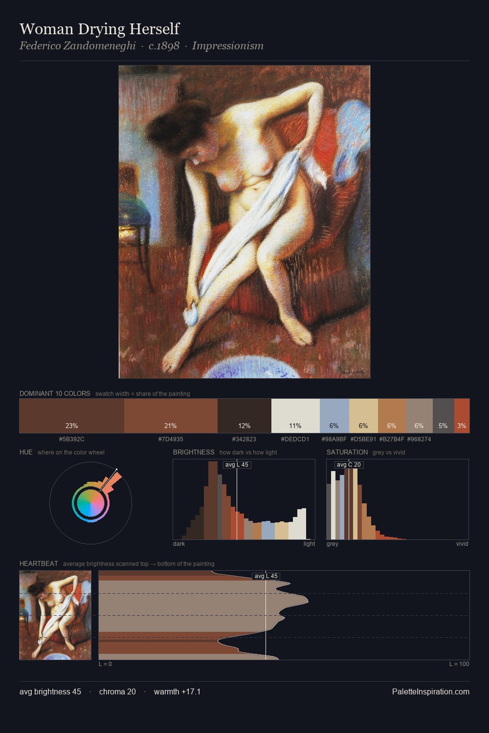
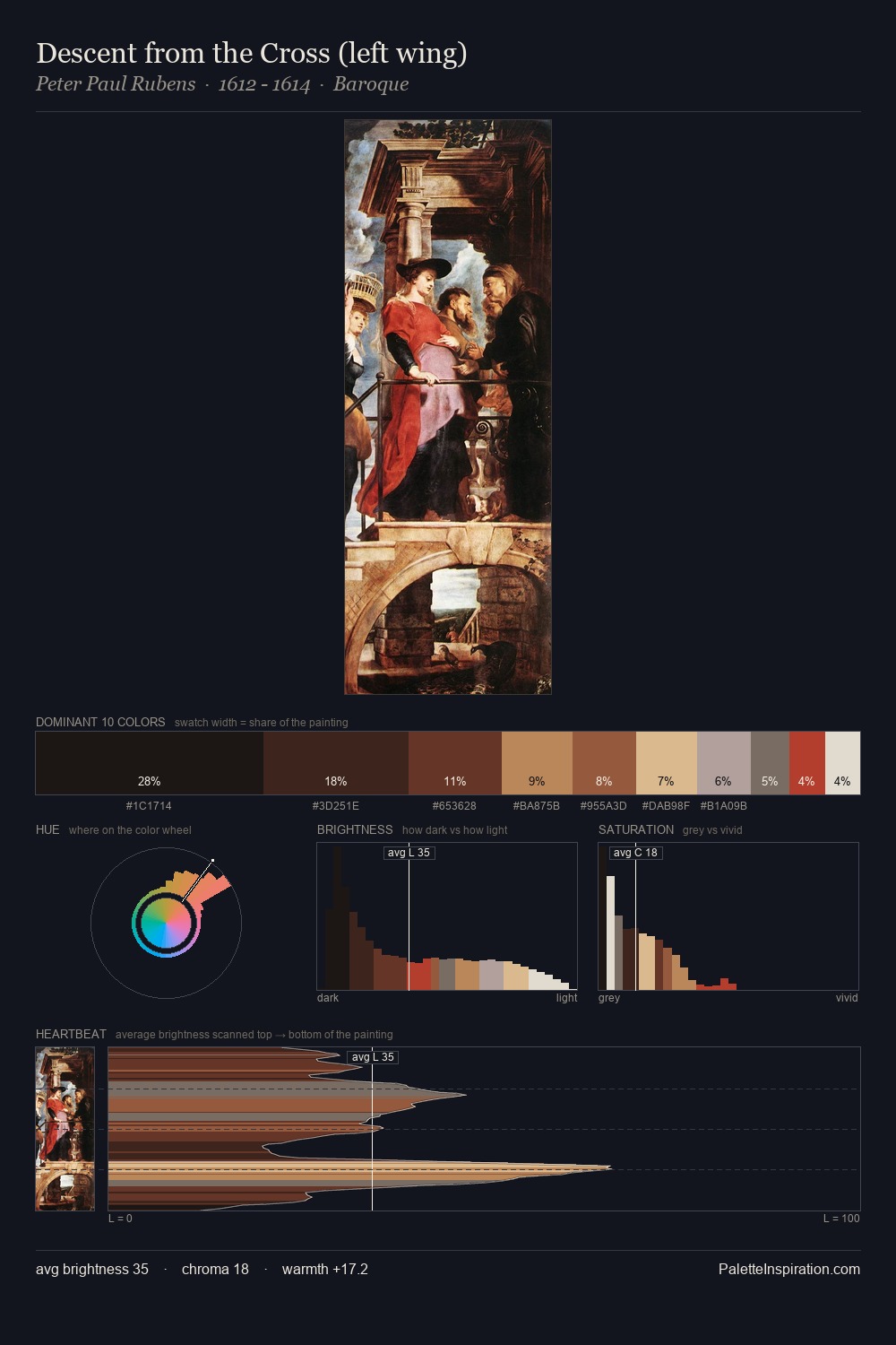
Palette Analysis
High Renaissance distributes its values across the middle register, creating harmony without high contrast. Temperature reads distinctly warm: the reds and earth tones carry the compositional weight. Saturation is deliberately withheld - the beauty here lies in the near-monochromatic gradations rather than colour difference. The highest-chroma note - #AA754A - appears at just 5.9%, deployed as a precision accent against the quieter ground. From deepest dark to palest light, the palette traverses 65 units of the value scale - a span that creates natural depth.
Example use cases
- theater design
- jewelry brands
- tobacco-adjacent retail
- event branding
- film & entertainment
I Love This!
Use This Palette
Copy, export, or download for your project
Copy, export, or download for your project
Copy:
Download:
Share: