High Renaissance Palette 40

Palette Analysis
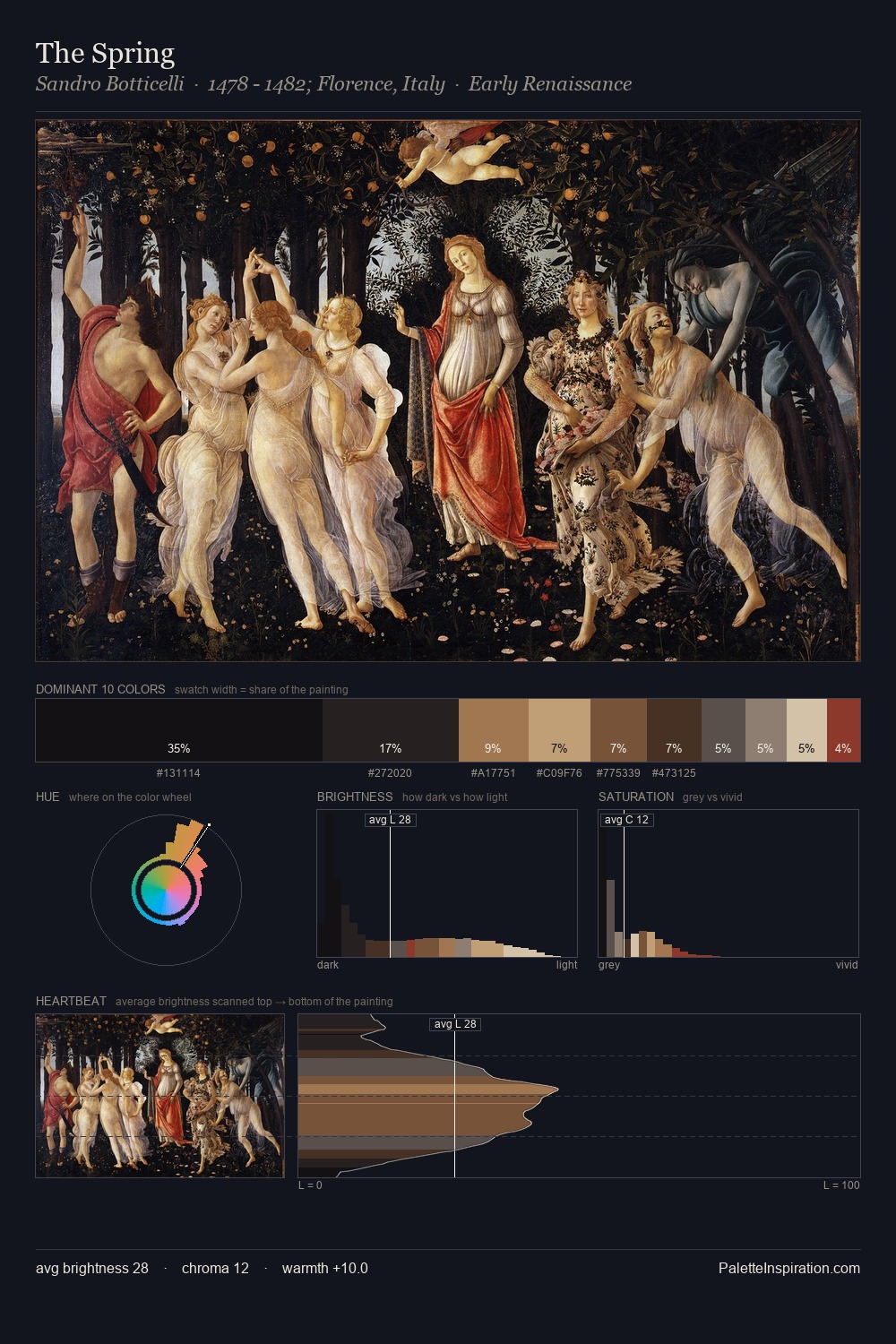
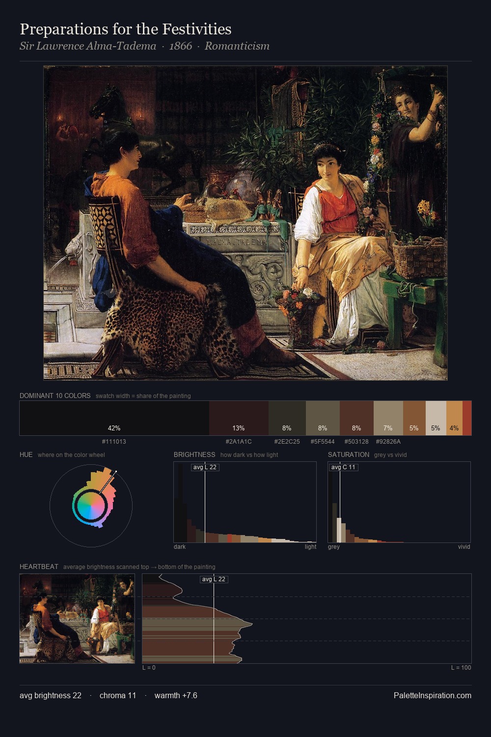
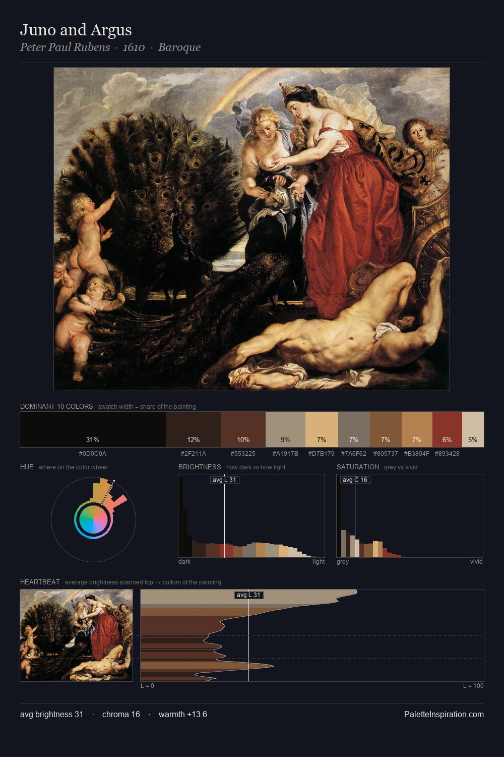
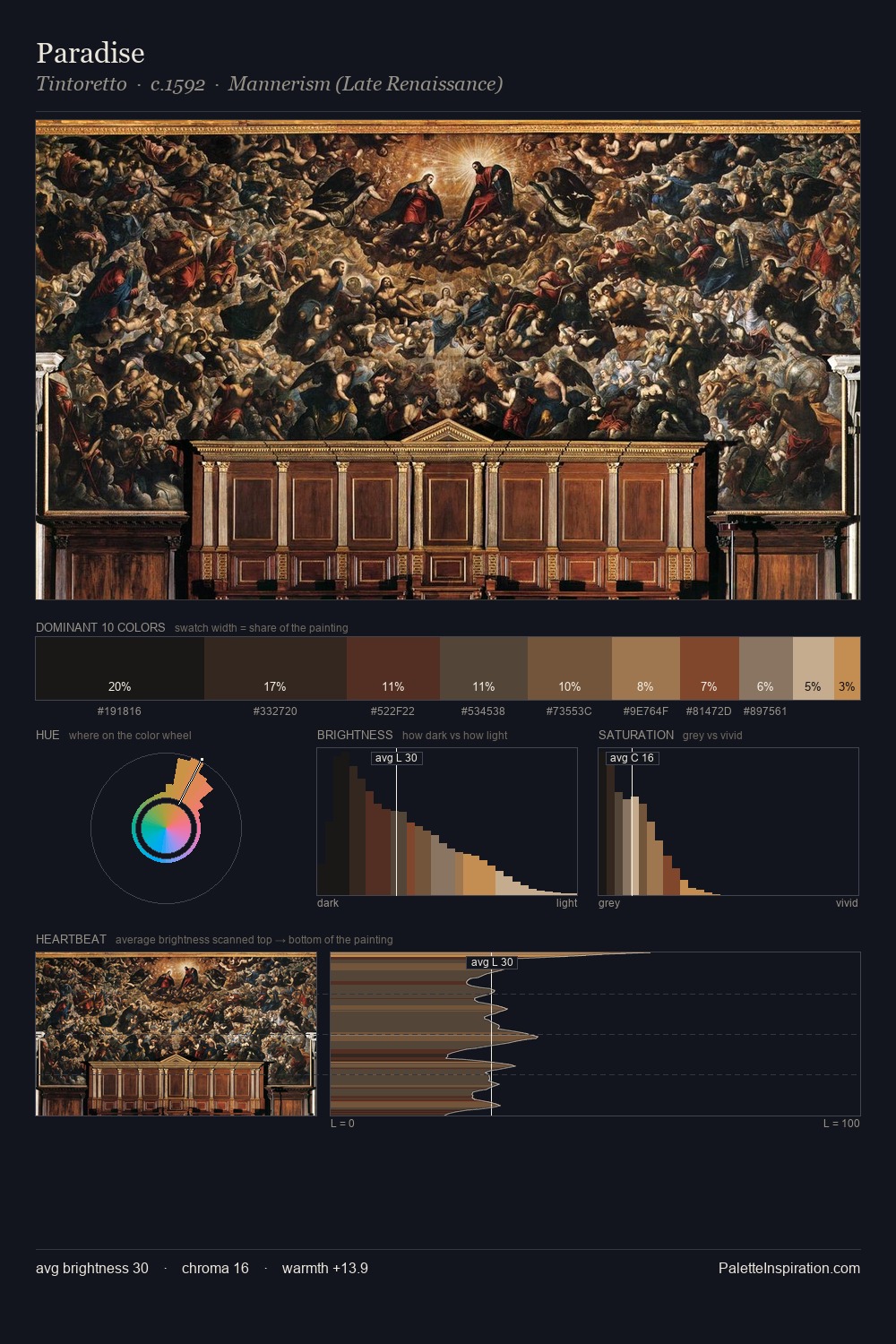
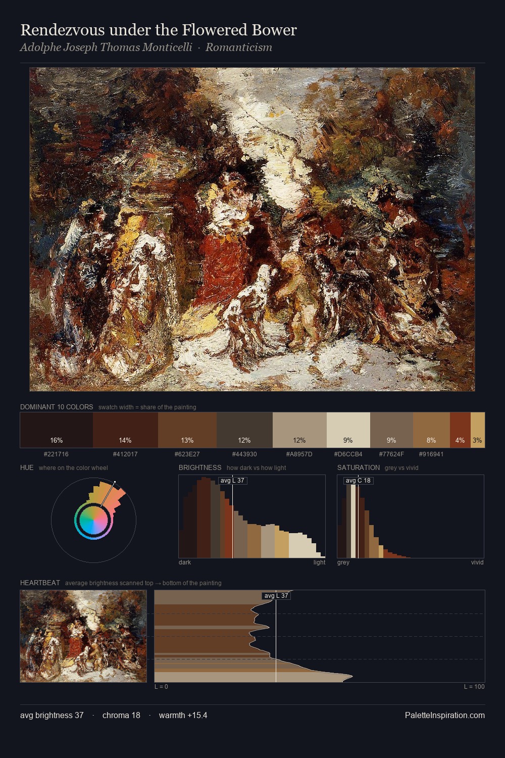
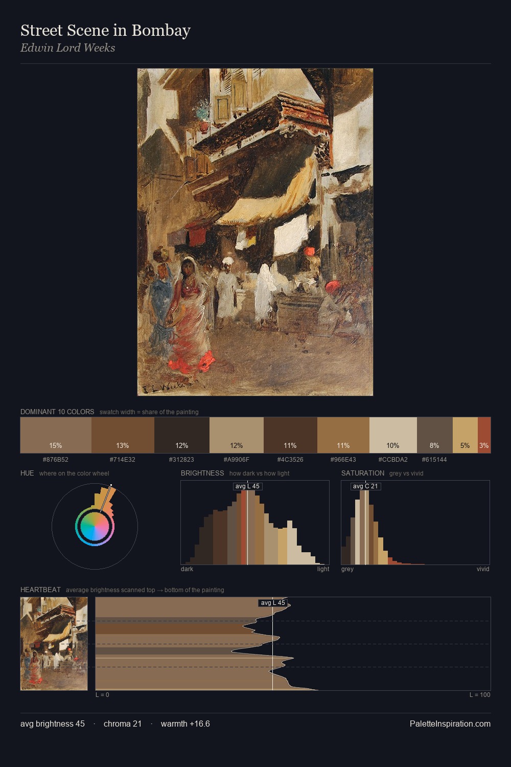
High Renaissance works almost entirely in the lower half of the value scale, privileging depth over brilliance. Warm hues command this palette; it favours the reds, oranges, and yellows of firelight and earth. The absence of saturated colour is itself an expressive choice: this is a palette of restraint and atmosphere. At 29.6%, #120E0F functions less as a colour accent and more as a complete atmospheric environment. At 4.4%, #C9975D carries the palette's sharpest chromatic charge: an accent that earns its place precisely because it is withheld. From deepest dark to palest light, the palette traverses 62 units of the value scale - a span that creates natural depth. This tonal restraint is characteristic of the Tonalist sensibility: colour serves light, not the reverse.
Example use cases
- theater design
- jewelry brands
- tobacco-adjacent retail
- event branding
- film & entertainment
I Love This!
Copy, export, or download for your project