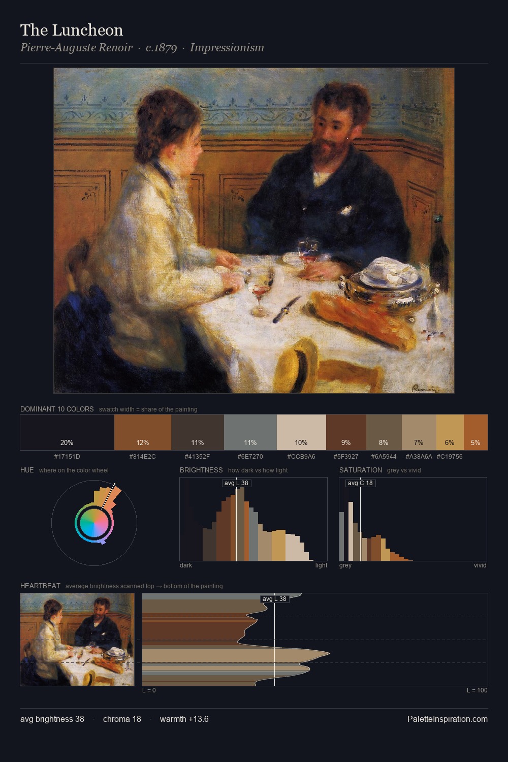
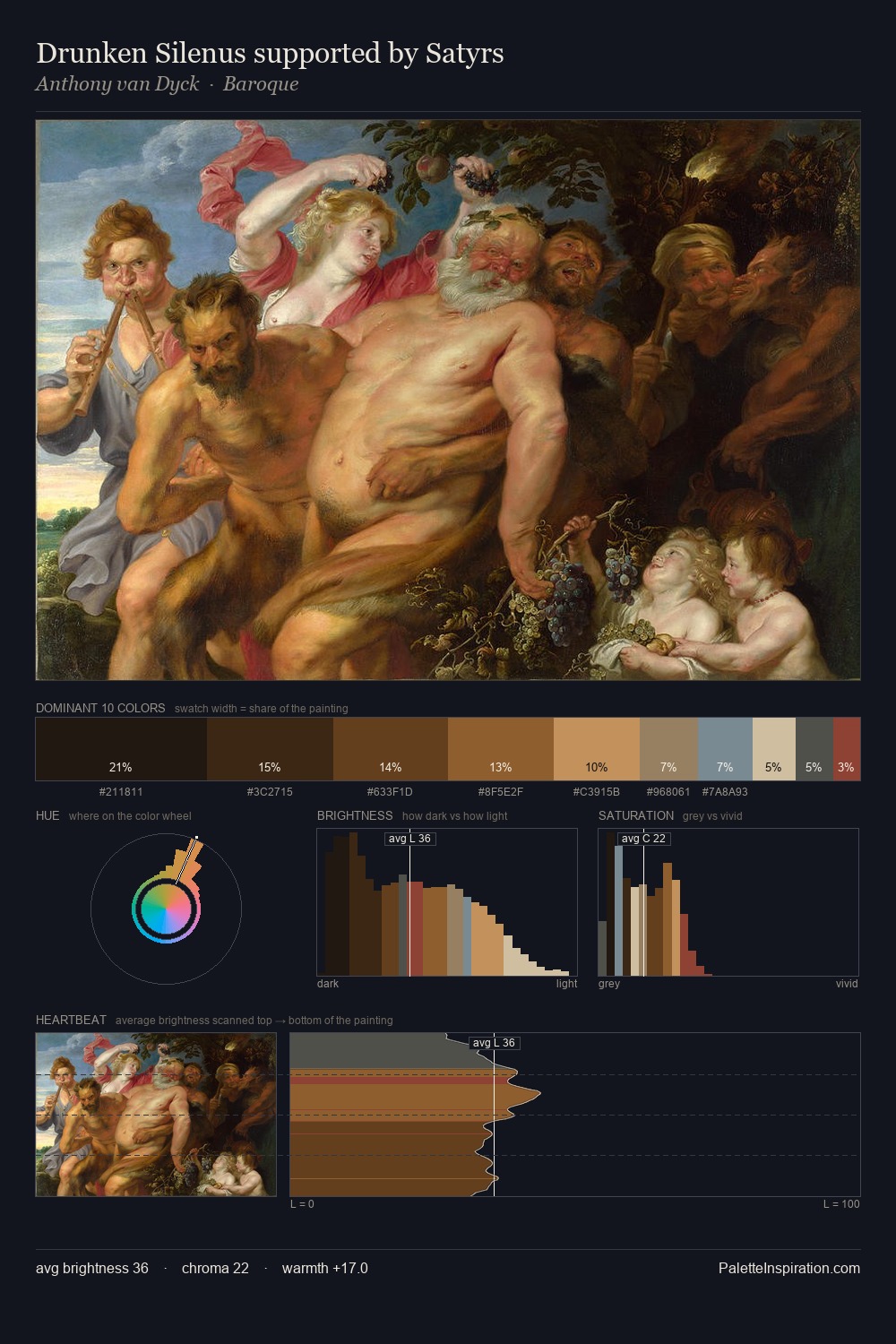
High Renaissance Palette 32
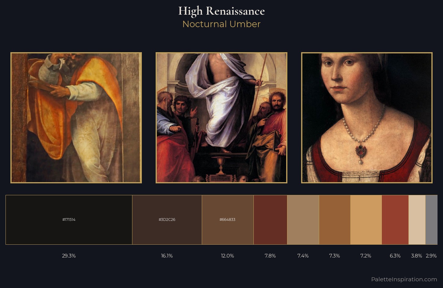
Nocturnal Umber
Nocturnal Night-register palette - very low values, the world after dark.
Umber Dark earthy brown - raw or burnt umber, a foundational old-master earth pigment.
Palette Analysis
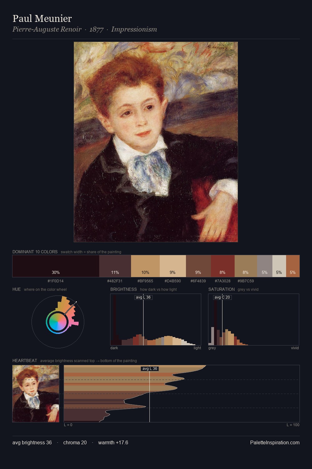
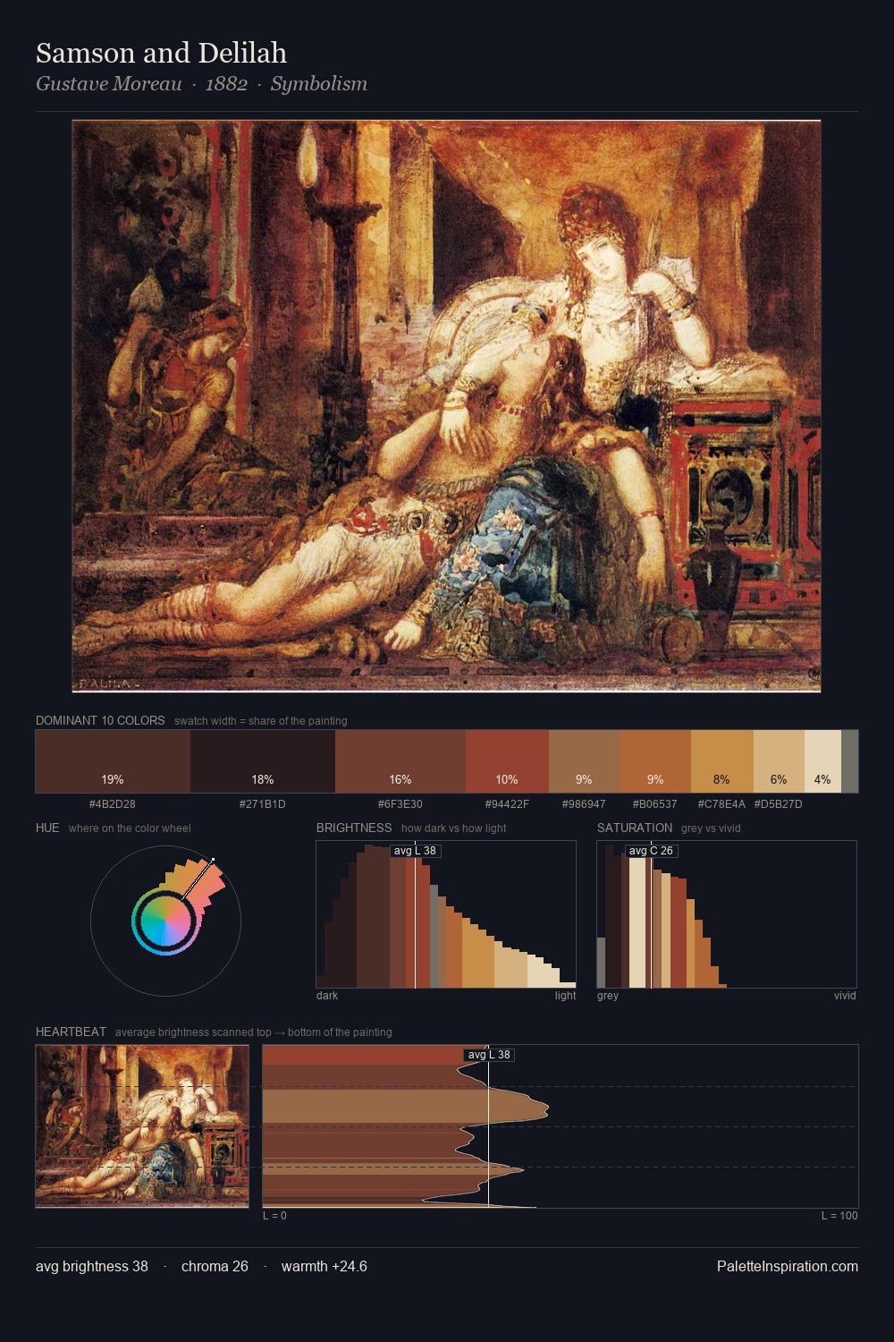
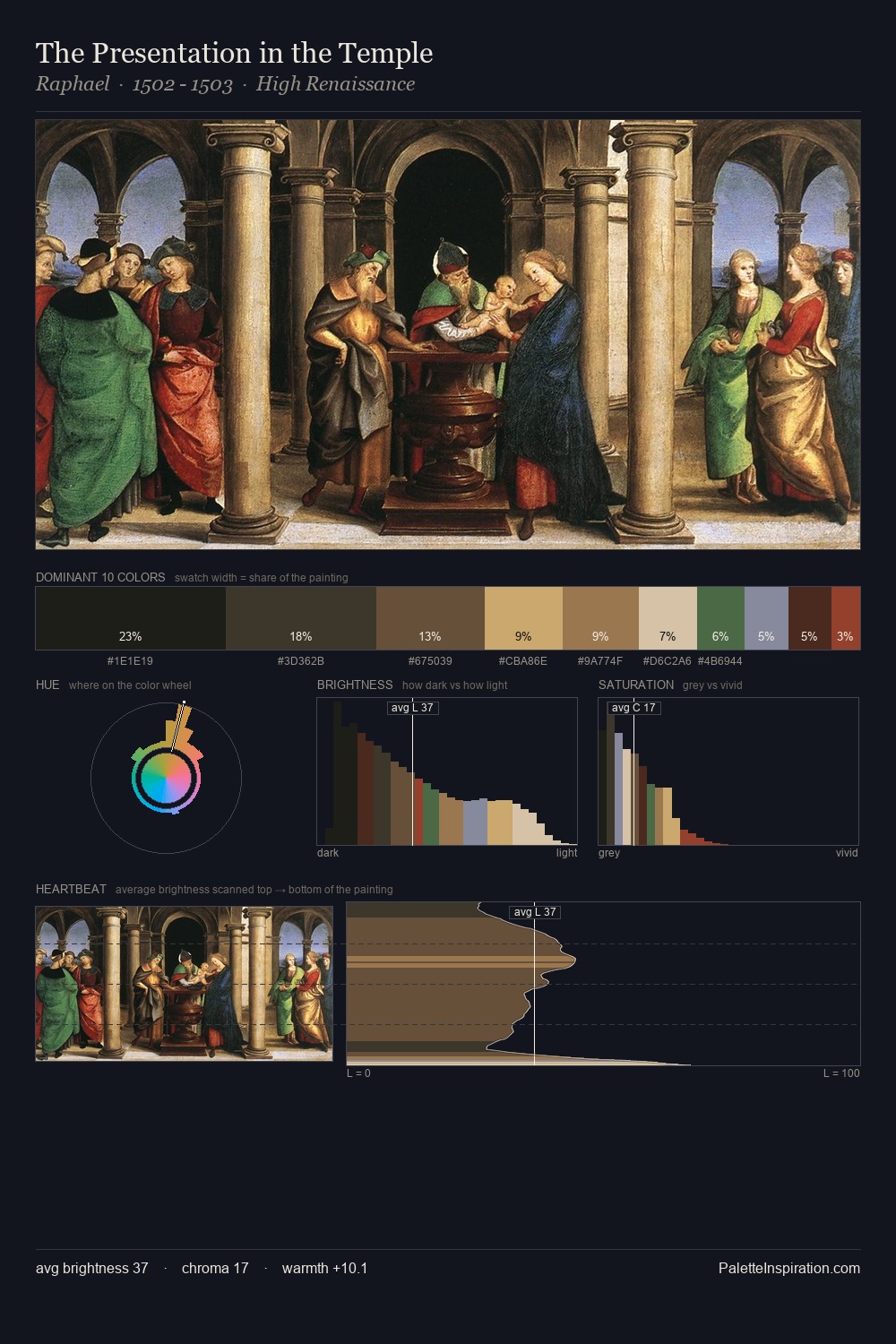
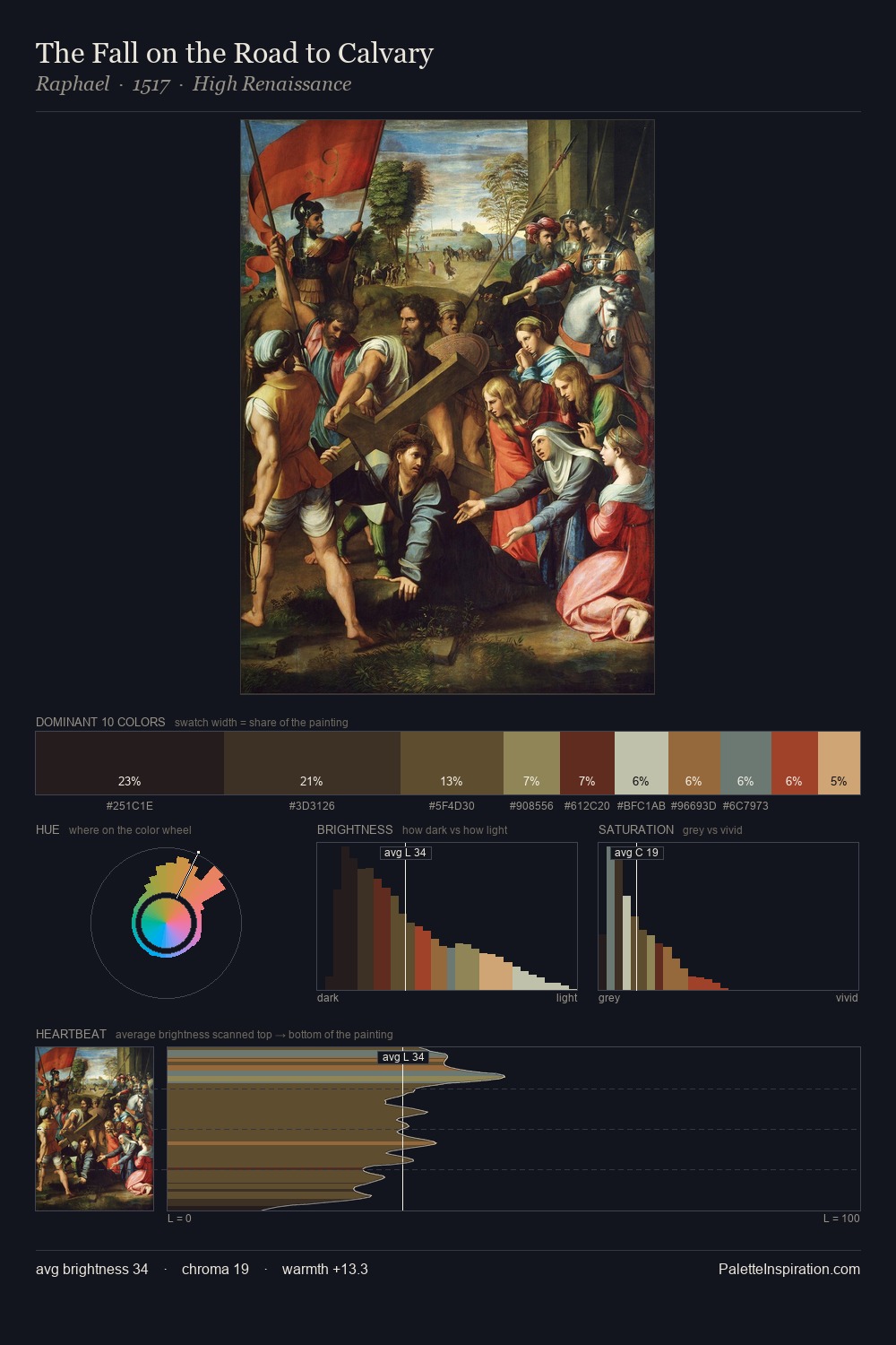
High Renaissance distributes its values across the middle register, creating harmony without high contrast. Warmth dominates - the palette leans heavily on the yellow-orange-red arc of the colour wheel. The absence of saturated colour is itself an expressive choice: this is a palette of restraint and atmosphere. 29.3% of the palette belongs to #171514, a concentration that makes it the unmistakable visual centre. The saturated accent, #CD9B60, registers at 7.2% - sparse enough to feel like a deliberate surprise. The value range spans 62 units across the palette, providing the full gamut from deep shadow to near-white and ensuring clear tonal hierarchy.
Example use cases
- theater design
- jewelry brands
- tobacco-adjacent retail
- event branding
- film & entertainment
I Love This!
Use This Palette
Copy, export, or download for your project
Copy, export, or download for your project
Copy:
Download:
Share: