High Renaissance Palette 2
Luminous Ivory
Luminous Self-illuminated feeling - high-key values with an inner glow quality.
Ivory Warm creamy white - the color of natural ivory, warmer than pure white.

Palette Analysis
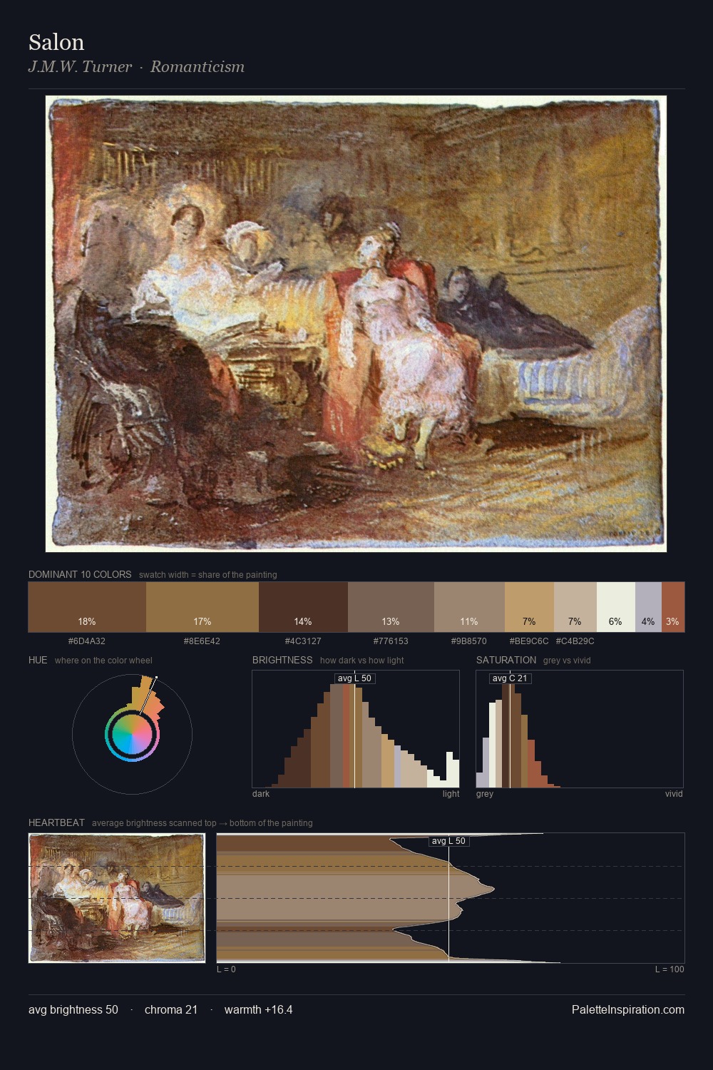
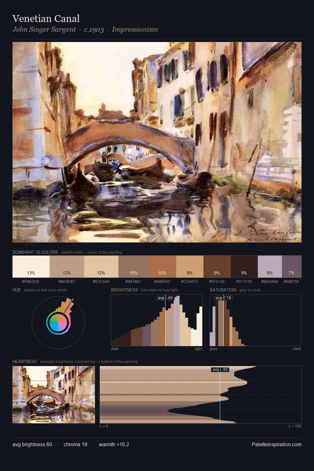
High Renaissance works in the upper reaches of the value scale, creating an atmosphere of brightness and expansiveness. Yellow, ochre, sienna: warm hues deployed as the palette's primary energy. The absence of saturated colour is itself an expressive choice: this is a palette of restraint and atmosphere. A single dominant - #FFFEFF at 42.3% - sets the character of the whole composition. #9D583E delivers the chromatic peak at only 3.7% - a small shot of colour with outsized visual impact. The value range spans 67 units across the palette, providing the full gamut from deep shadow to near-white and ensuring clear tonal hierarchy.
Example use cases
- publishing
- corporate identity
- consumer apps
- hospitality
- design agencies
I Love This!
Use This Palette
Copy, export, or download for your project
Copy, export, or download for your project
Copy:
Download:
Share: