High Renaissance Palette 31
Shadowed Gamboge
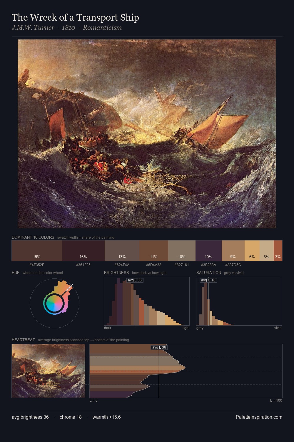
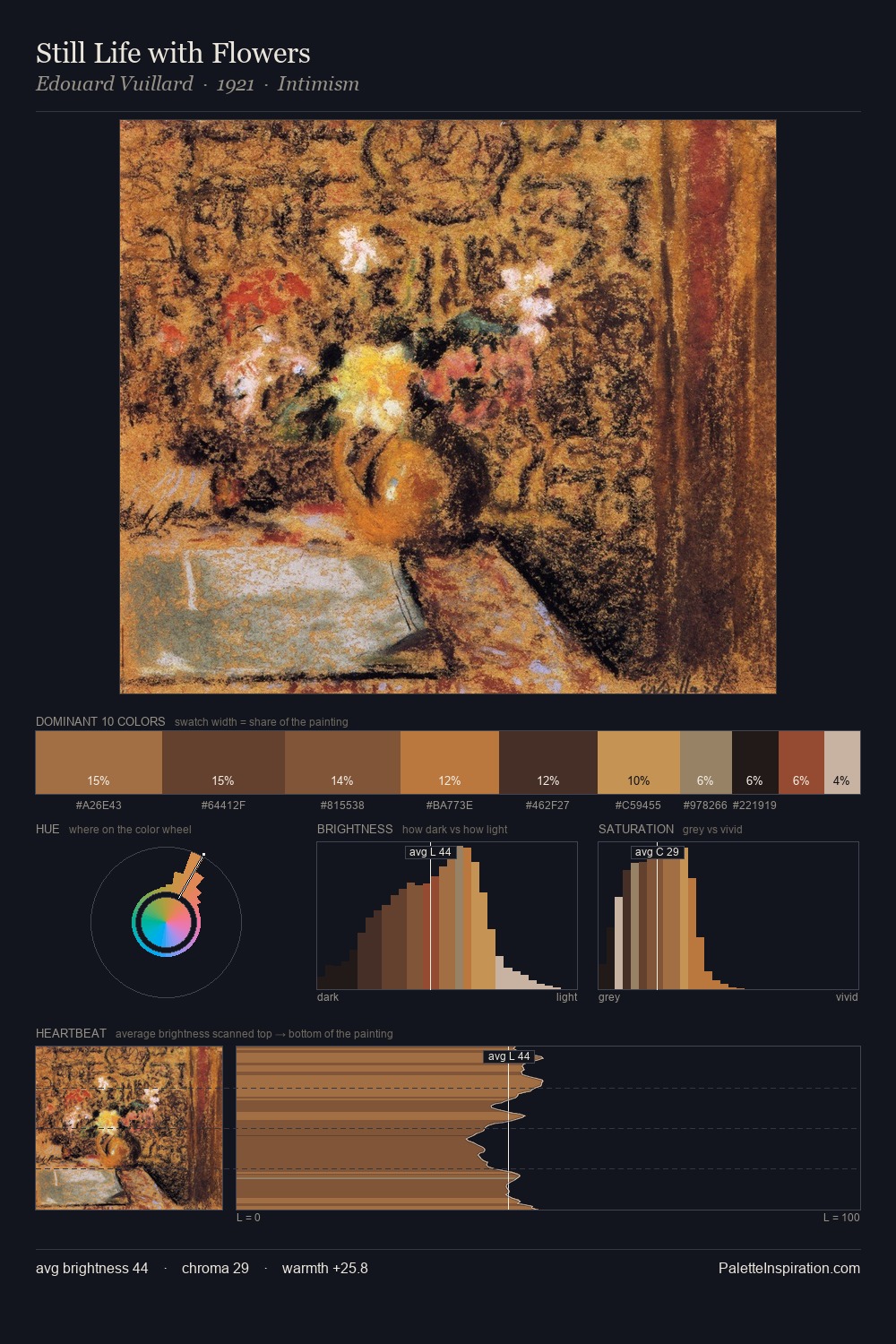
Shadowed Low-key - values weighted toward shadow, the palette of dim interiors and overcast skies.
Gamboge Deep golden yellow - a traditional warm pigment, rich amber-gold.

Palette Analysis
High Renaissance occupies the comfortable middle of the value scale, avoiding both extremes to hold the eye in a sustained middle grey. Warm hues command this palette; it favours the reds, oranges, and yellows of firelight and earth. Chroma is kept low across all colours, producing the soft, enveloping quality that characterises tonal painting. The highest-chroma note - #AA553C - appears at just 4.1%, deployed as a precision accent against the quieter ground. From deepest dark to palest light, the palette traverses 55 units of the value scale - a span that creates natural depth.
Example use cases
- theater design
- jewelry brands
- tobacco-adjacent retail
- event branding
- film & entertainment
I Love This!
Use This Palette
Copy, export, or download for your project
Copy, export, or download for your project
Copy:
Download:
Share: