High Renaissance Palette 29
Nocturnal Umber
Nocturnal Night-register palette - very low values, the world after dark.
Umber Dark earthy brown - raw or burnt umber, a foundational old-master earth pigment.

Palette Analysis
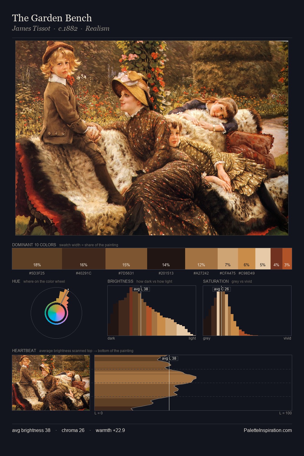
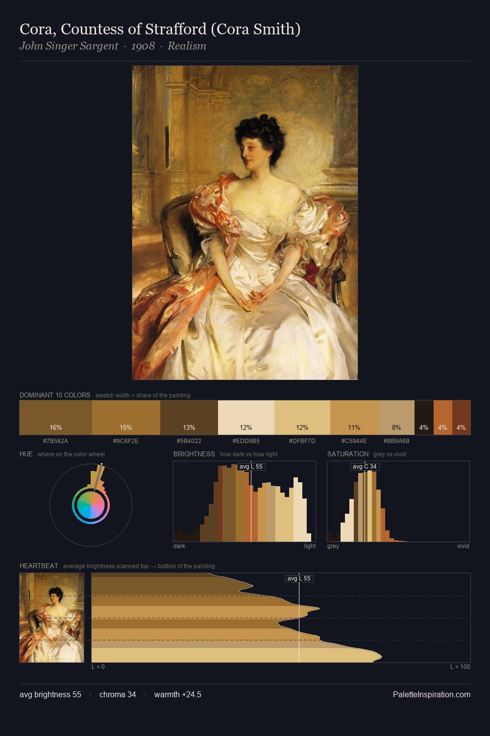
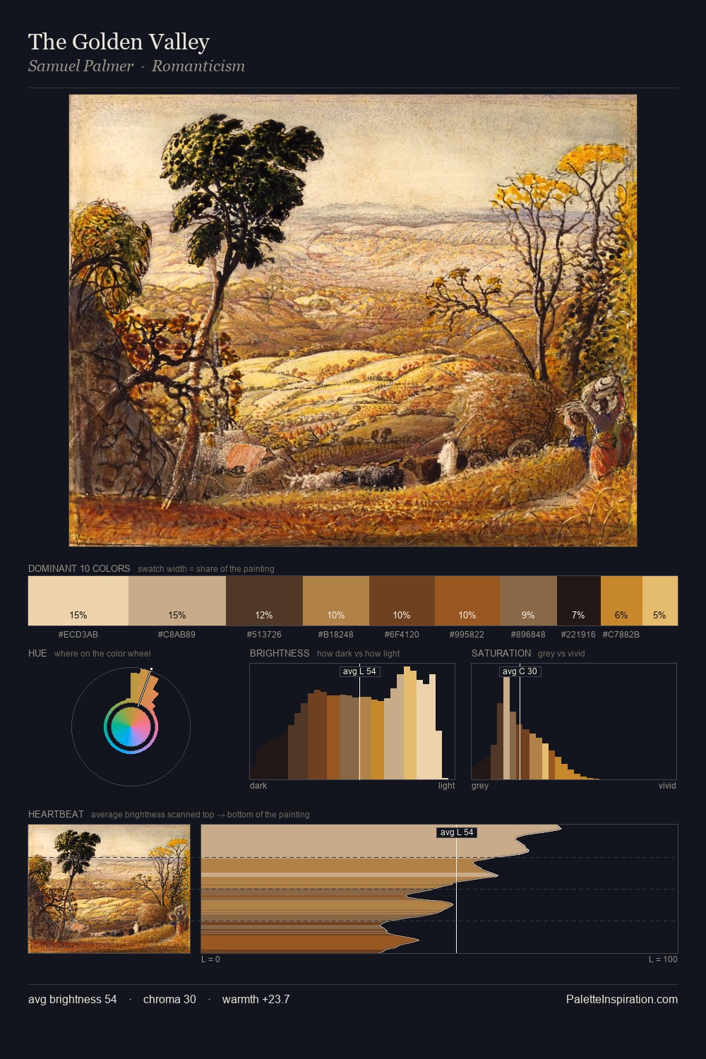
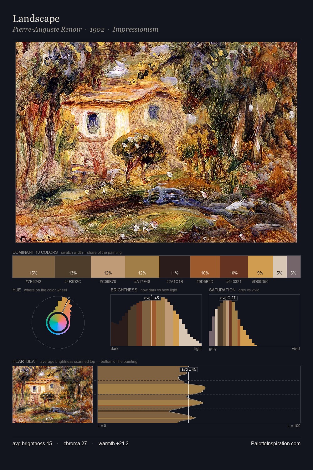
High Renaissance distributes its values across the middle register, creating harmony without high contrast. Yellow, ochre, sienna: warm hues deployed as the palette's primary energy. The absence of saturated colour is itself an expressive choice: this is a palette of restraint and atmosphere. 28.2% of the palette belongs to #141111, a concentration that makes it the unmistakable visual centre. The saturated accent, #DBA552, registers at 5.0% - sparse enough to feel like a deliberate surprise. At 67 units of value range, the palette has the tonal breadth to sustain complex spatial readings.
Example use cases
- film & entertainment
- fine dining
- spirits branding
- menswear
- theater design
I Love This!
Use This Palette
Copy, export, or download for your project
Copy, export, or download for your project
Copy:
Download:
Share: