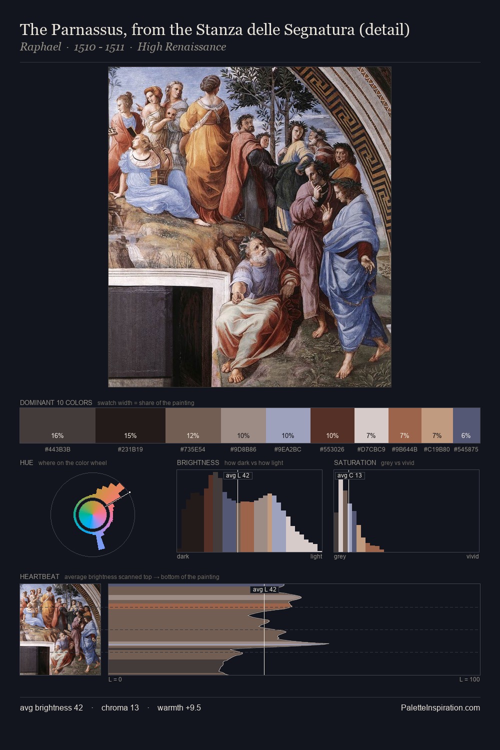
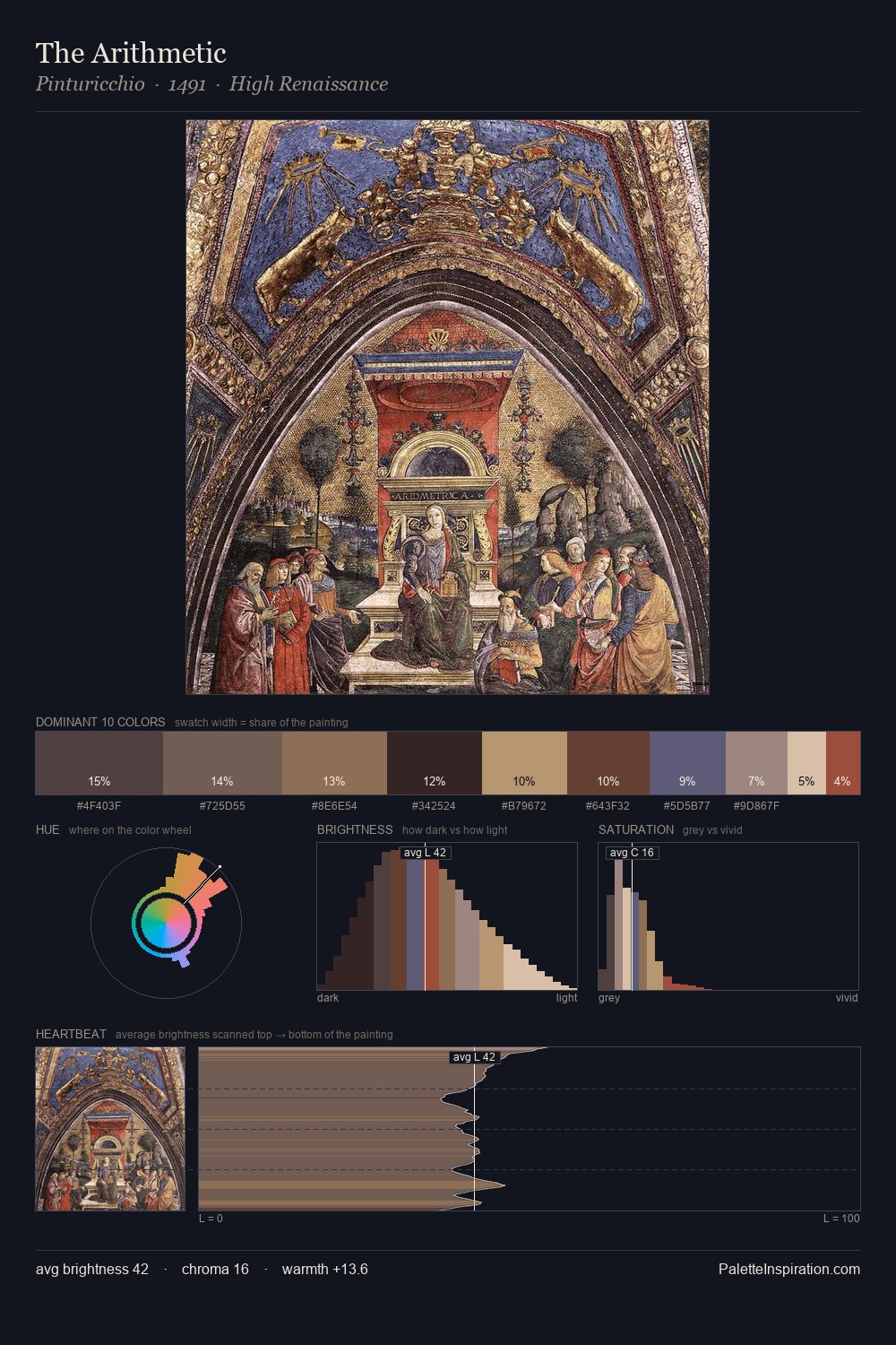
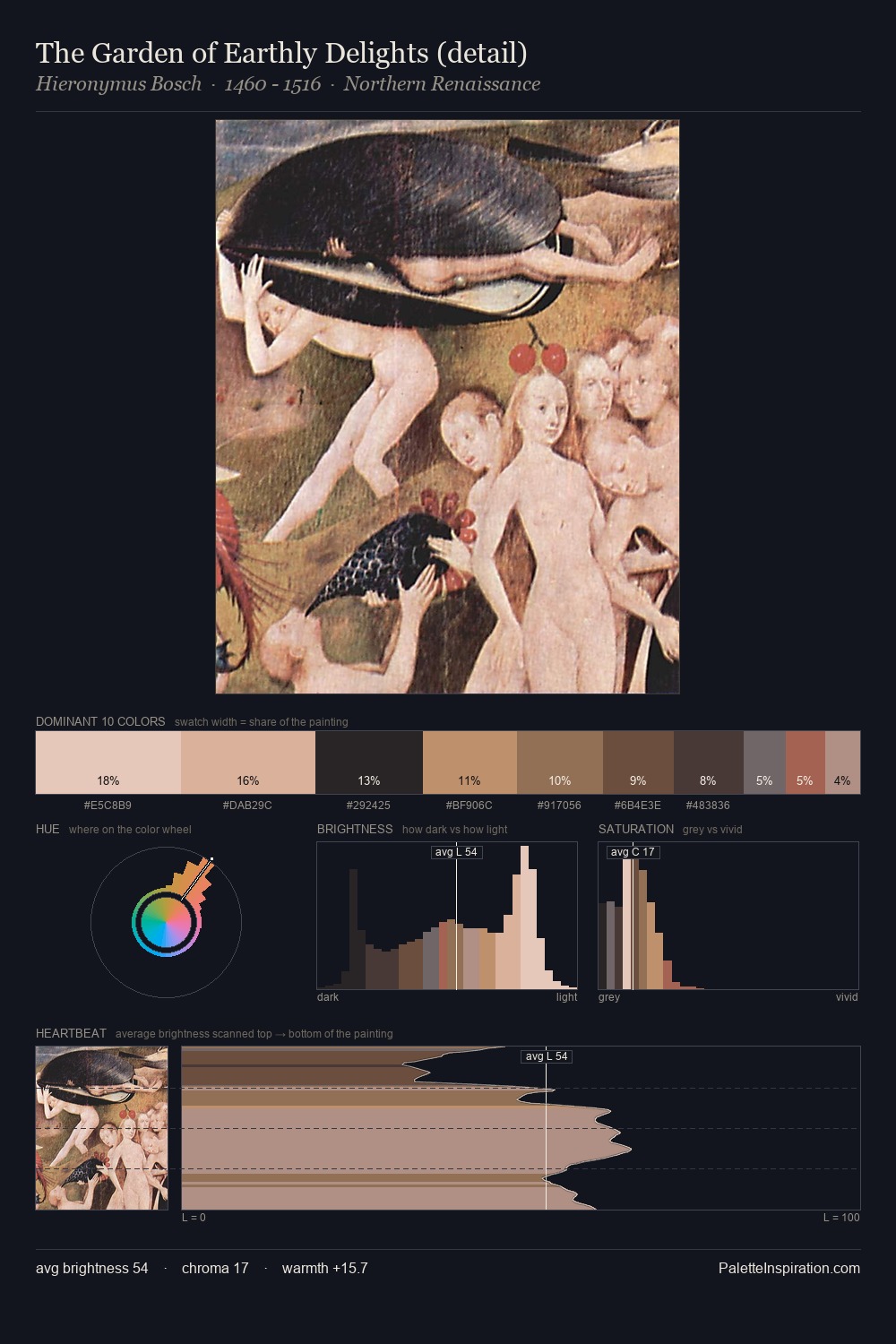
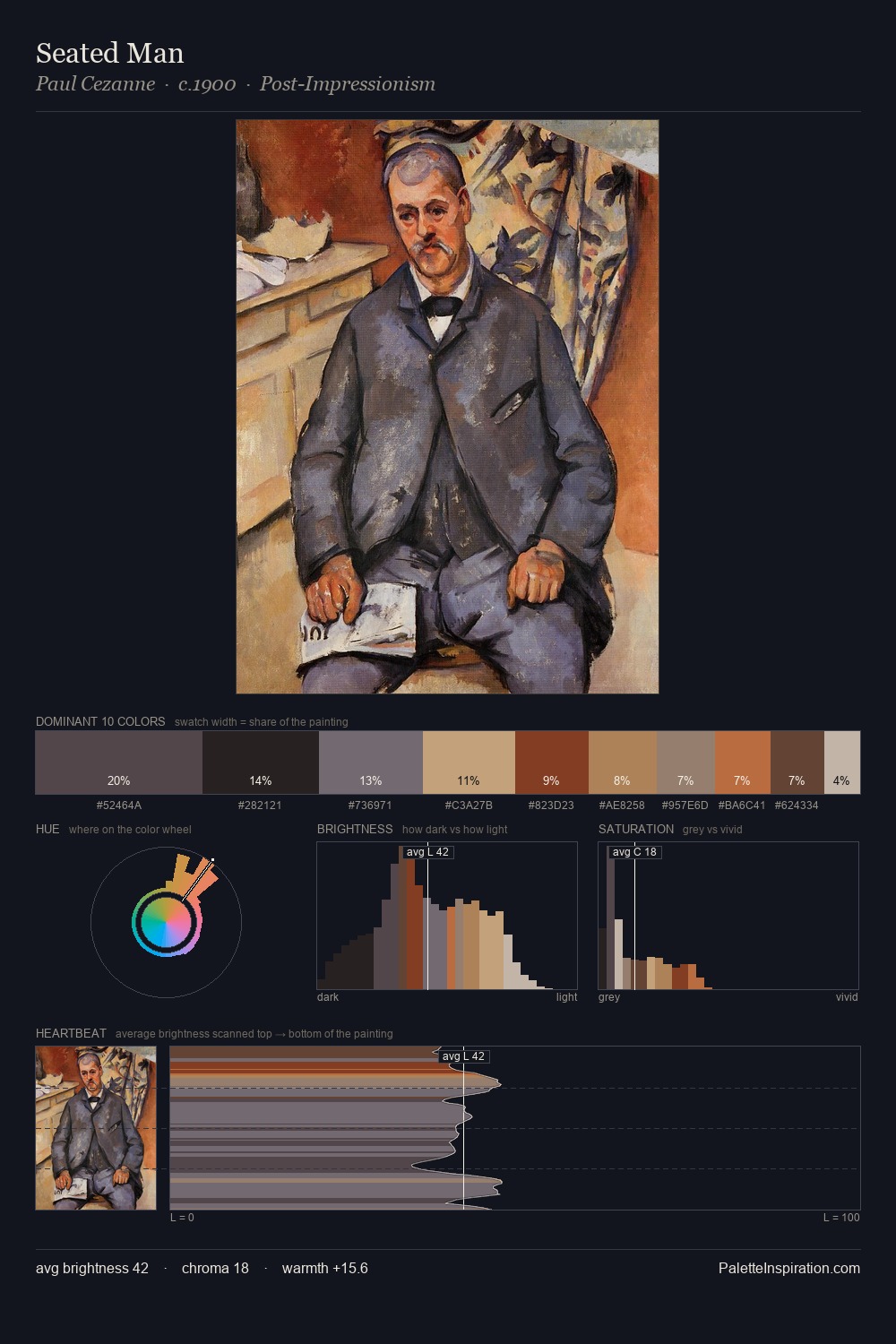
High Renaissance Palette 27
Shadowed Sienna
Shadowed Low-key - values weighted toward shadow, the palette of dim interiors and overcast skies.
Sienna Warm red-brown earth - named after the Sienese pigment, a fundamental artist earth color.

Palette Analysis
Values in High Renaissance rest in the mid-range - neither dramatically lit nor steeped in shadow. The dominant temperature is warm, with earth tones and fire-hues setting the emotional key. The absence of saturated colour is itself an expressive choice: this is a palette of restraint and atmosphere. The dominant colour, #221E1F, takes 25.1% of the total area, establishing the overall mood before any other hue is introduced. The most saturated colour, #4D2F27, is reserved to 9.0% of the surface, where it acts as a focal punctuation. The full value range is 60 units: broad enough to build convincing three-dimensional form.
Example use cases
- theater design
- jewelry brands
- tobacco-adjacent retail
- event branding
- film & entertainment
I Love This!
Use This Palette
Copy, export, or download for your project
Copy, export, or download for your project
Copy:
Download:
Share: