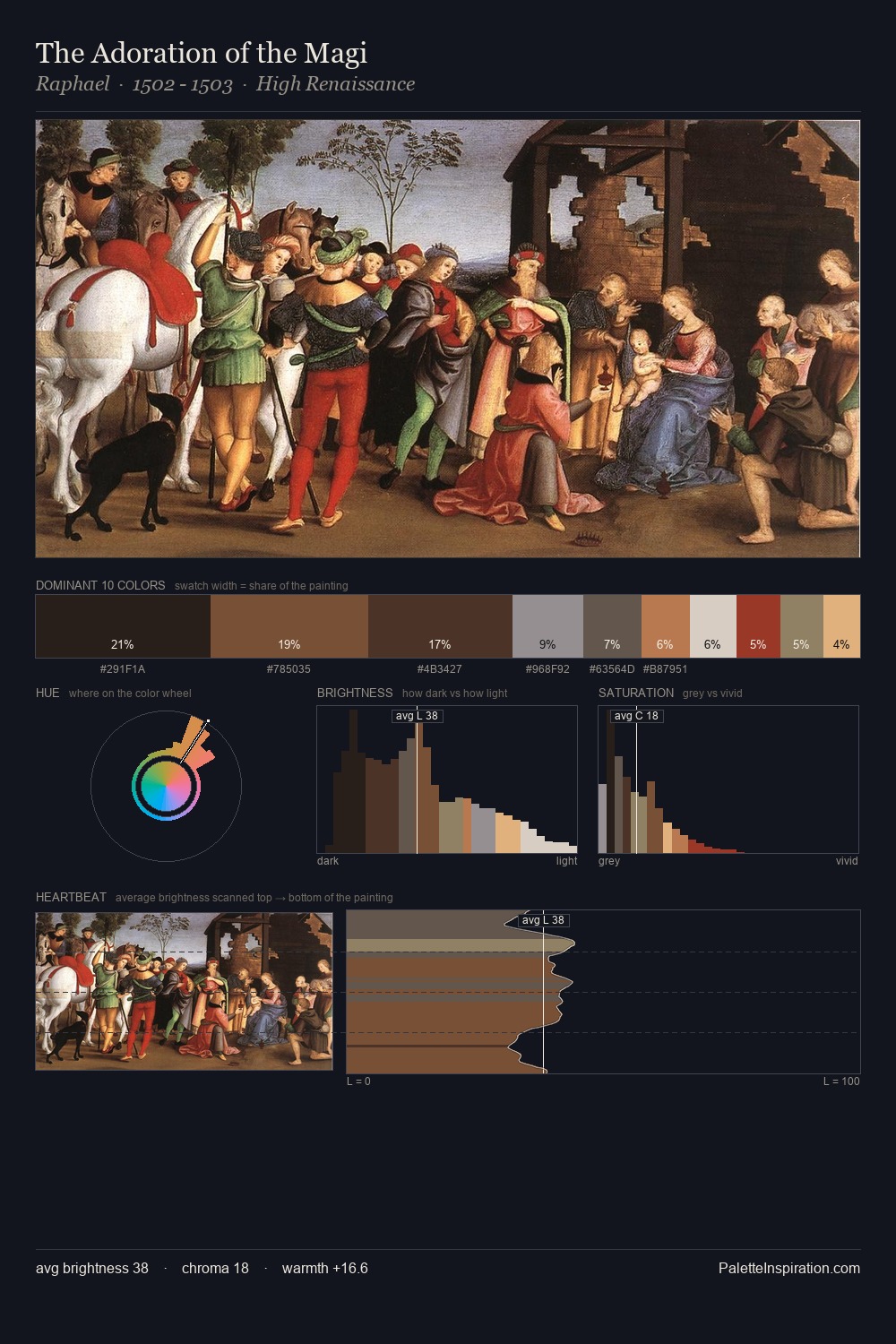
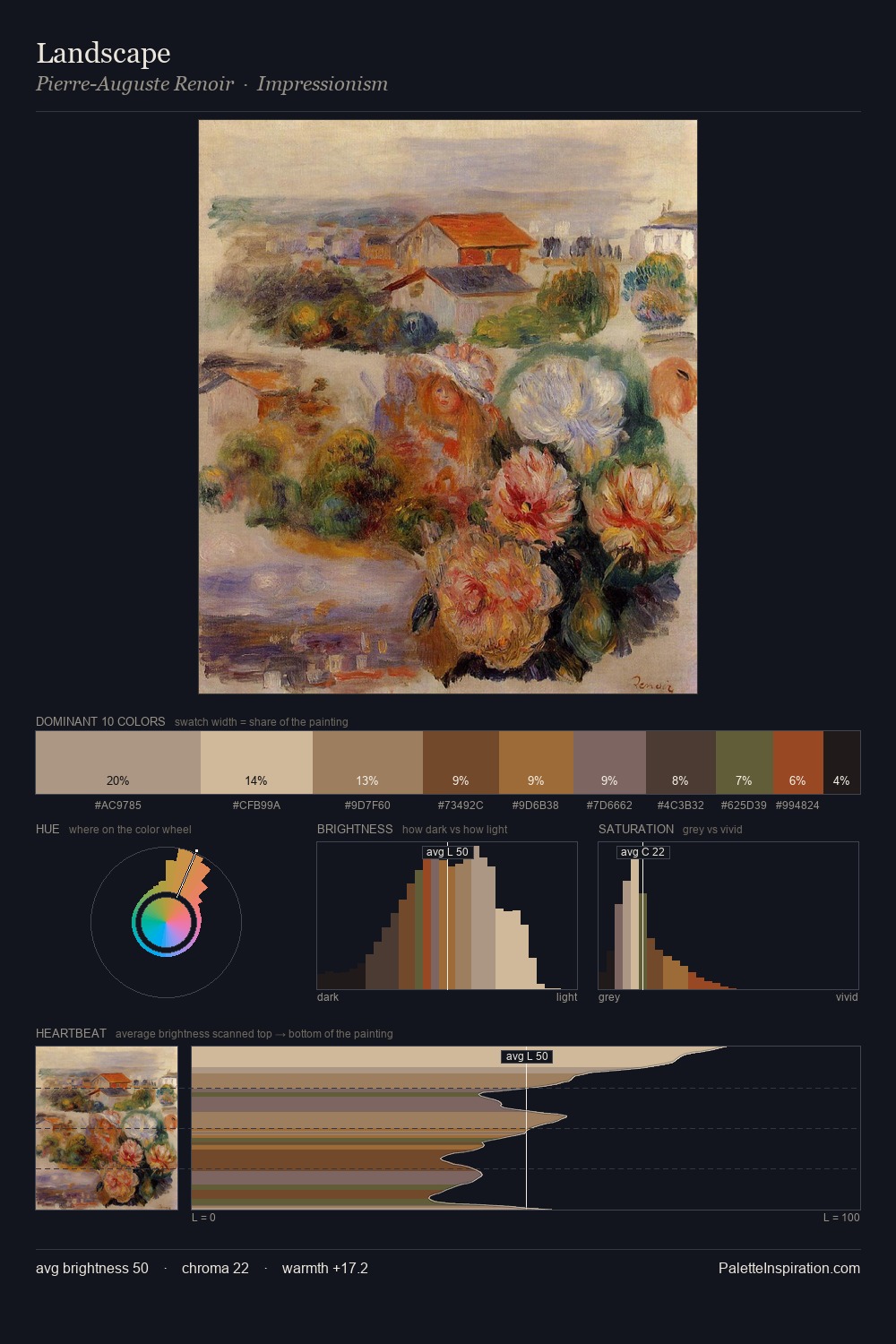
High Renaissance Palette 23
Shadowed Tawny
Shadowed Low-key - values weighted toward shadow, the palette of dim interiors and overcast skies.
Tawny Warm orange-brown - a traditional term for the color of tanned leather or lion fur.

Palette Analysis
High Renaissance occupies the comfortable middle of the value scale, avoiding both extremes to hold the eye in a sustained middle grey. Yellow, ochre, sienna: warm hues deployed as the palette's primary energy. The absence of saturated colour is itself an expressive choice: this is a palette of restraint and atmosphere. The most saturated colour, #A14937, is reserved to 3.6% of the surface, where it acts as a focal punctuation. A value spread of 57 units gives the palette both depth and air - shadows are genuinely dark, lights genuinely light.
Example use cases
- theater design
- jewelry brands
- tobacco-adjacent retail
- event branding
- film & entertainment
I Love This!
Use This Palette
Copy, export, or download for your project
Copy, export, or download for your project
Copy:
Download:
Share: