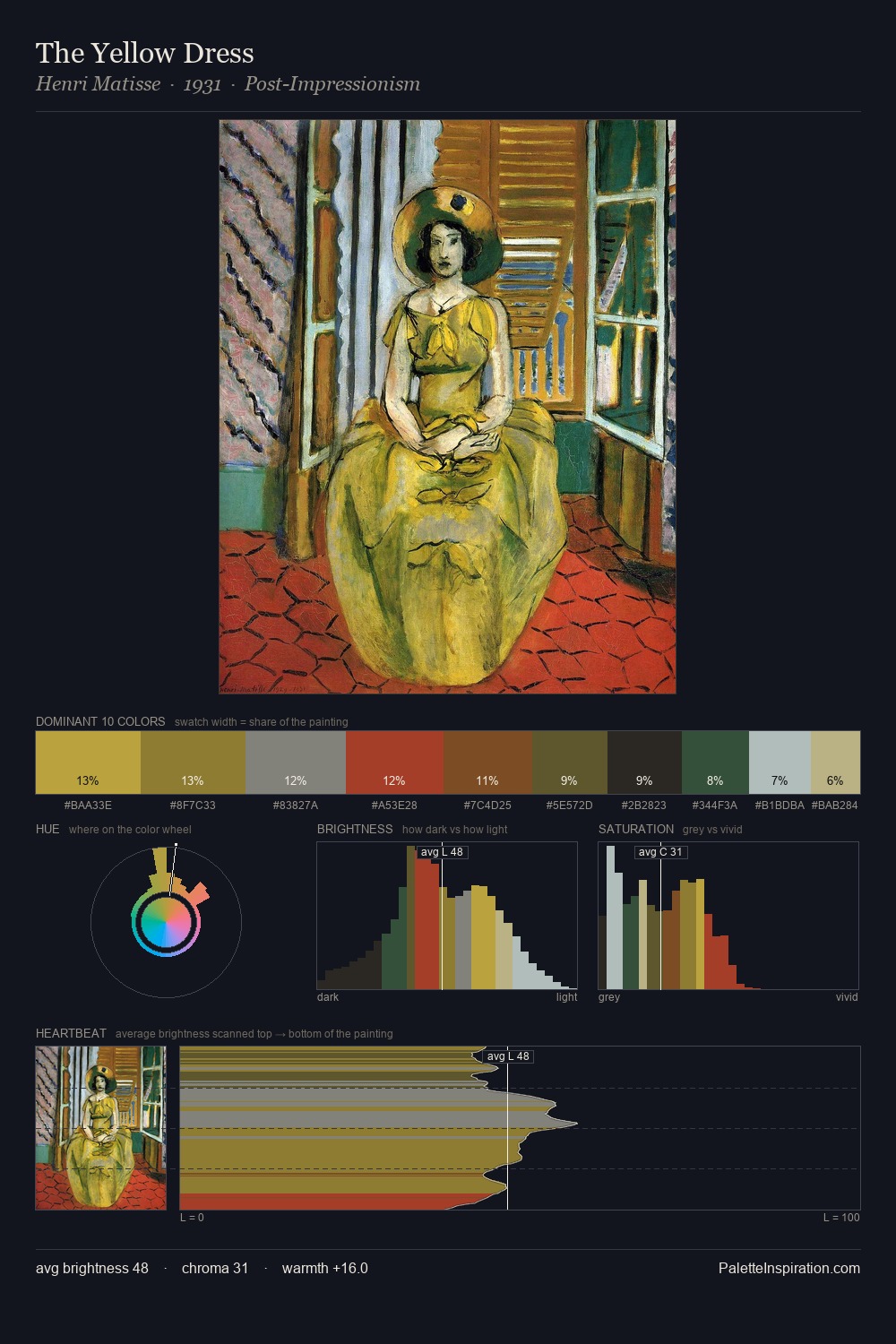
Henri Matisse Palette 24

Palette Analysis
Henri Matisse keeps values measured and balanced, a hallmark of tonal restraint. Cool tones set the register here - the blues and greens easily outweigh any warm accents. Chroma is moderate: colours carry enough saturation to be read as colour, but the palette stops well short of garish intensity. The most saturated colour, #A64B2A, is reserved to 5.4% of the surface, where it acts as a focal punctuation. At 57 units of value range, the palette has the tonal breadth to sustain complex spatial readings. The palette has the character of outdoor light: cool, mid-bright, with colour rendered faithfully rather than expressively. Henri Matisse's palette 24 carries its own internal logic while remaining in conversation with the artist's broader colour intelligence.
Example use cases
- publishing
- corporate identity
- consumer apps
- hospitality
- design agencies
I Love This!
Copy, export, or download for your project