Henri Matisse Palette 13
Soft Vellum
Soft Low-contrast, gentle chroma - mid-key values and low saturation, approachable and calm.
Vellum Smooth pale tan - the color of prepared calf-skin vellum, warmer than parchment.

Palette Analysis
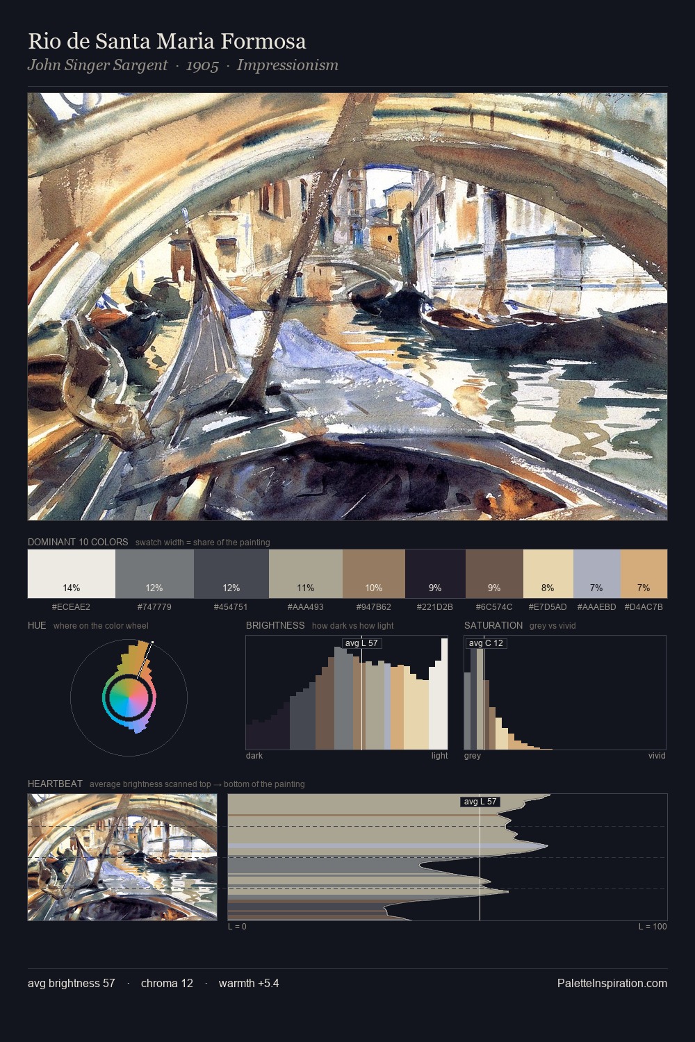
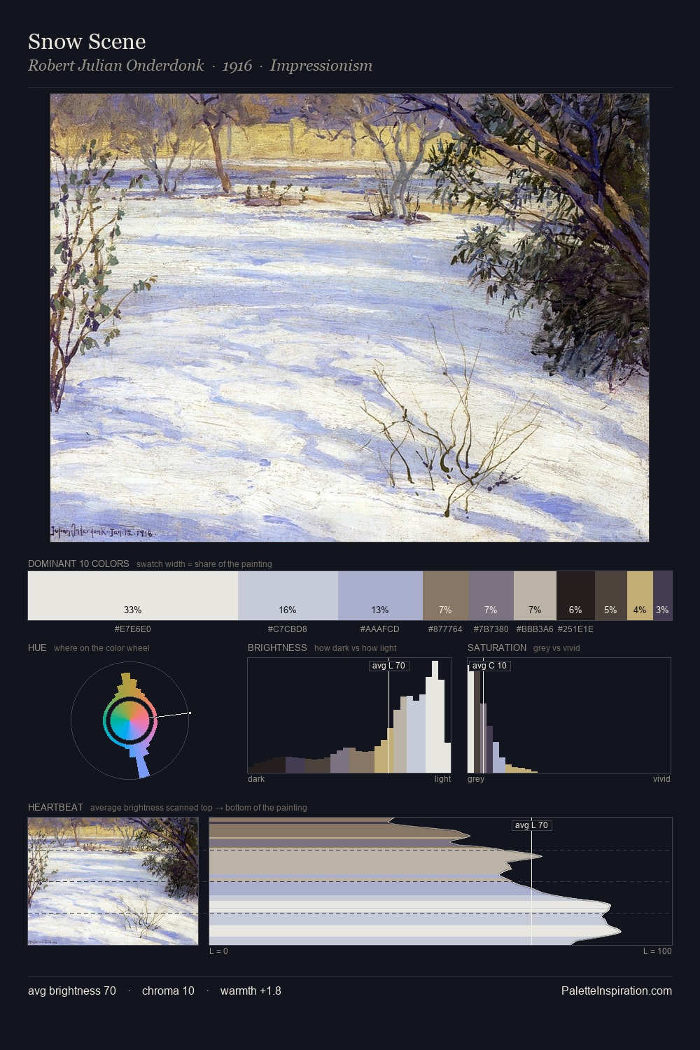
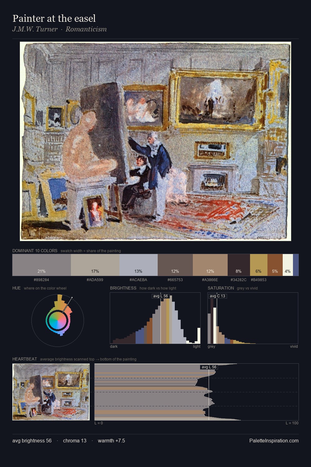
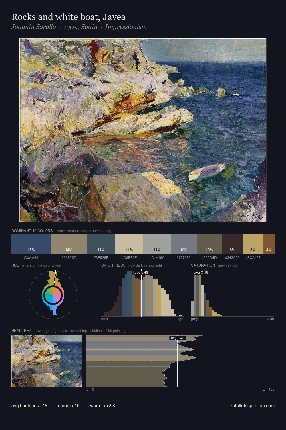
Values in Henri Matisse tilt decisively toward white, giving the palette its luminous character. Henri Matisse tilts toward cool - blues and silver-greys carry the structural weight. The absence of saturated colour is itself an expressive choice: this is a palette of restraint and atmosphere. The most saturated colour, #B2A265, is reserved to 3.5% of the surface, where it acts as a focal punctuation. At 62 units of value range, the palette has the tonal breadth to sustain complex spatial readings. High luminosity and cool temperature suggest the plein-air condition: unfiltered daylight and open sky. Palette 13 sits within the larger chromatic argument that Henri Matisse's complete body of work advances.
Example use cases
- exhibition design
- foundation branding
- estate management
- art education
- museums & galleries
I Love This!
Use This Palette
Copy, export, or download for your project
Copy, export, or download for your project
Copy:
Download:
Share: