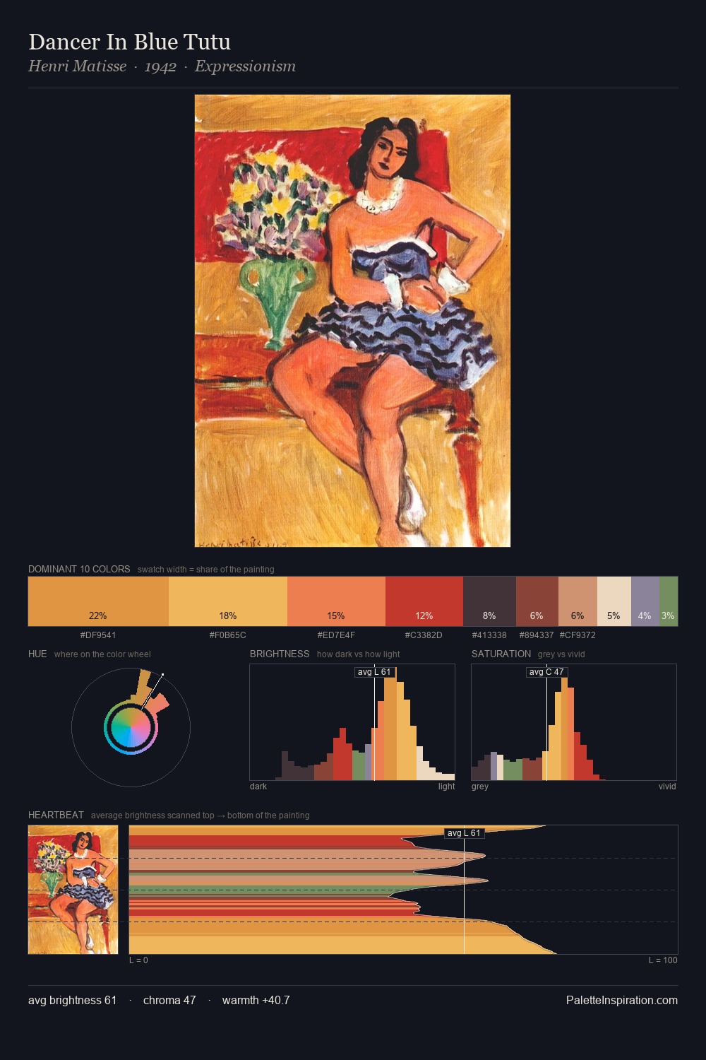
Henri Matisse Palette 16
Muted Apricot
Muted Deliberately desaturated - chroma pulled toward gray, the restraint of tonal painting.
Apricot Soft warm orange - peach-adjacent, the color of ripe stone fruit.

Palette Analysis
Henri Matisse distributes its values across the middle register, creating harmony without high contrast. Warm hues command this palette; Henri Matisse favours the reds, oranges, and yellows of firelight and earth. Chroma is moderate: colours carry enough saturation to be read as colour, but the palette stops well short of garish intensity. #C07455 functions as the palette's exclamation mark: highest chroma, lowest percentage (8.1%). The value range of 52 units sits in the comfortable middle: enough depth, enough light, neither extreme. Palette 16 sits within the larger chromatic argument that Henri Matisse's complete body of work advances.
Example use cases
- interior design
- furniture brands
- cookbook publishing
- wine & spirits
- food packaging
I Love This!
Use This Palette
Copy, export, or download for your project
Copy, export, or download for your project
Copy:
Download:
Share: