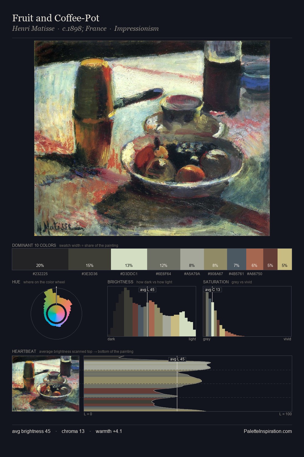
Henri Matisse Palette 23

Palette Analysis
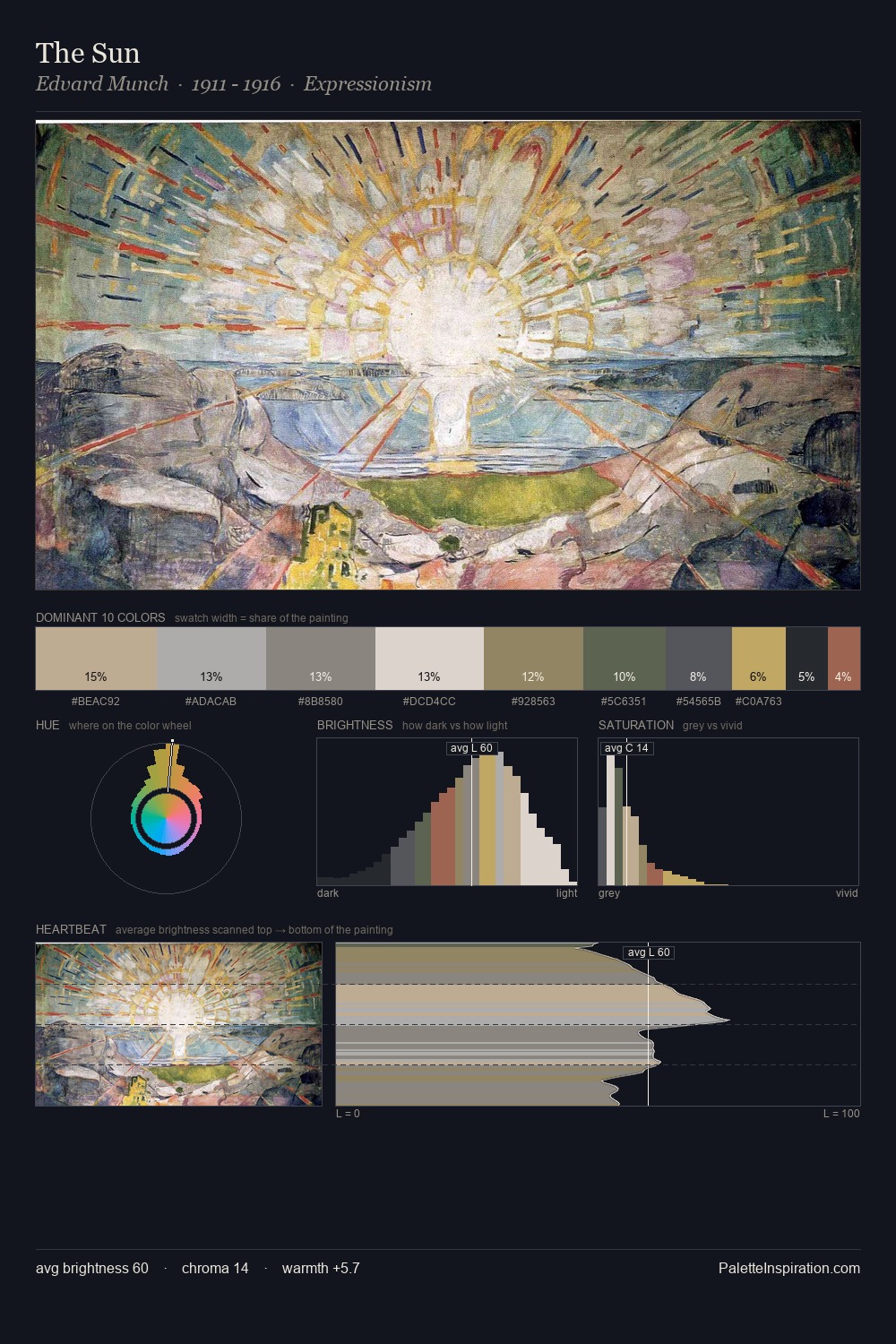
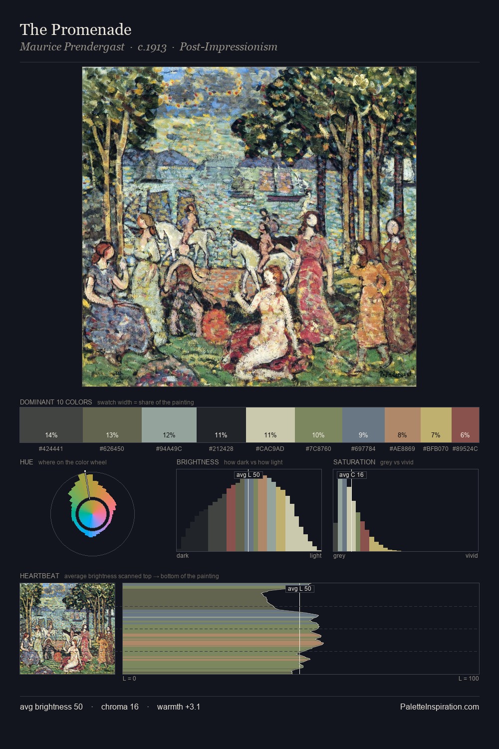
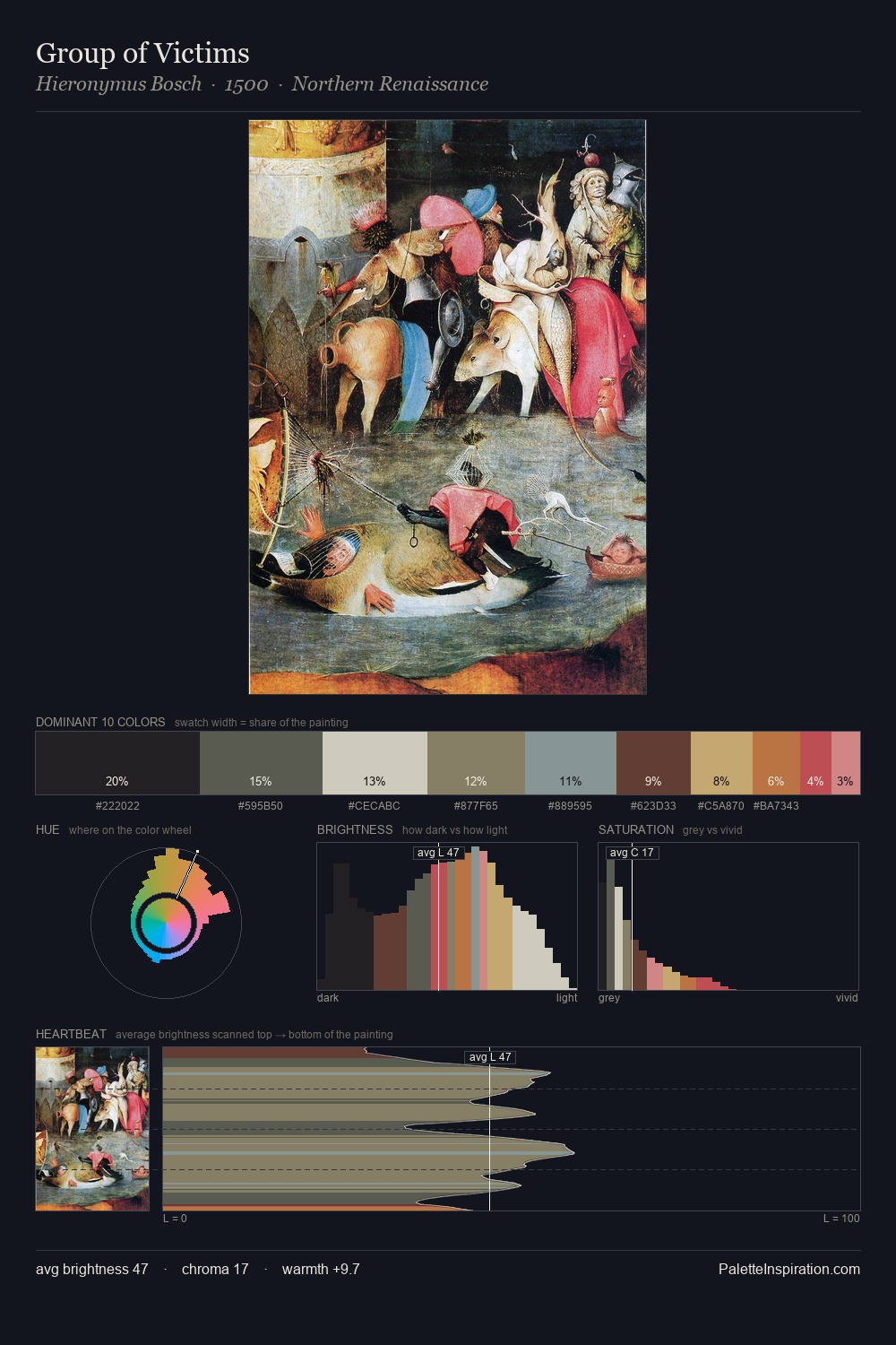
Henri Matisse occupies the comfortable middle of the value scale, avoiding both extremes to hold the eye in a sustained middle grey. Henri Matisse builds on cool foundations: the palette favours the blue-cyan-green arc. Muted throughout, the palette achieves its effects through value and temperature rather than chromatic force. The most saturated colour, #924F48, is reserved to 3.7% of the surface, where it acts as a focal punctuation. 69 units of value range underpin the palette's structural clarity: the eye always knows where light falls. The mid-to-high key, cool bias, and moderate chroma point to outdoor observation - sky and diffused daylight as the dominant light source. Henri Matisse's palette 23 carries its own internal logic while remaining in conversation with the artist's broader colour intelligence.
Example use cases
- exhibition design
- foundation branding
- estate management
- art education
- museums & galleries
I Love This!
Copy, export, or download for your project