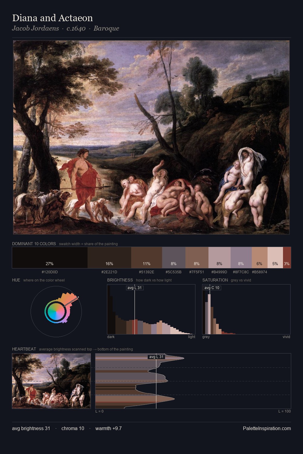
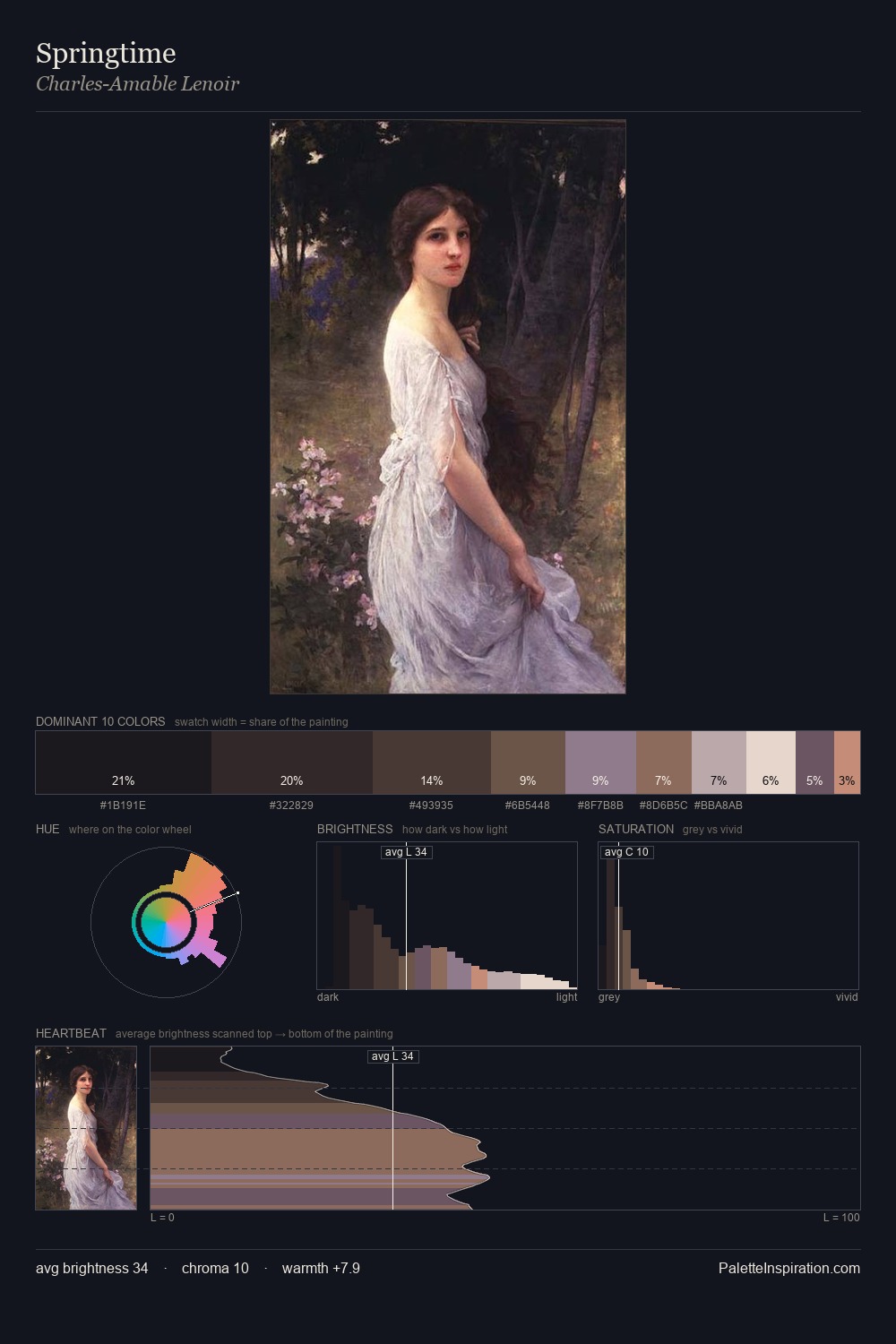
Giulio Romano Palette 4

Palette Analysis
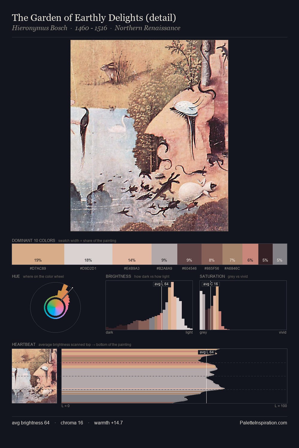
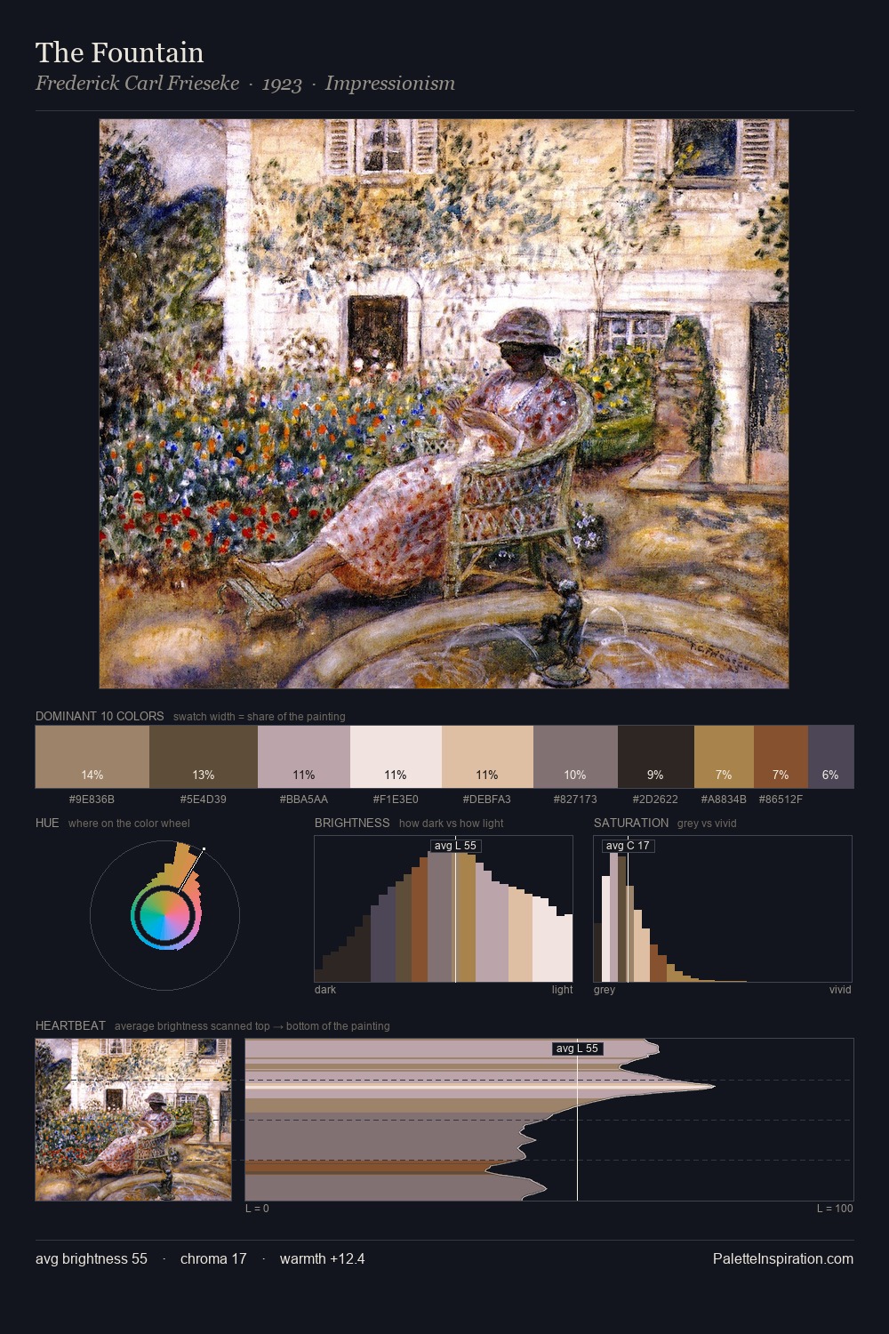
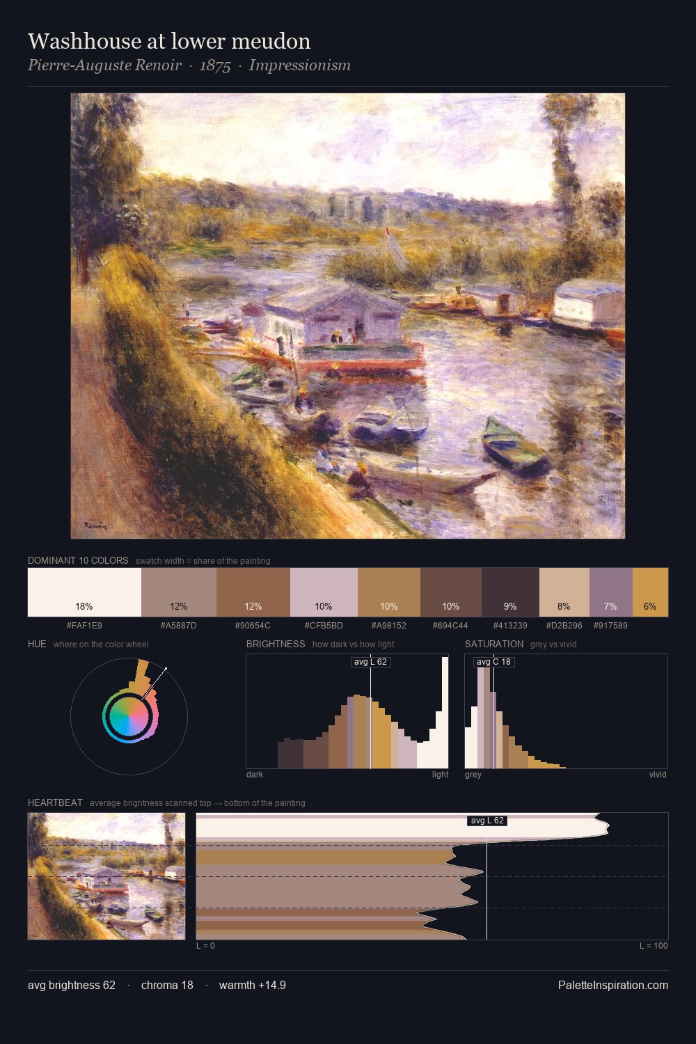
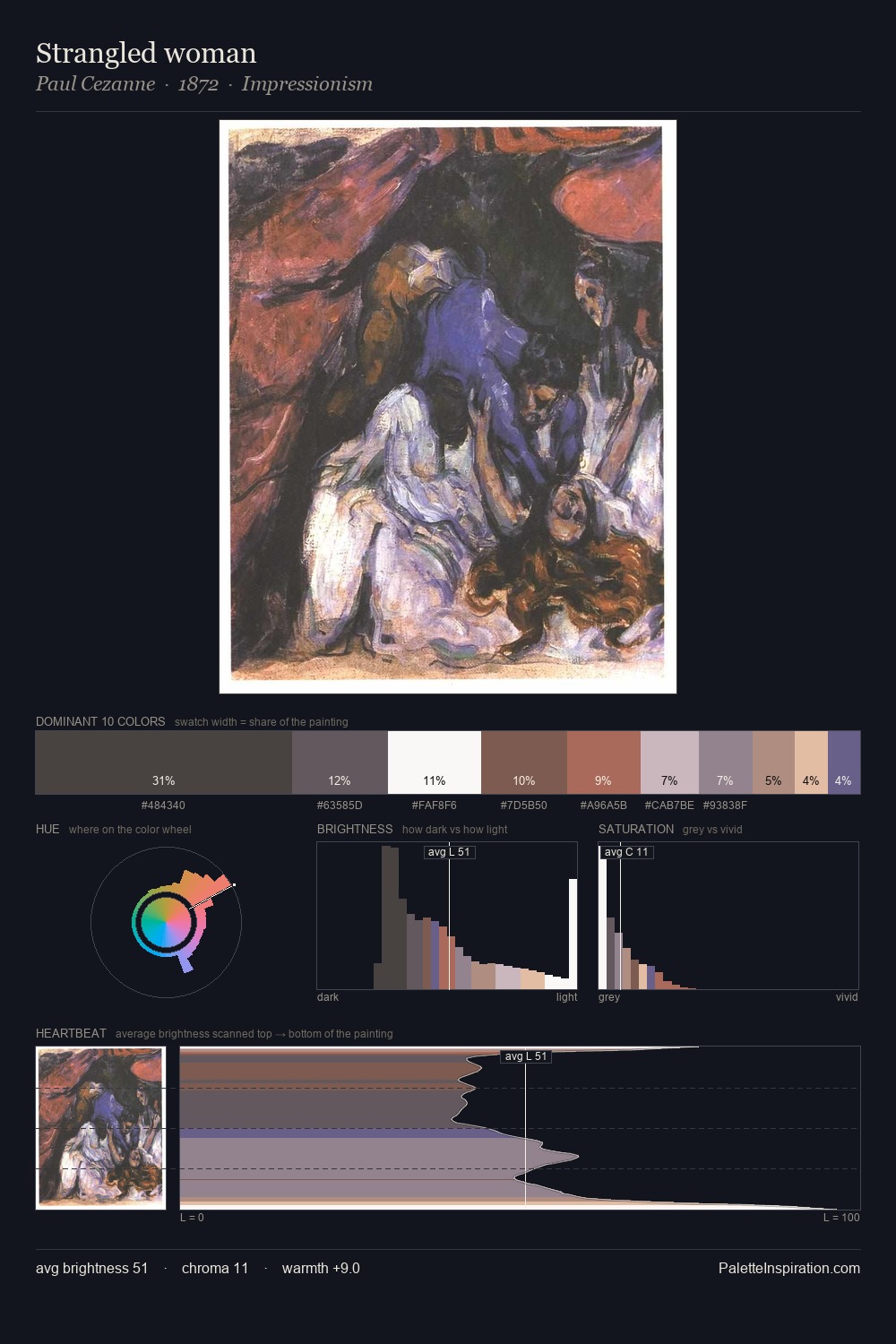
Values in Giulio Romano rest in the mid-range - neither dramatically lit nor steeped in shadow. Yellow, ochre, sienna: warm hues that Giulio Romano deploys as the palette's primary energy. The absence of saturated colour is itself an expressive choice: this is a palette of restraint and atmosphere. At 37.6%, #2B2727 functions less as a colour accent and more as a complete atmospheric environment. At 3.9%, #F1E4E9 carries the palette's sharpest chromatic charge: an accent that earns its place precisely because it is withheld. A value spread of 65 units gives the palette both depth and air - shadows are genuinely dark, lights genuinely light. This is palette 4 of Giulio Romano's sequence - a single chapter in a chromatic story told across many works.
Example use cases
- theater design
- jewelry brands
- tobacco-adjacent retail
- event branding
- film & entertainment
I Love This!
Copy, export, or download for your project