John Downman Palette 2

Palette Analysis
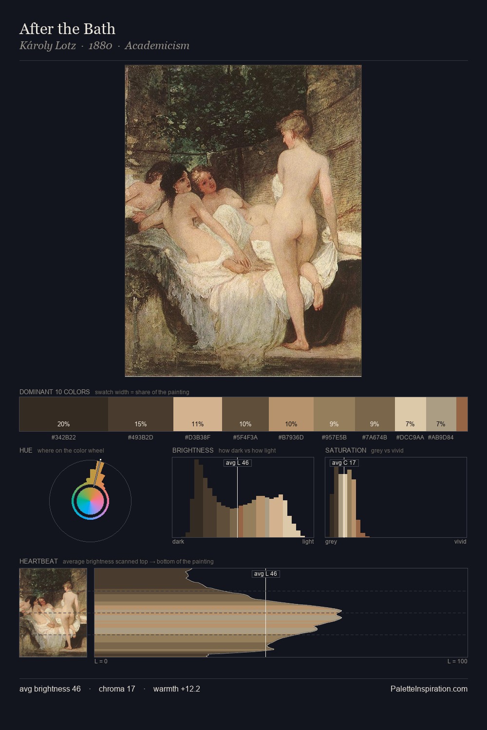
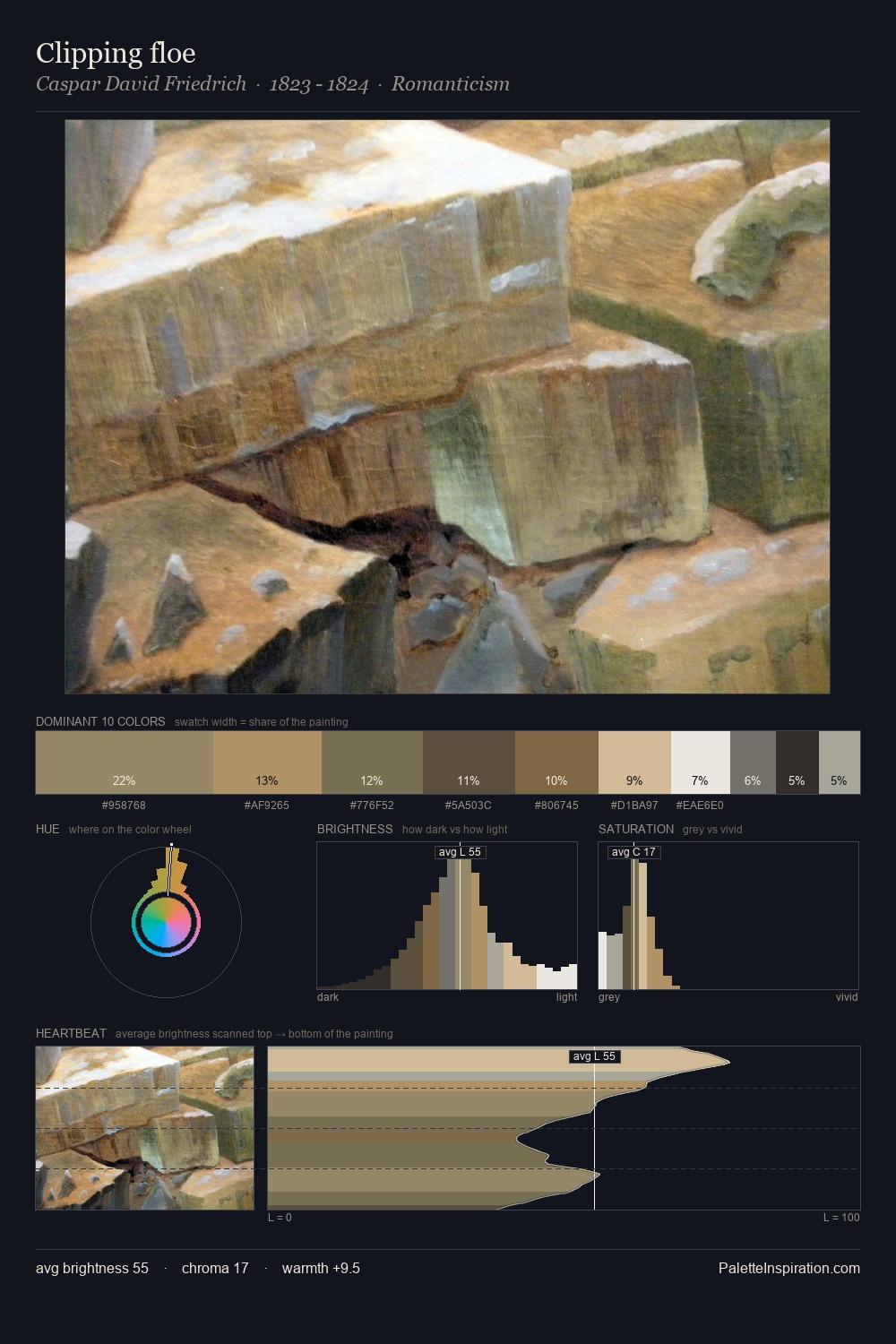
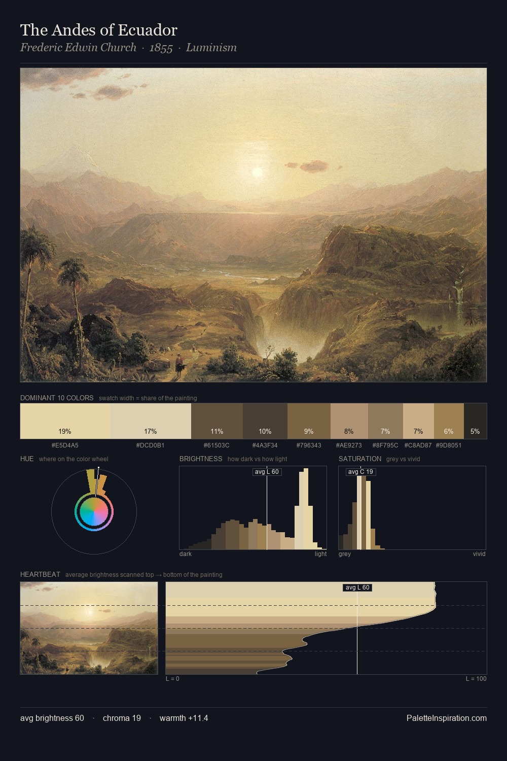
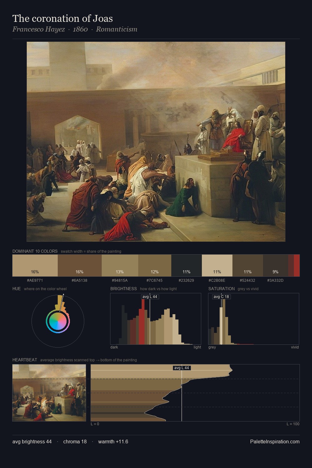
John Downman occupies the comfortable middle of the value scale, avoiding both extremes to hold the eye in a sustained middle grey. Heat pervades this palette; warm chromatic identities outweigh cool ones at almost every weight. Chroma hovers near zero; colour declares itself through subtle shifts in hue rather than outright saturation. At 38.5%, #302D2B functions less as a colour accent and more as a complete atmospheric environment. #CAB68E delivers the chromatic peak at only 3.7% - a small shot of colour with outsized visual impact. Spanning 48 units on the value axis, the palette achieves the balance between tonal flatness and fragmentation. John Downman's palette 2 carries its own internal logic while remaining in conversation with the artist's broader colour intelligence.
Example use cases
- theater design
- jewelry brands
- tobacco-adjacent retail
- event branding
- film & entertainment
I Love This!
Copy, export, or download for your project