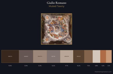
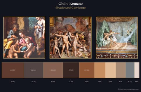
Giulio Romano Palette 1
Muted Apricot
Muted Deliberately desaturated - chroma pulled toward gray, the restraint of tonal painting.
Apricot Soft warm orange - peach-adjacent, the color of ripe stone fruit.
Palette Analysis
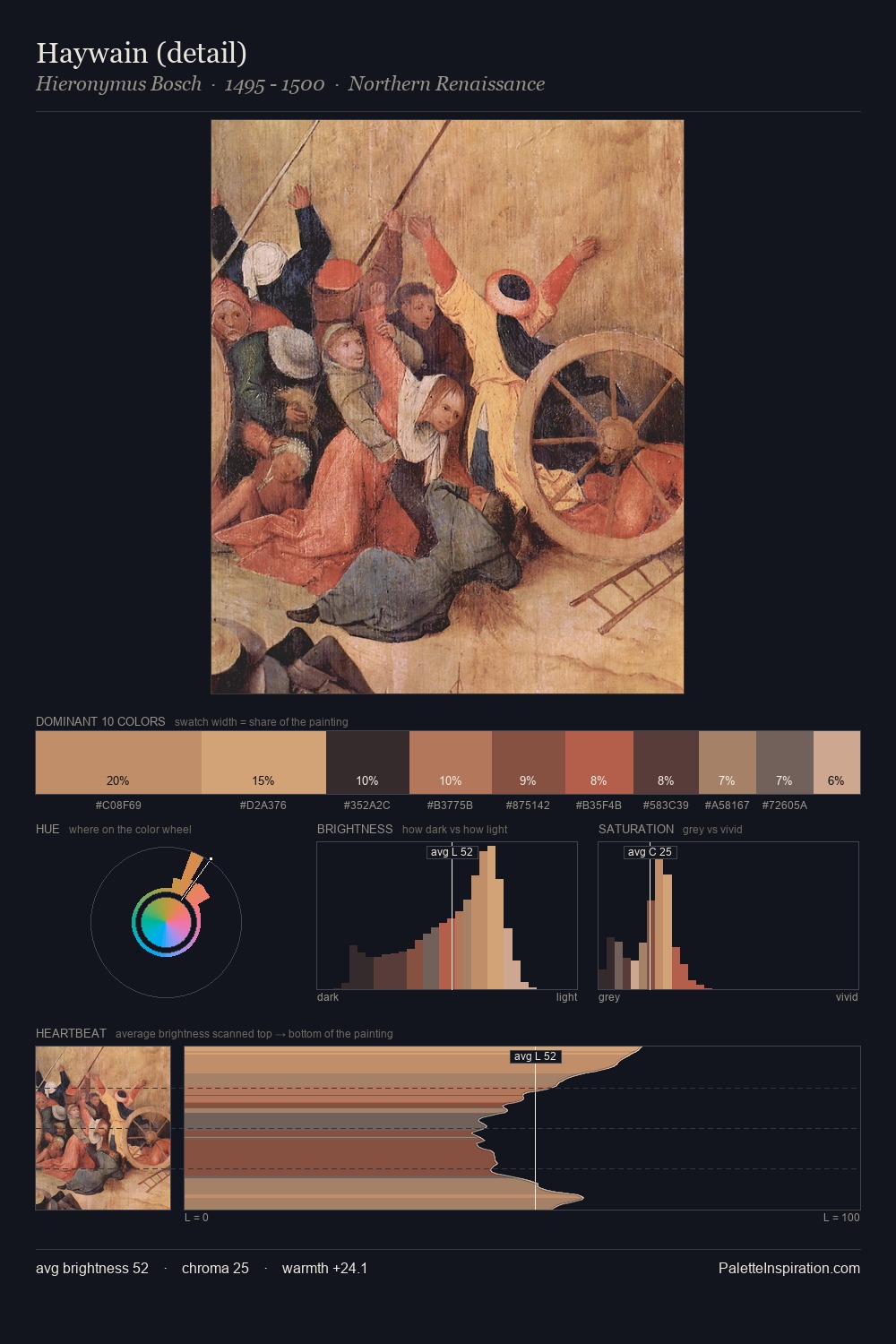
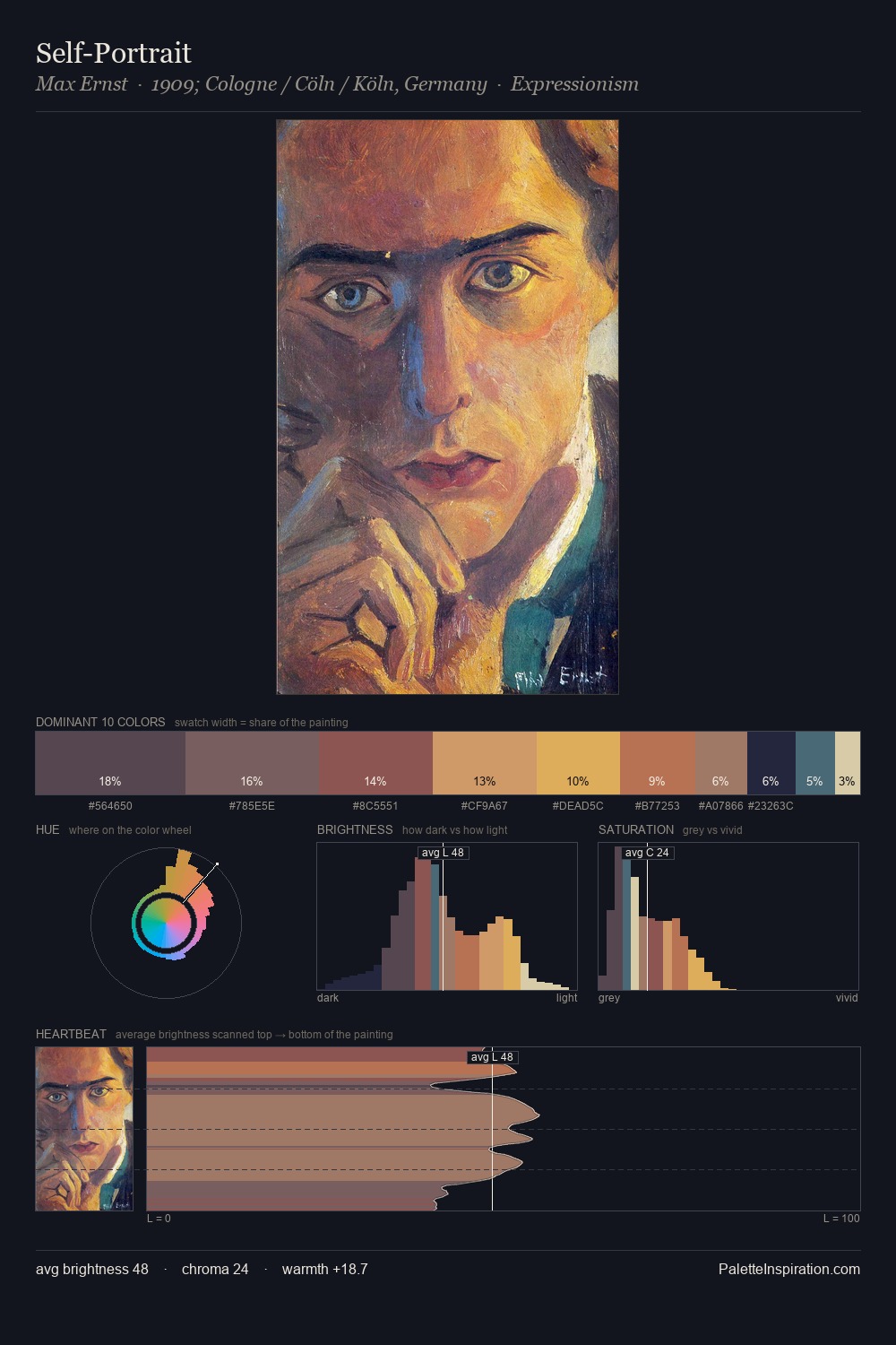
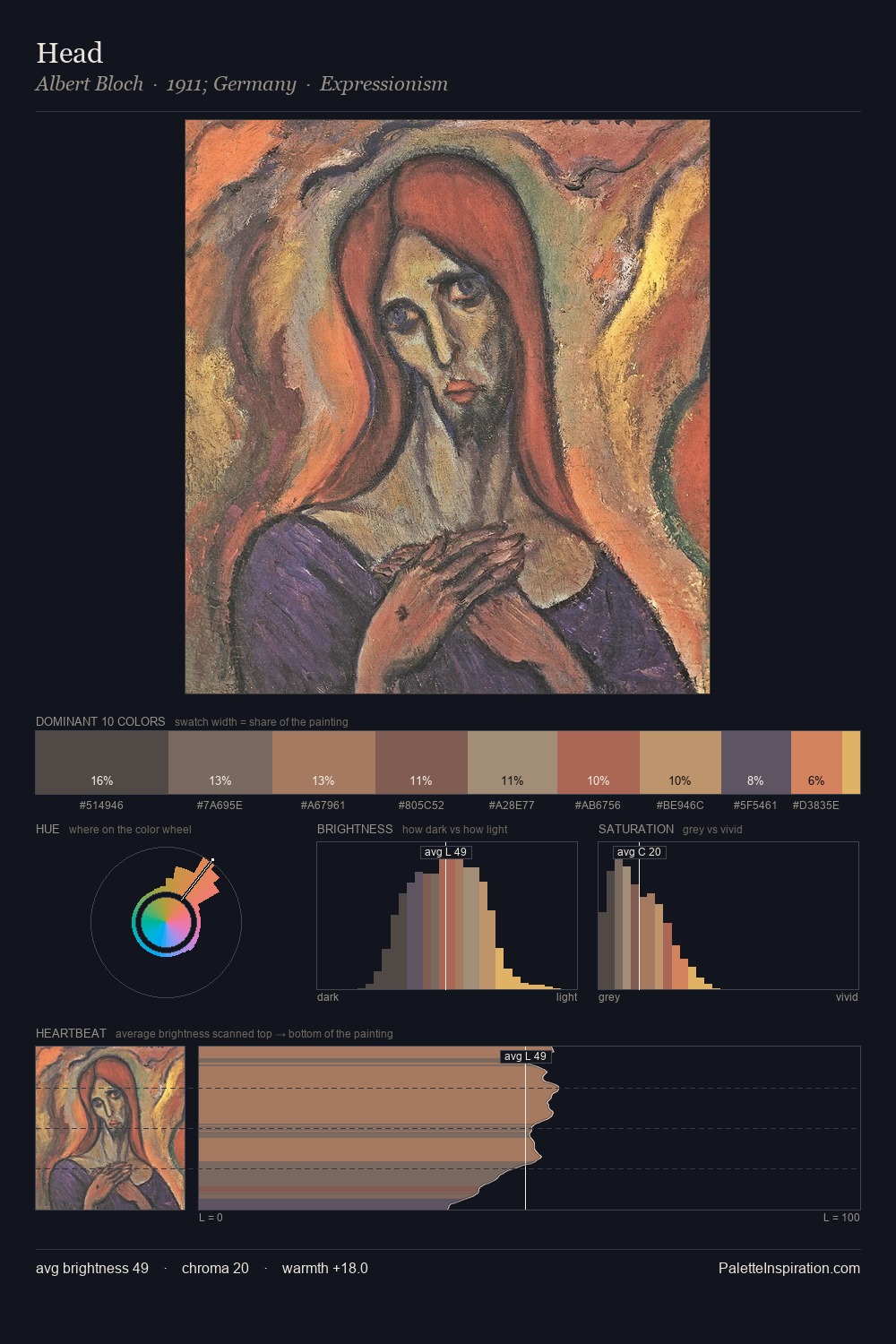
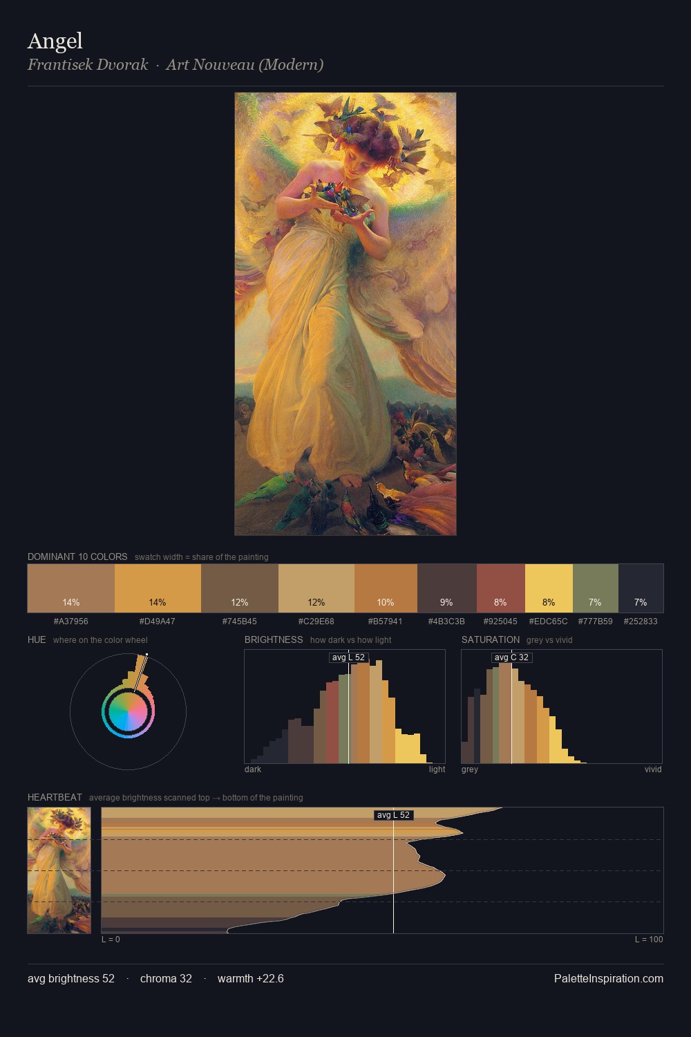
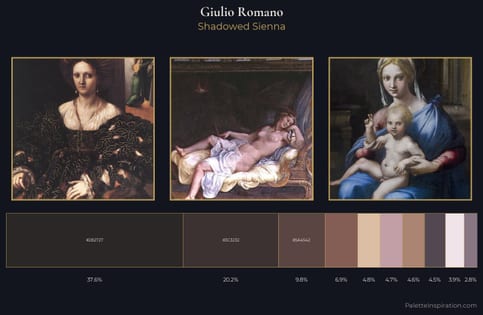
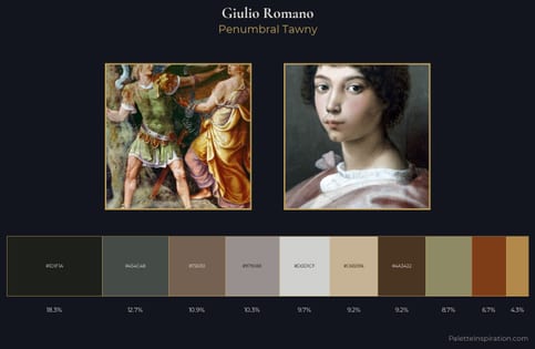
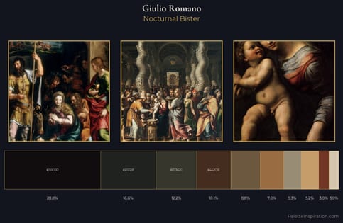
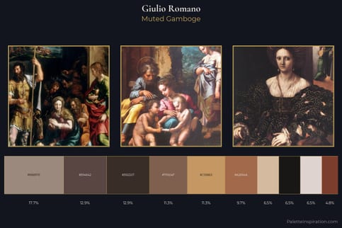
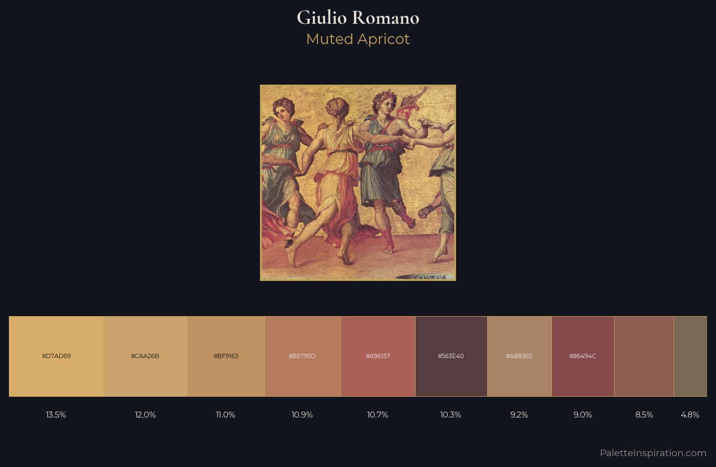
Mid-key values give Giulio Romano its characteristic quietness - nothing blazes, nothing disappears. Warmth dominates - the palette of Giulio Romano leans heavily on the yellow-orange-red arc of the colour wheel. A restrained, mid-chroma palette: every hue is present and legible, but nothing shouts. At 10.7%, #A96157 carries the palette's sharpest chromatic charge: an accent that earns its place precisely because it is withheld. The value range of 38 units sits in the comfortable middle: enough depth, enough light, neither extreme. Palette 1 sits within the larger chromatic argument that Giulio Romano's complete body of work advances.
Example use cases
- ceramics & pottery
- boutique hospitality
- menswear
- heritage food brands
- craft & artisan brands
I Love This!
Use This Palette
Copy, export, or download for your project
Copy, export, or download for your project
Copy:
Download:
Share: