Wu Daozi Palette 2
Nocturnal Sienna
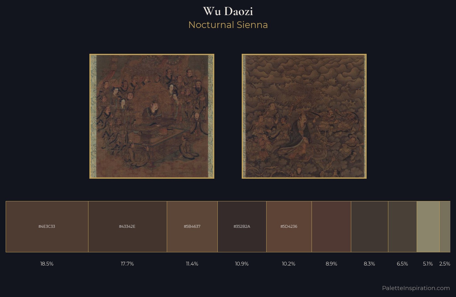
Nocturnal Night-register palette - very low values, the world after dark.
Sienna Warm red-brown earth - named after the Sienese pigment, a fundamental artist earth color.
Palette Analysis
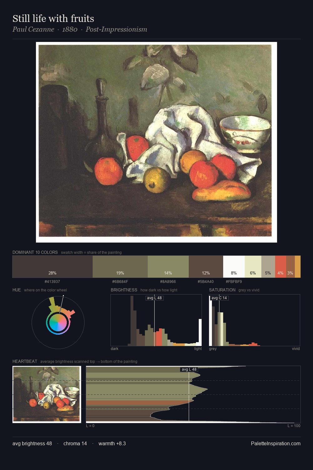
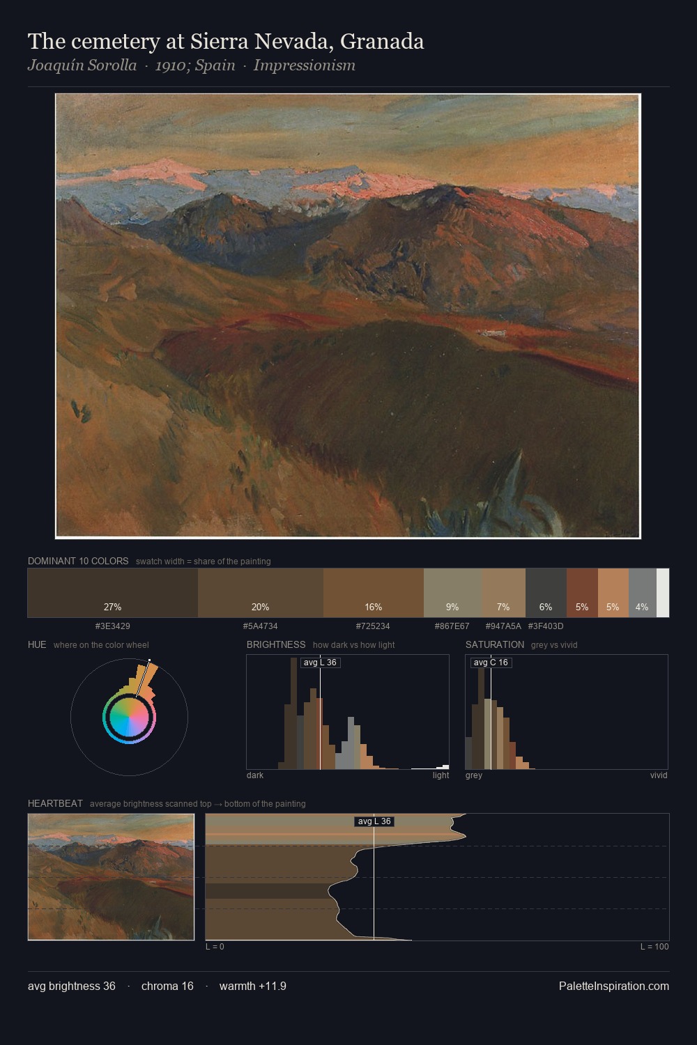
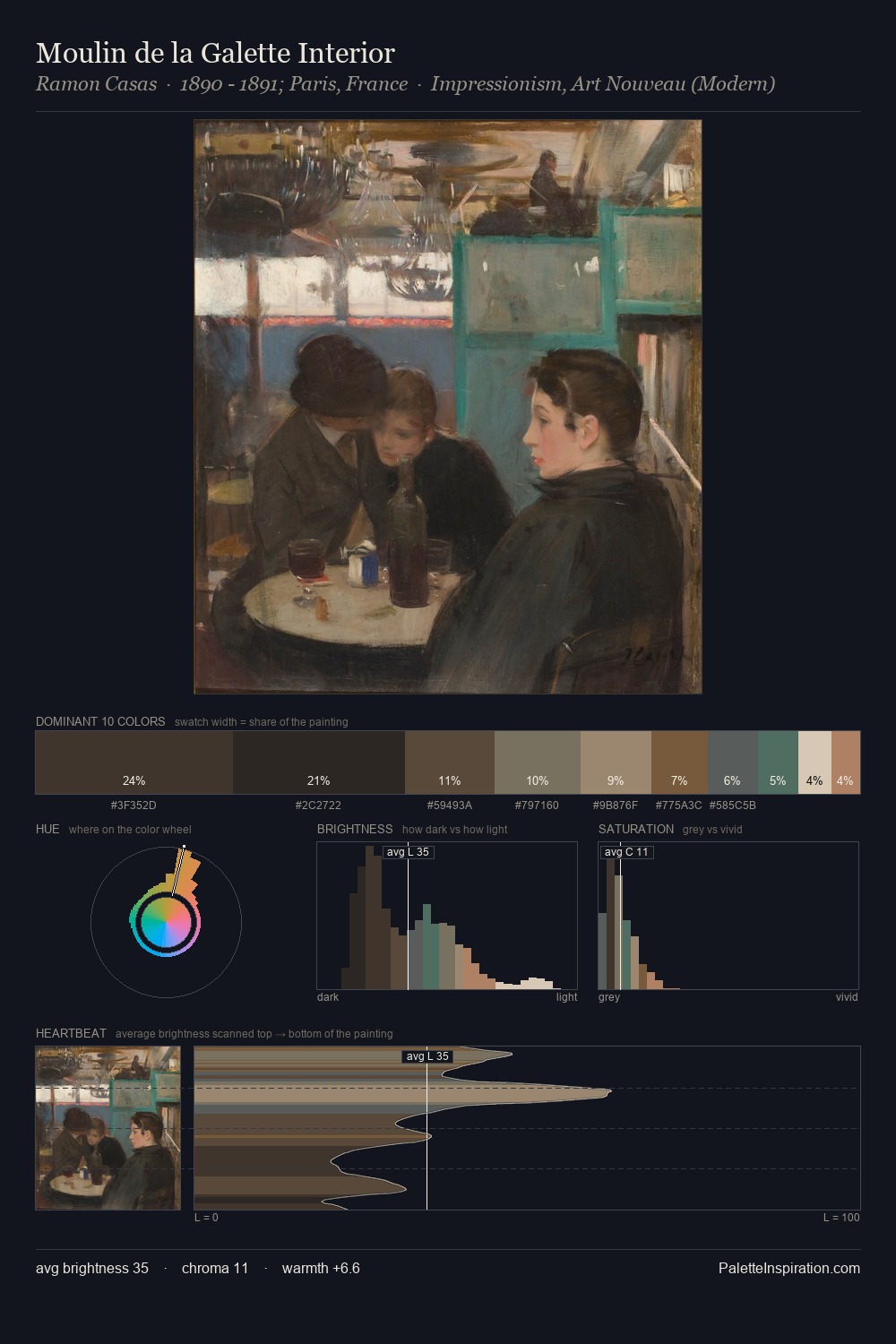
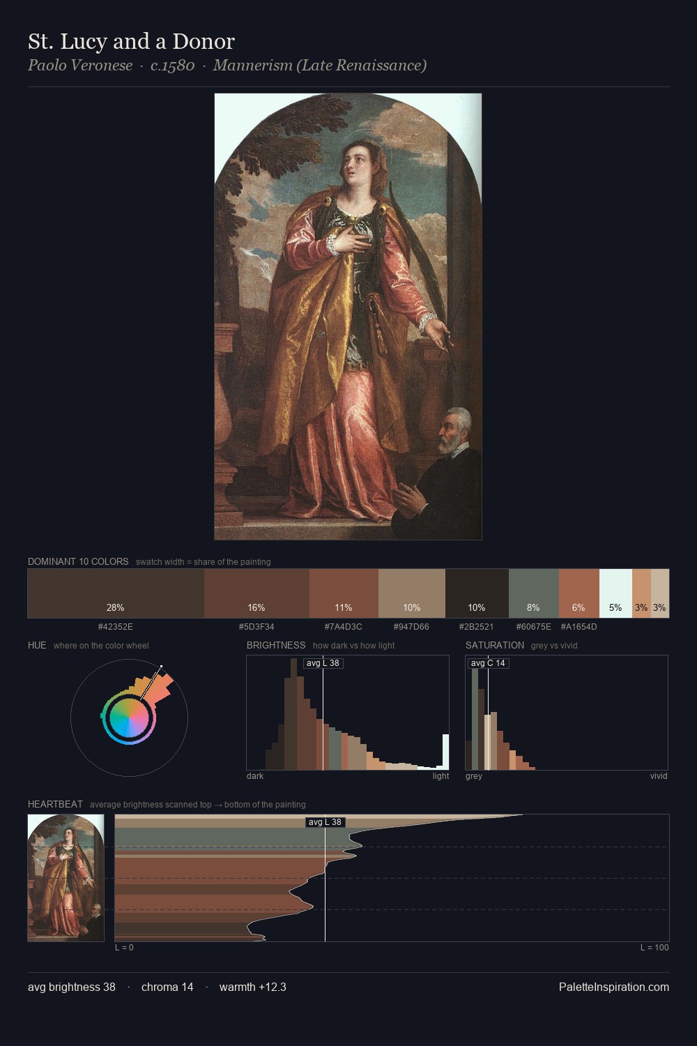
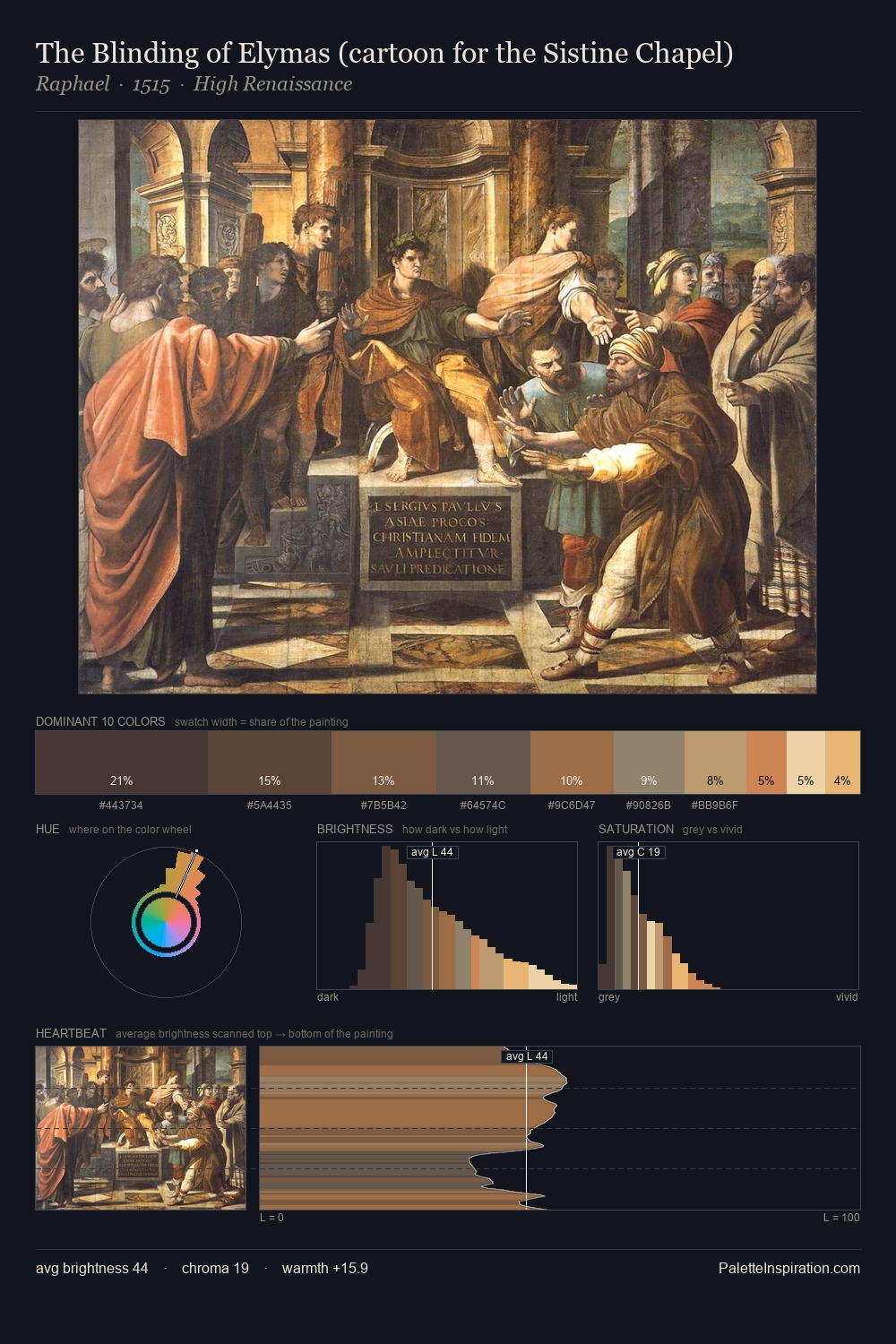
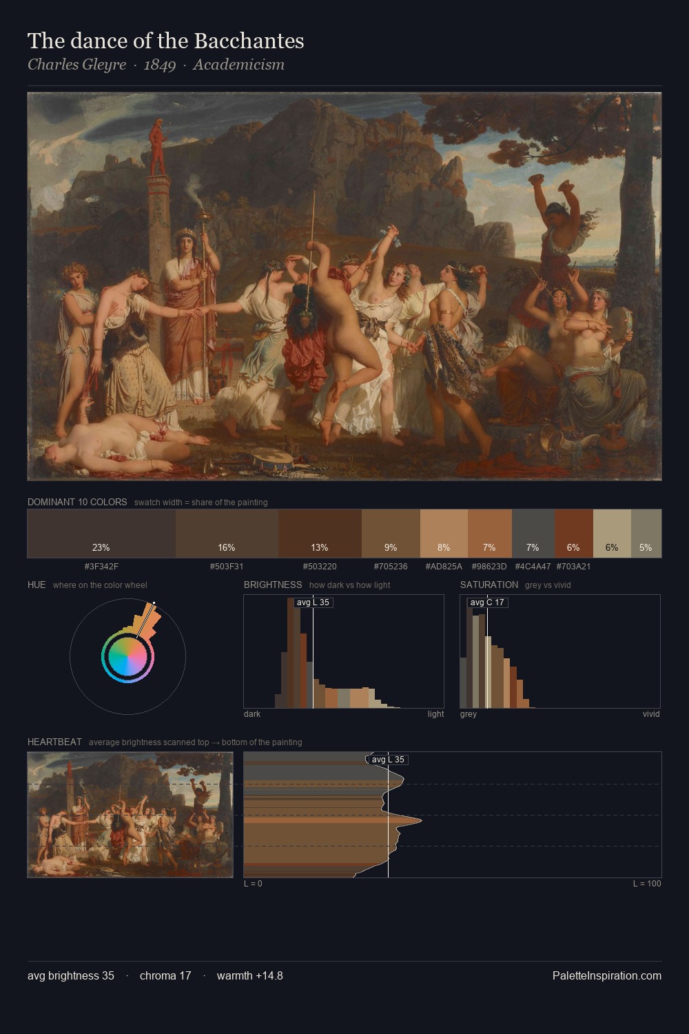
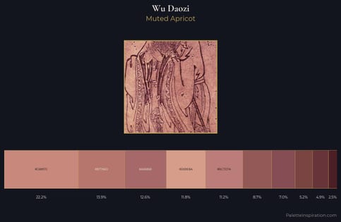
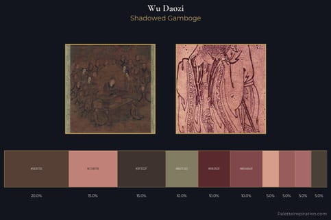
Wu Daozi sits in the centre of the value range, lending the palette a sense of even, sustained light. Heat pervades this palette; warm chromatic identities outweigh cool ones at almost every weight. All colours lean toward grey, building depth through value rather than colour punch. #503932 delivers the chromatic peak at only 8.9% - a small shot of colour with outsized visual impact. 32 units of value spread create a palette that is varied but unified - contrast in the service of harmony. Palette 2 sits within the larger chromatic argument that Wu Daozi's complete body of work advances.
Example use cases
- theater design
- jewelry brands
- tobacco-adjacent retail
- event branding
- film & entertainment
I Love This!
Use This Palette
Copy, export, or download for your project
Copy, export, or download for your project
Copy:
Download:
Share: