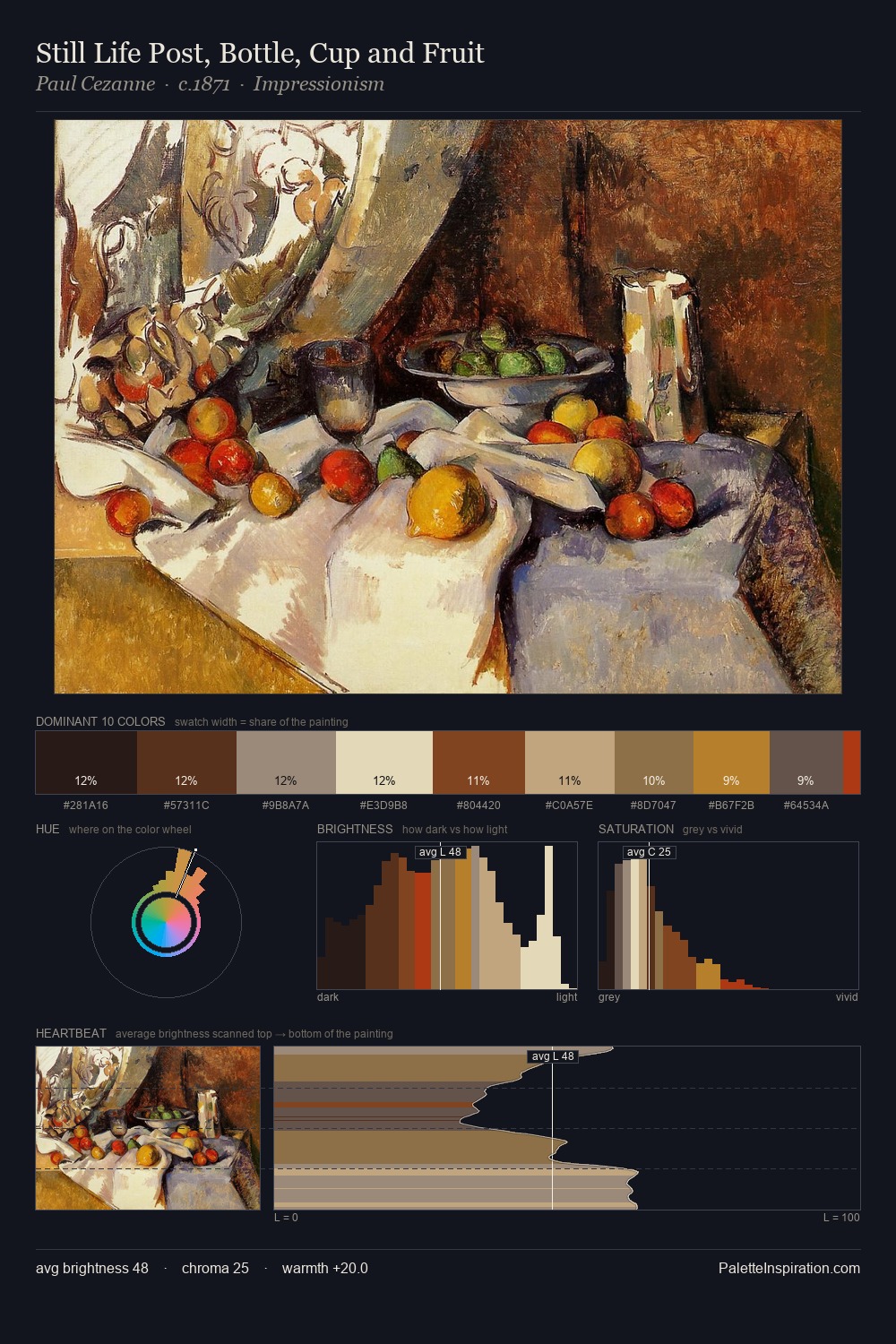
Giovanni Battista Moroni Palette 5

Palette Analysis
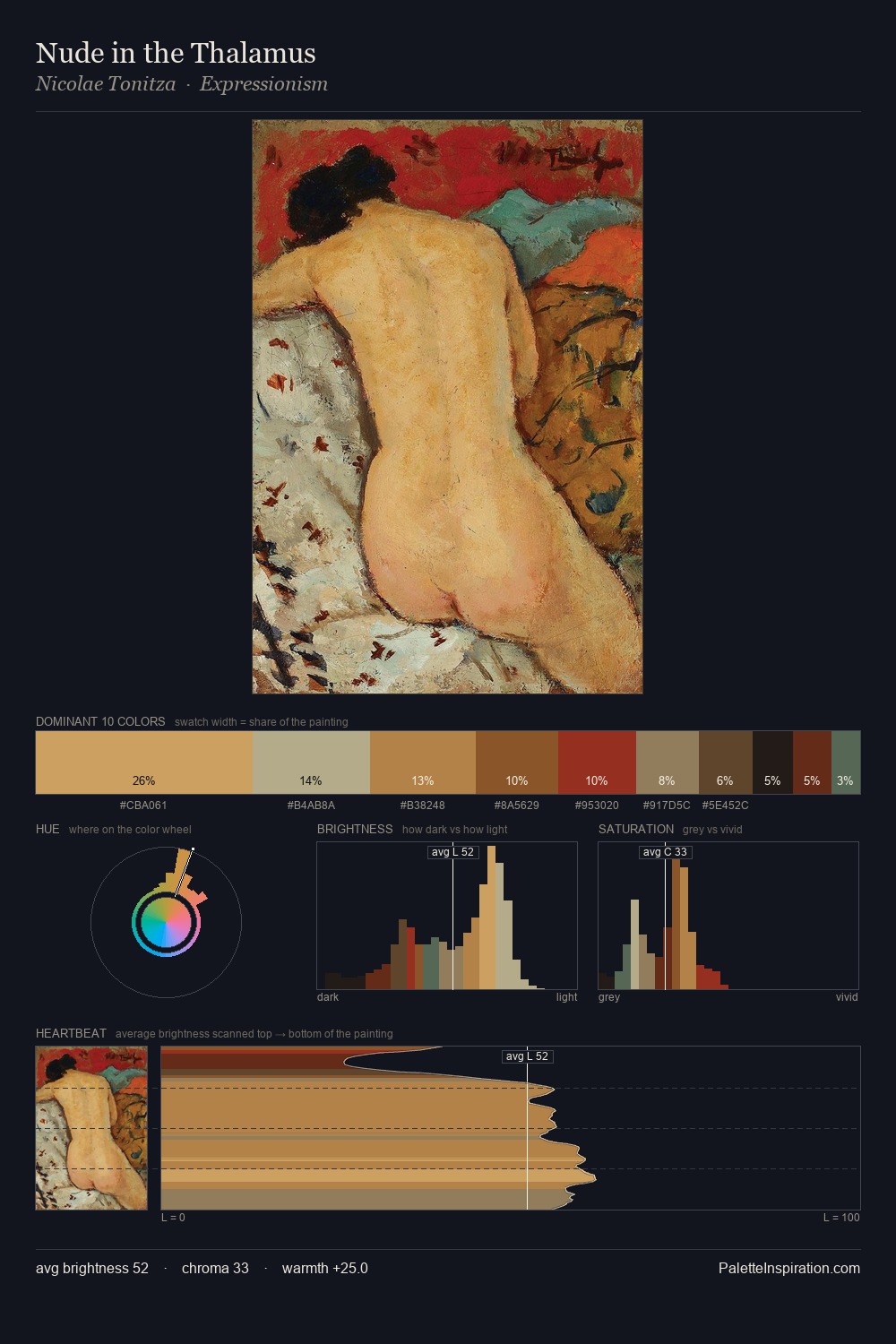
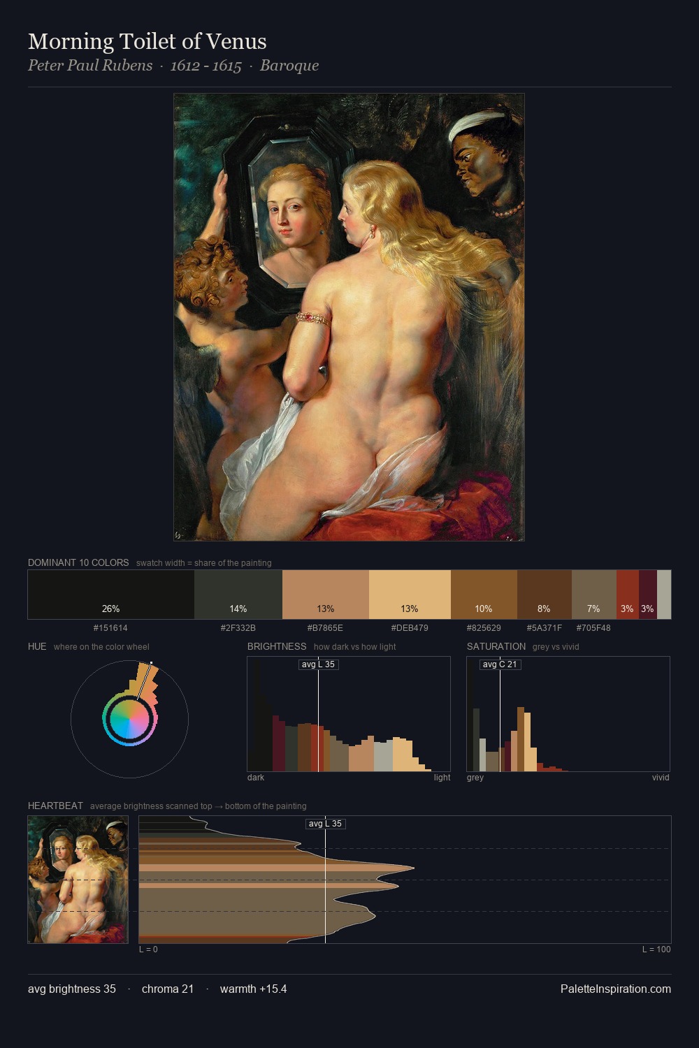
Giovanni Battista Moroni distributes its values across the middle register, creating harmony without high contrast. Warmth dominates - the palette of Giovanni Battista Moroni leans heavily on the yellow-orange-red arc of the colour wheel. The absence of saturated colour is itself an expressive choice: this is a palette of restraint and atmosphere. 39.7% of the palette belongs to #140F11, a concentration that makes it the unmistakable visual centre. The saturated accent, #A33213, registers at 1.1% - sparse enough to feel like a deliberate surprise. At 58 units of value range, the palette has the tonal breadth to sustain complex spatial readings. This is palette 5 of Giovanni Battista Moroni's sequence - a single chapter in a chromatic story told across many works.
Example use cases
- theater design
- jewelry brands
- tobacco-adjacent retail
- event branding
- film & entertainment
I Love This!
Copy, export, or download for your project