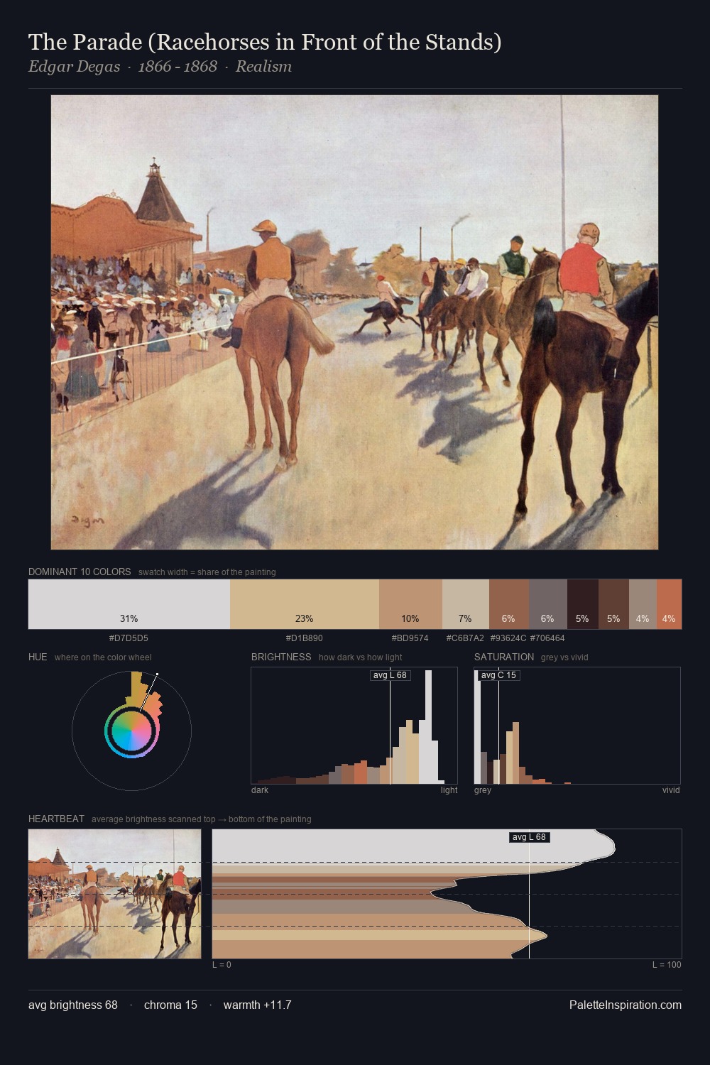
Giovanni Battista Moroni Palette 2
Muted Tawny
Muted Deliberately desaturated - chroma pulled toward gray, the restraint of tonal painting.
Tawny Warm orange-brown - a traditional term for the color of tanned leather or lion fur.

Palette Analysis
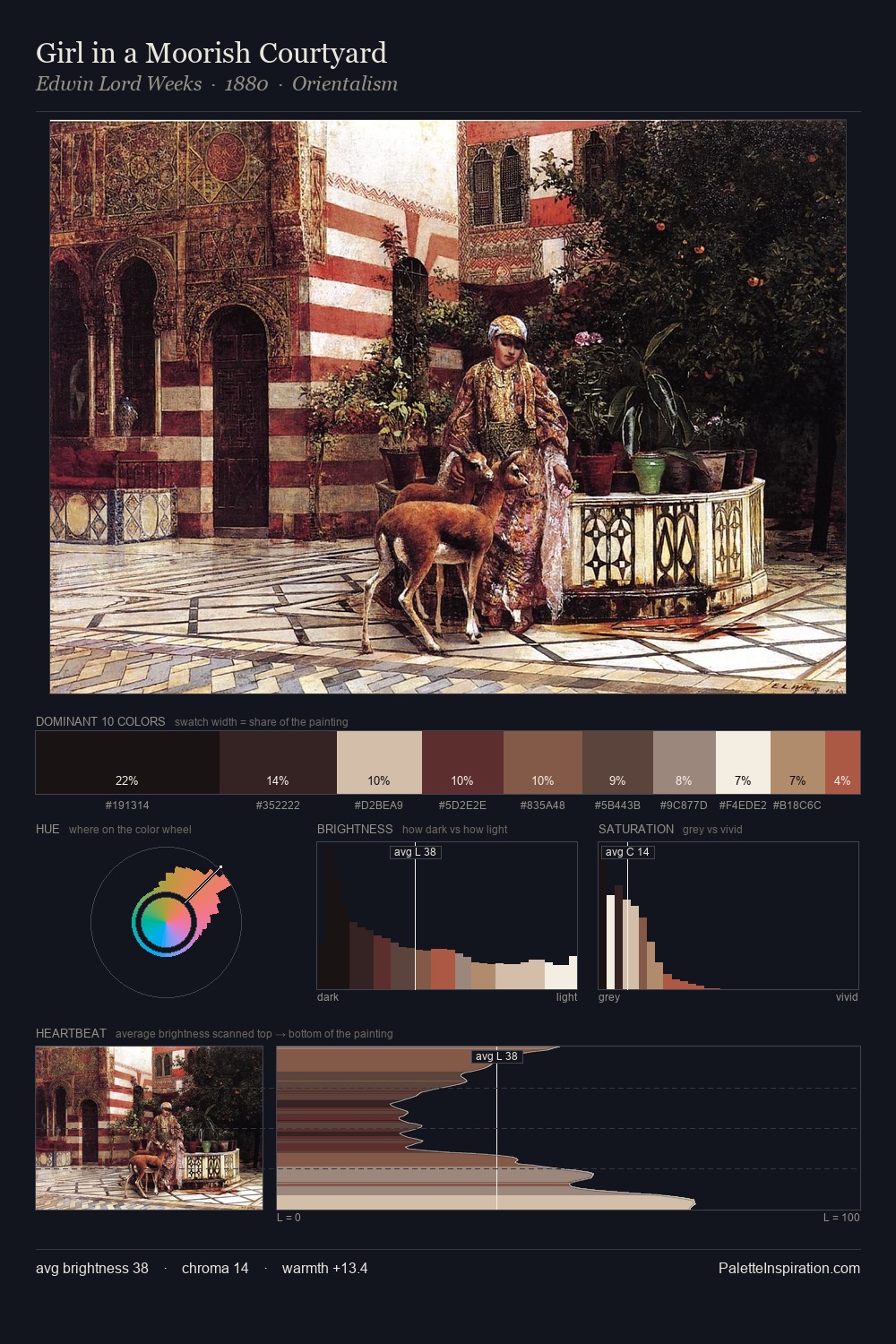
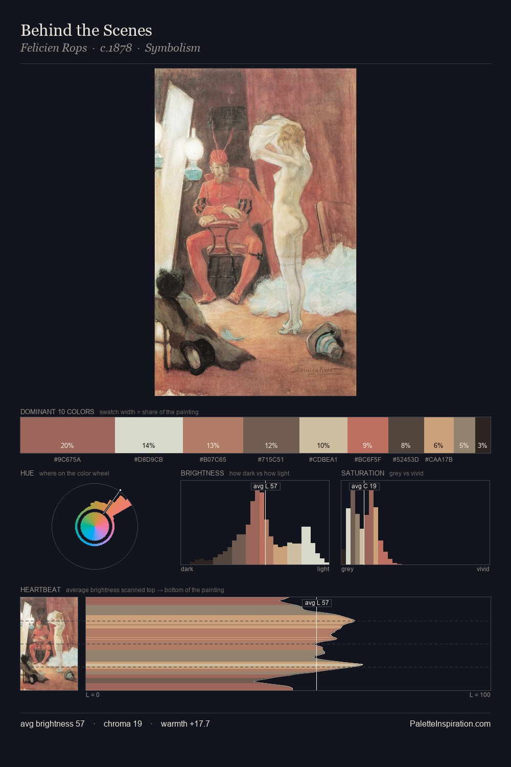
Values in Giovanni Battista Moroni rest in the mid-range - neither dramatically lit nor steeped in shadow. Giovanni Battista Moroni orchestrates warmth above all else - reds, ambers, and siennas take the lead. Every colour is desaturated; the palette proceeds through near-neutrals and gently-coloured greys. The saturated accent, #BD5B4A, registers at 5.6% - sparse enough to feel like a deliberate surprise. The full value range is 70 units: broad enough to build convincing three-dimensional form. Palette 2 sits within the larger chromatic argument that Giovanni Battista Moroni's complete body of work advances.
Example use cases
- exhibition design
- foundation branding
- estate management
- art education
- museums & galleries
I Love This!
Use This Palette
Copy, export, or download for your project
Copy, export, or download for your project
Copy:
Download:
Share:
Related Palettes

Giovanni Battista Moroni Palette 1
Shadowed Parchment

Giovanni Battista Moroni Palette 3
Muted Parchment

Giovanni Battista Moroni Palette 4
Shadowed Bister

Giovanni Battista Moroni Palette 5
Shadowed Bister

Giovanni Battista Moroni Palette 6
Nocturnal Bister

Giovanni Battista Moroni Master Palette
Shadowed Gamboge