Giovanni Battista Moroni Palette 3

Palette Analysis
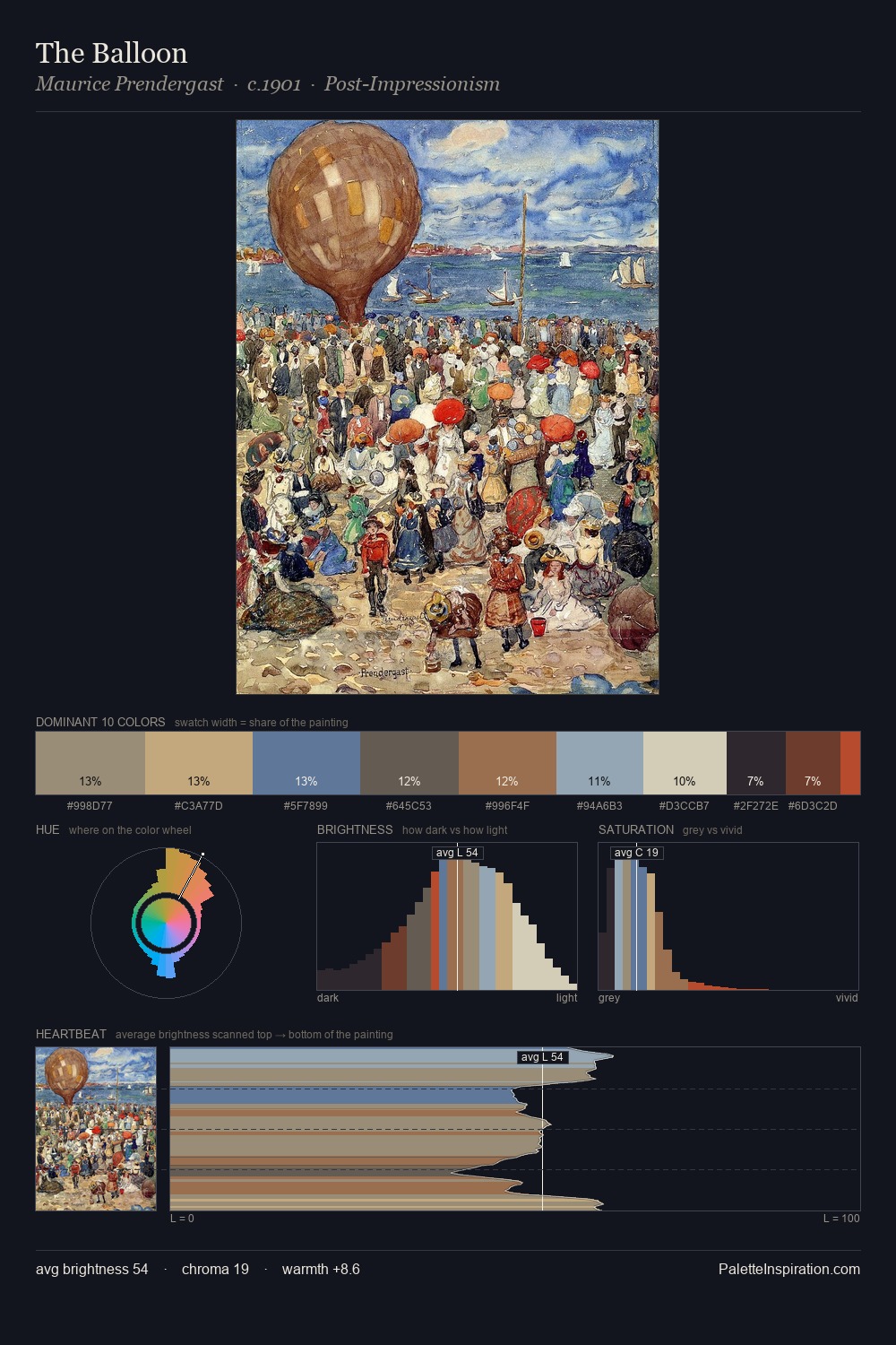
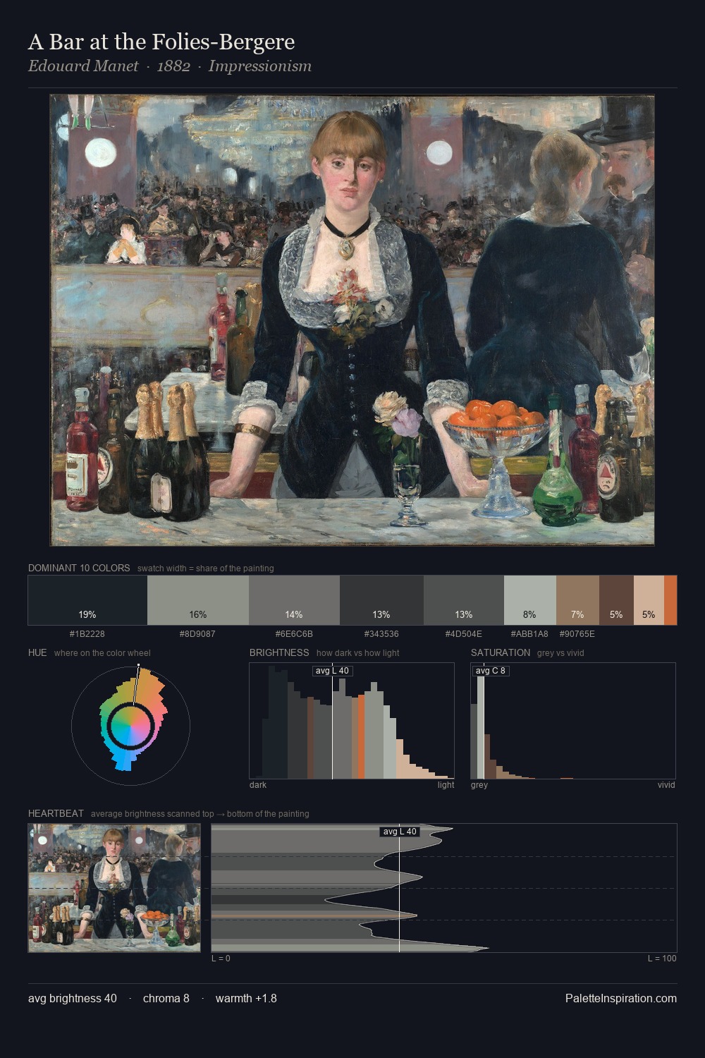
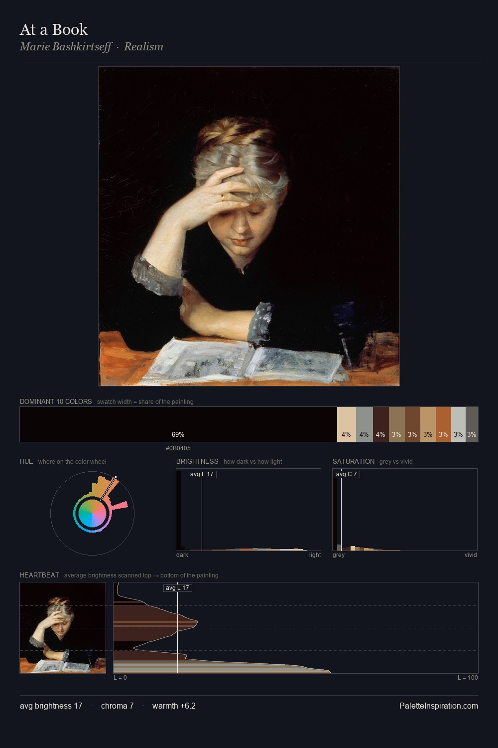
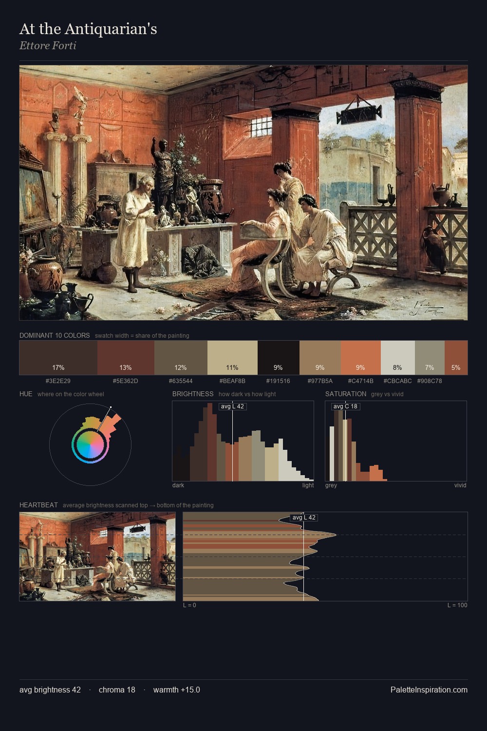
Mid-key values give Giovanni Battista Moroni its characteristic quietness - nothing blazes, nothing disappears. Giovanni Battista Moroni builds on cool foundations: the palette favours the blue-cyan-green arc. The absence of saturated colour is itself an expressive choice: this is a palette of restraint and atmosphere. The most saturated colour, #D6C4A8, is reserved to 9.8% of the surface, where it acts as a focal punctuation. From deepest dark to palest light, the palette traverses 61 units of the value scale - a span that creates natural depth. High luminosity and cool temperature suggest the plein-air condition: unfiltered daylight and open sky. This is palette 3 of Giovanni Battista Moroni's sequence - a single chapter in a chromatic story told across many works.
Example use cases
- exhibition design
- foundation branding
- estate management
- art education
- museums & galleries
I Love This!
Copy, export, or download for your project