Giovanni Battista Moroni Palette 4

Palette Analysis
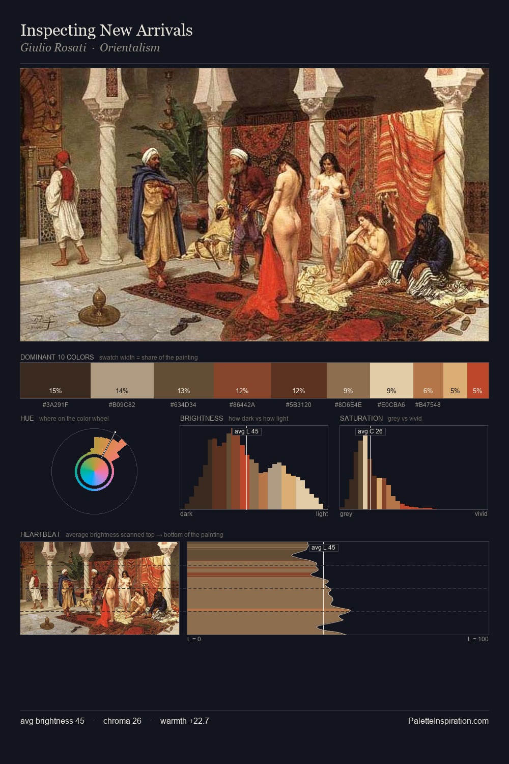
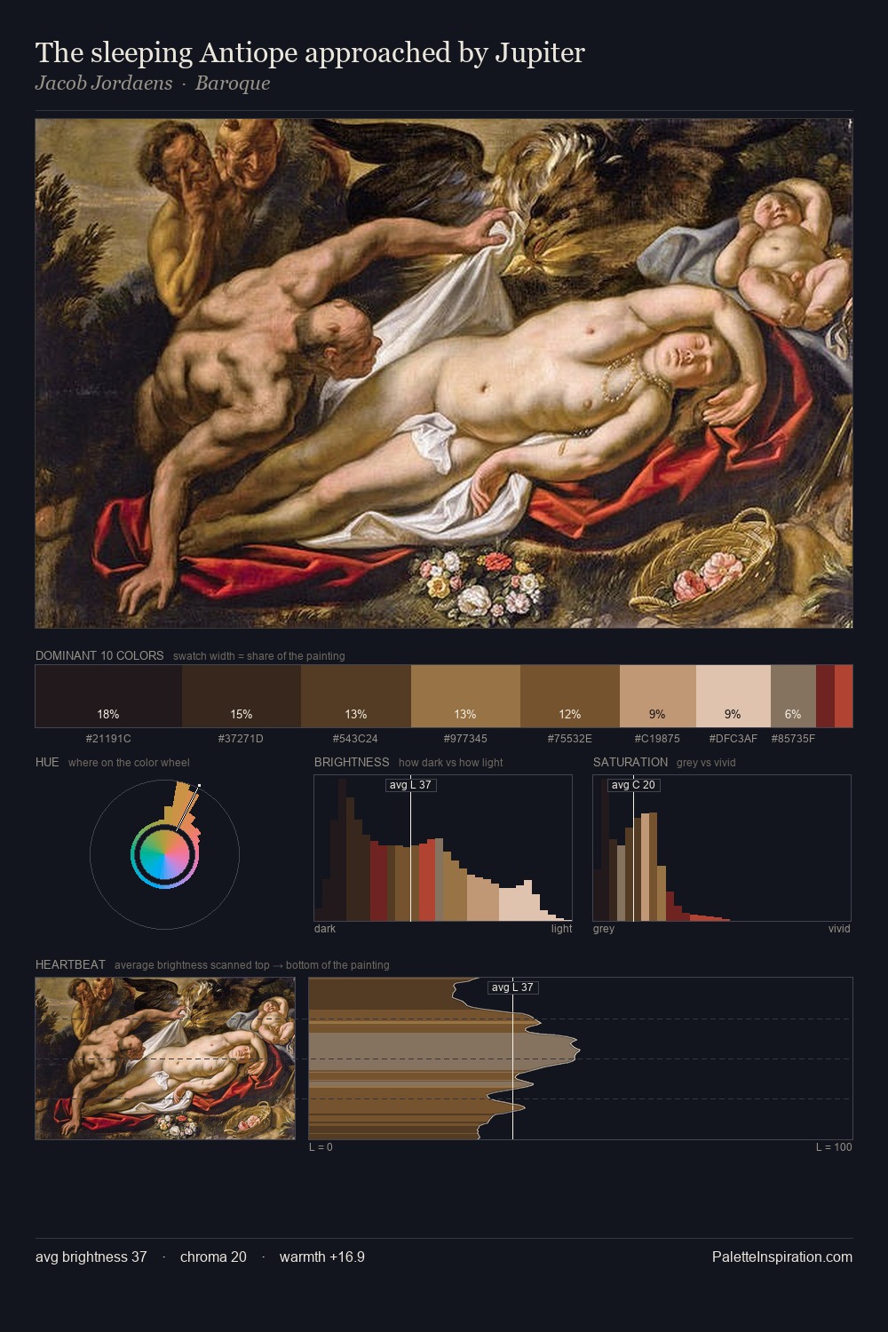
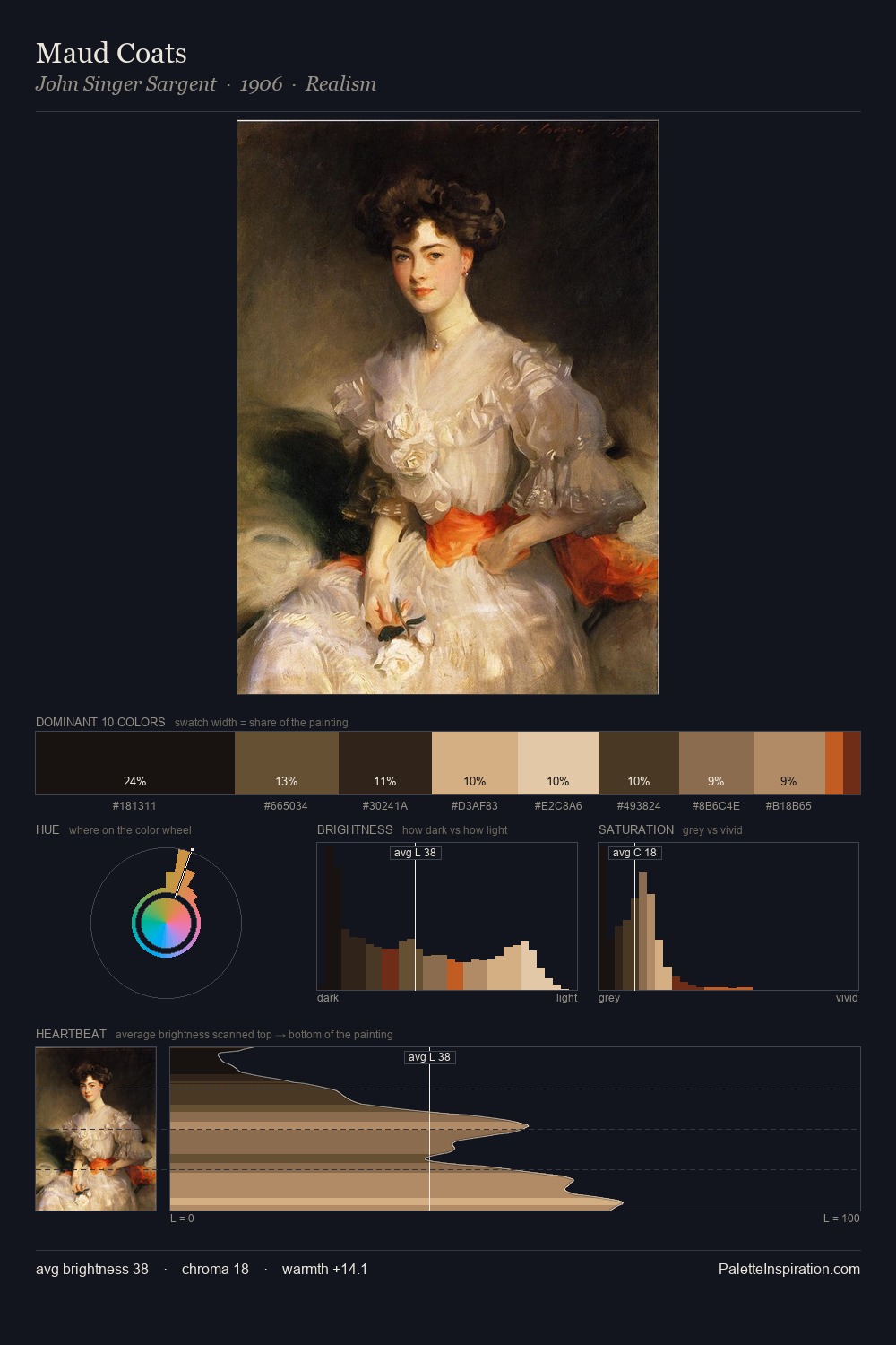
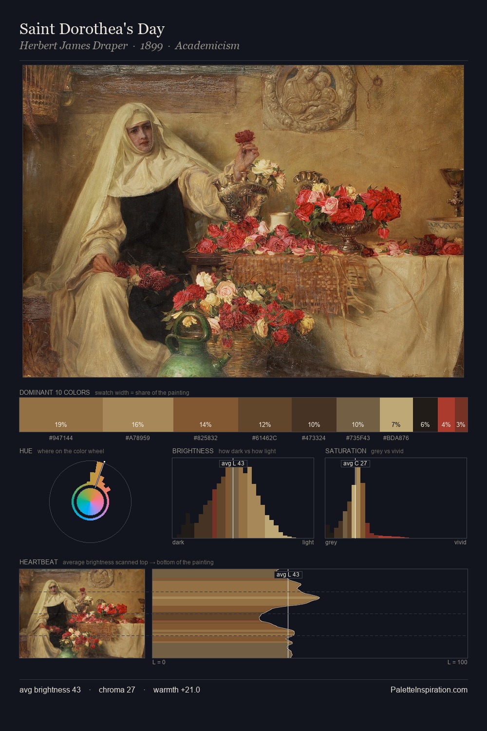
Values in Giovanni Battista Moroni rest in the mid-range - neither dramatically lit nor steeped in shadow. Temperature reads distinctly warm: the reds and earth tones from Giovanni Battista Moroni carry the compositional weight. All colours lean toward grey, building depth through value rather than colour punch. The dominant colour, #16190E, takes 32.1% of the total area, establishing the overall mood before any other hue is introduced. #C25136 delivers the chromatic peak at only 3.7% - a small shot of colour with outsized visual impact. The value range spans 61 units across the palette, providing the full gamut from deep shadow to near-white and ensuring clear tonal hierarchy. This is palette 4 of Giovanni Battista Moroni's sequence - a single chapter in a chromatic story told across many works.
Example use cases
- theater design
- jewelry brands
- tobacco-adjacent retail
- event branding
- film & entertainment
I Love This!
Copy, export, or download for your project