Giorgio Vasari Master Palette
Shadowed Tawny
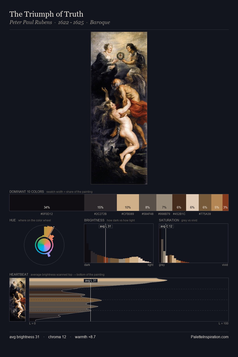
Shadowed Low-key - values weighted toward shadow, the palette of dim interiors and overcast skies.
Tawny Warm orange-brown - a traditional term for the color of tanned leather or lion fur.

Palette Analysis
Giorgio Vasari sits in the centre of the value range, lending the palette a sense of even, sustained light. Warmth dominates - the palette of Giorgio Vasari leans heavily on the yellow-orange-red arc of the colour wheel. Chroma is kept low across all colours, producing the soft, enveloping quality that characterises tonal painting. At 6.2%, #8E4234 carries the palette's sharpest chromatic charge: an accent that earns its place precisely because it is withheld. A value spread of 68 units gives the palette both depth and air - shadows are genuinely dark, lights genuinely light. These proportions encode Giorgio Vasari's instinctive sense of how much of each quality the eye can hold.
Example use cases
- ceramics & pottery
- boutique hospitality
- menswear
- heritage food brands
- craft & artisan brands
I Love This!
Use This Palette
Copy, export, or download for your project
Copy, export, or download for your project
Copy:
Download:
Share: