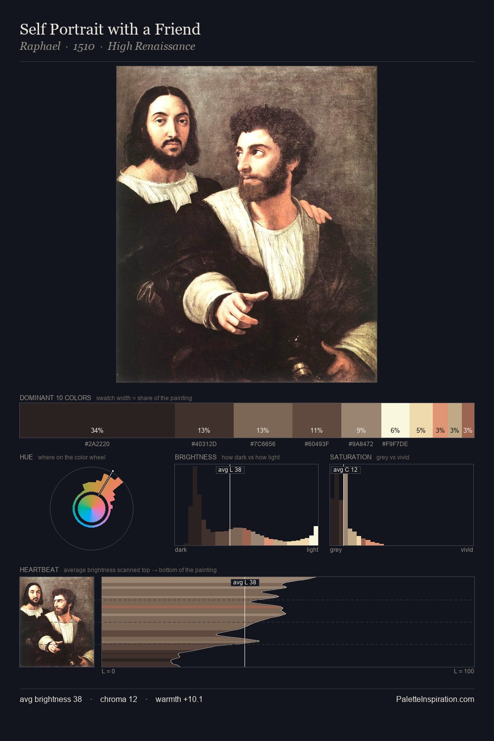
Giorgio Vasari Palette 2
Muted Tawny
Muted Deliberately desaturated - chroma pulled toward gray, the restraint of tonal painting.
Tawny Warm orange-brown - a traditional term for the color of tanned leather or lion fur.

Palette Analysis
Giorgio Vasari occupies the comfortable middle of the value scale, avoiding both extremes to hold the eye in a sustained middle grey. Heat pervades this palette; warm chromatic identities outweigh cool ones at almost every weight. All colours lean toward grey, building depth through value rather than colour punch. The most saturated colour, #9E5442, is reserved to 2.9% of the surface, where it acts as a focal punctuation. The value range spans 64 units across the palette, providing the full gamut from deep shadow to near-white and ensuring clear tonal hierarchy. Palette 2 sits within the larger chromatic argument that Giorgio Vasari's complete body of work advances.
Example use cases
- food packaging
- leather accessories
- travel & outdoor
- natural cosmetics
- interior design
I Love This!
Use This Palette
Copy, export, or download for your project
Copy, export, or download for your project
Copy:
Download:
Share: