Giorgio Vasari Palette 6
Muted Tawny
Muted Deliberately desaturated - chroma pulled toward gray, the restraint of tonal painting.
Tawny Warm orange-brown - a traditional term for the color of tanned leather or lion fur.

Palette Analysis
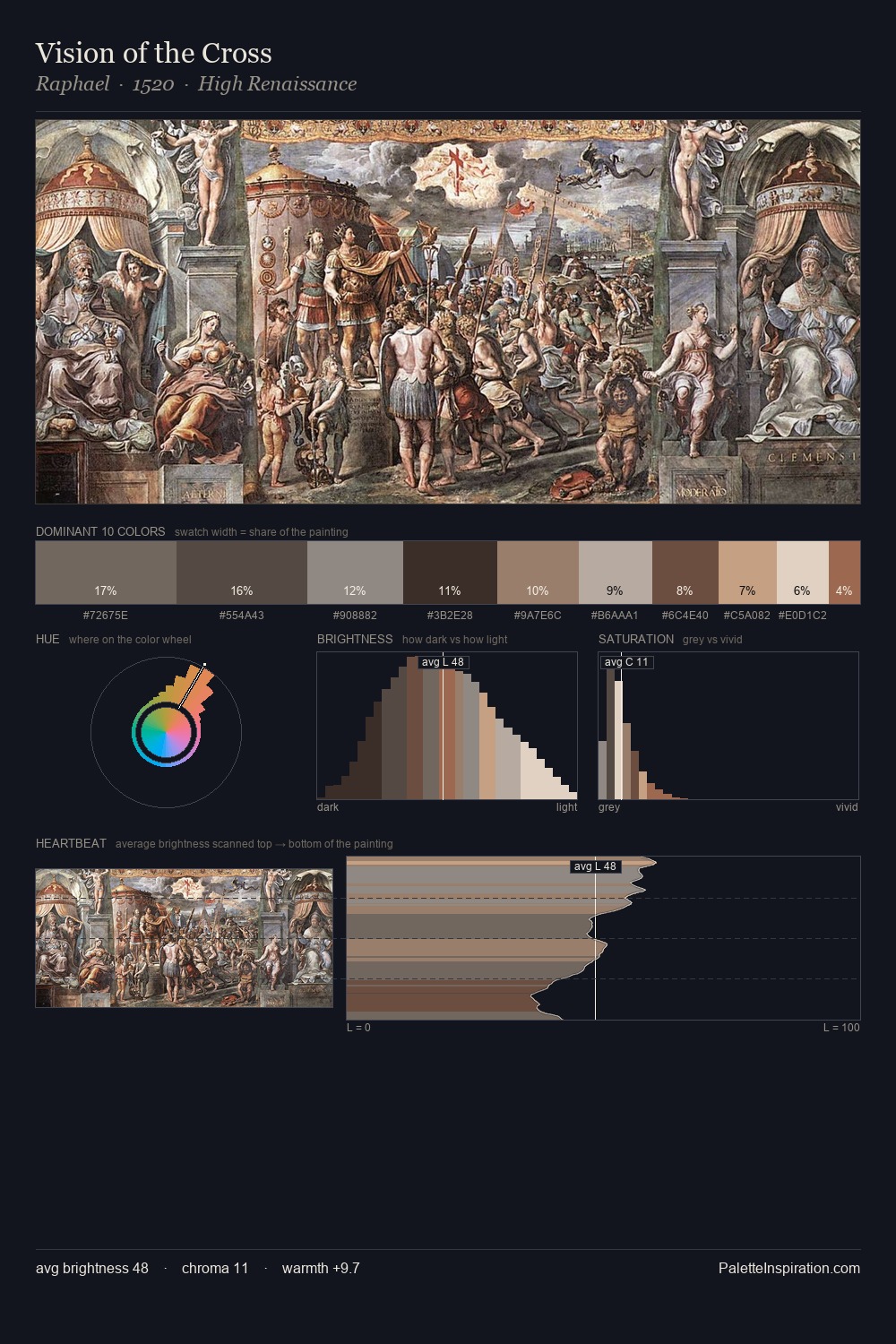
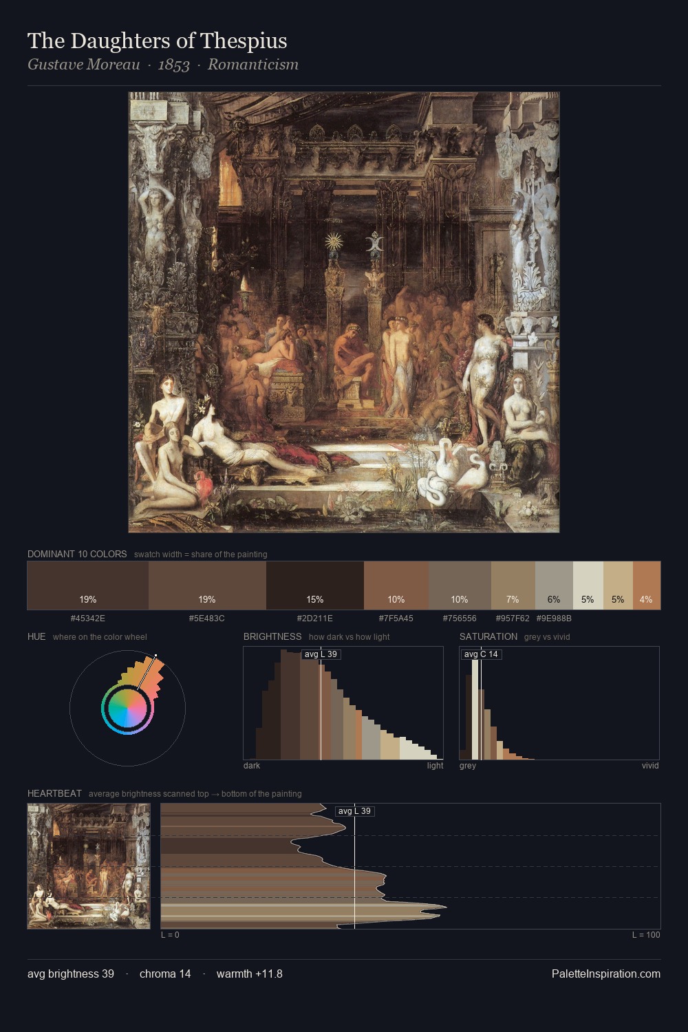
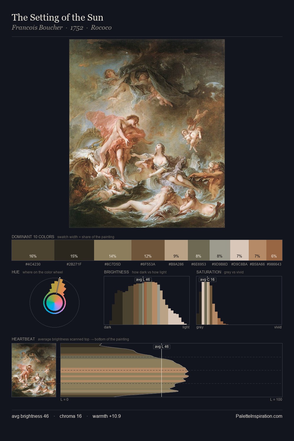
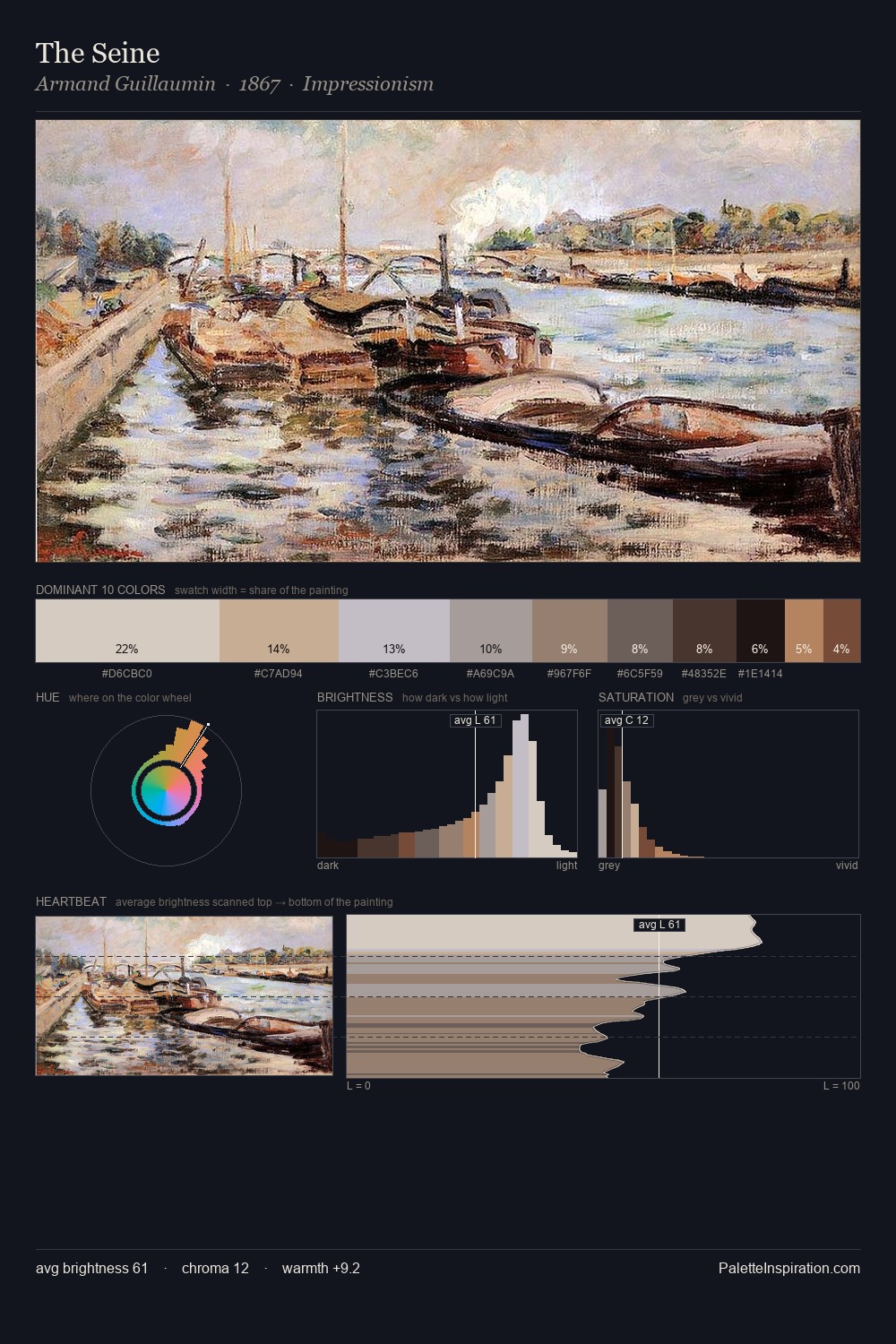
Giorgio Vasari sits in the centre of the value range, lending the palette a sense of even, sustained light. Yellow, ochre, sienna: warm hues that Giorgio Vasari deploys as the palette's primary energy. The absence of saturated colour is itself an expressive choice: this is a palette of restraint and atmosphere. #BBA083 functions as the palette's exclamation mark: highest chroma, lowest percentage (9.3%). At 52 units across the value scale, the palette keeps contrast readable without letting it dominate. Giorgio Vasari's palette 6 carries its own internal logic while remaining in conversation with the artist's broader colour intelligence.
Example use cases
- exhibition design
- foundation branding
- estate management
- art education
- museums & galleries
I Love This!
Use This Palette
Copy, export, or download for your project
Copy, export, or download for your project
Copy:
Download:
Share: