Giorgio Vasari Palette 3

Palette Analysis
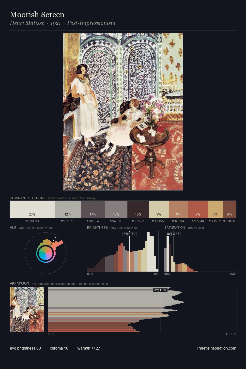
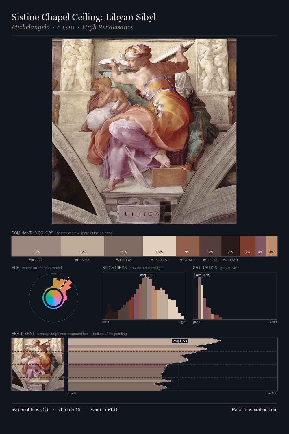
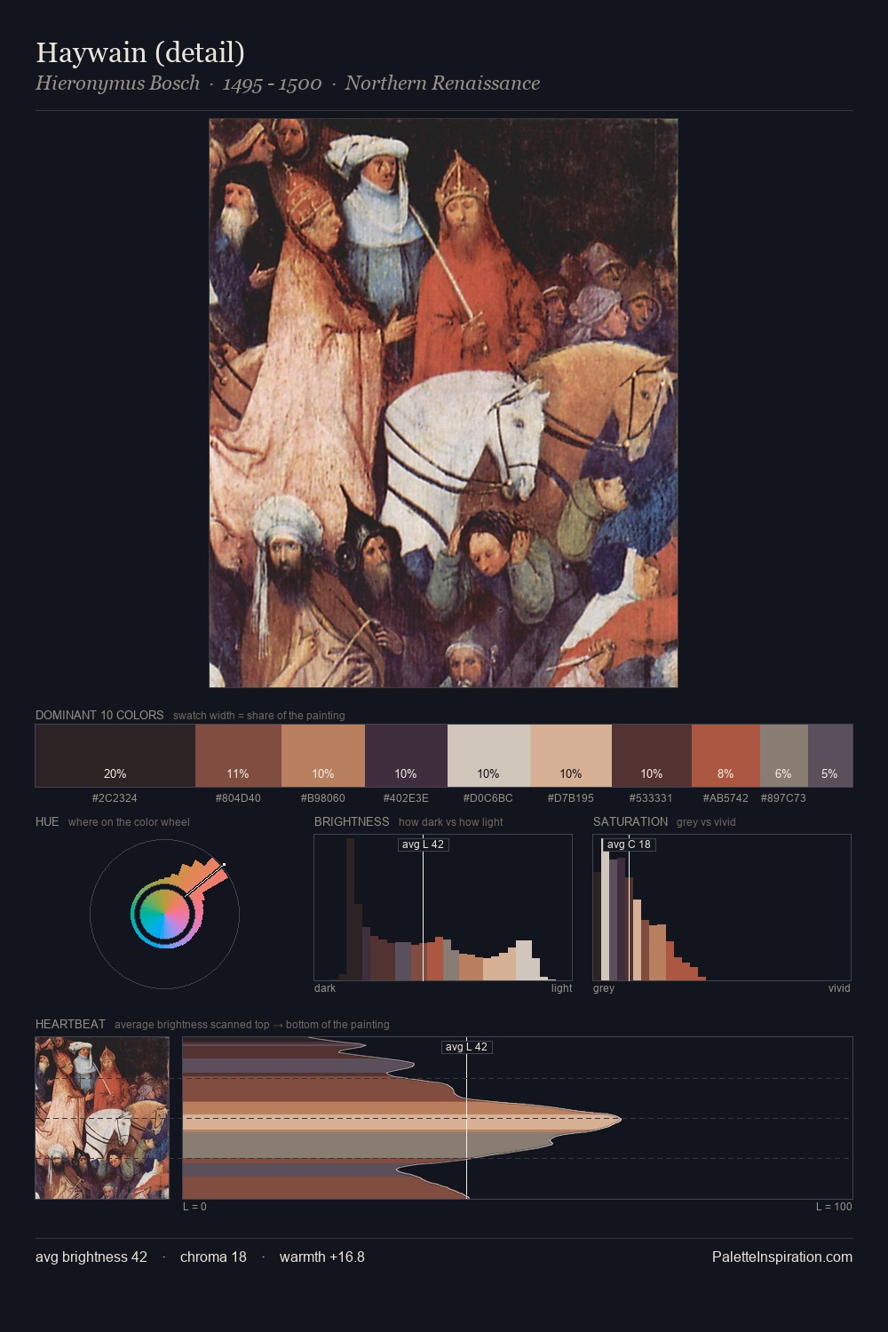
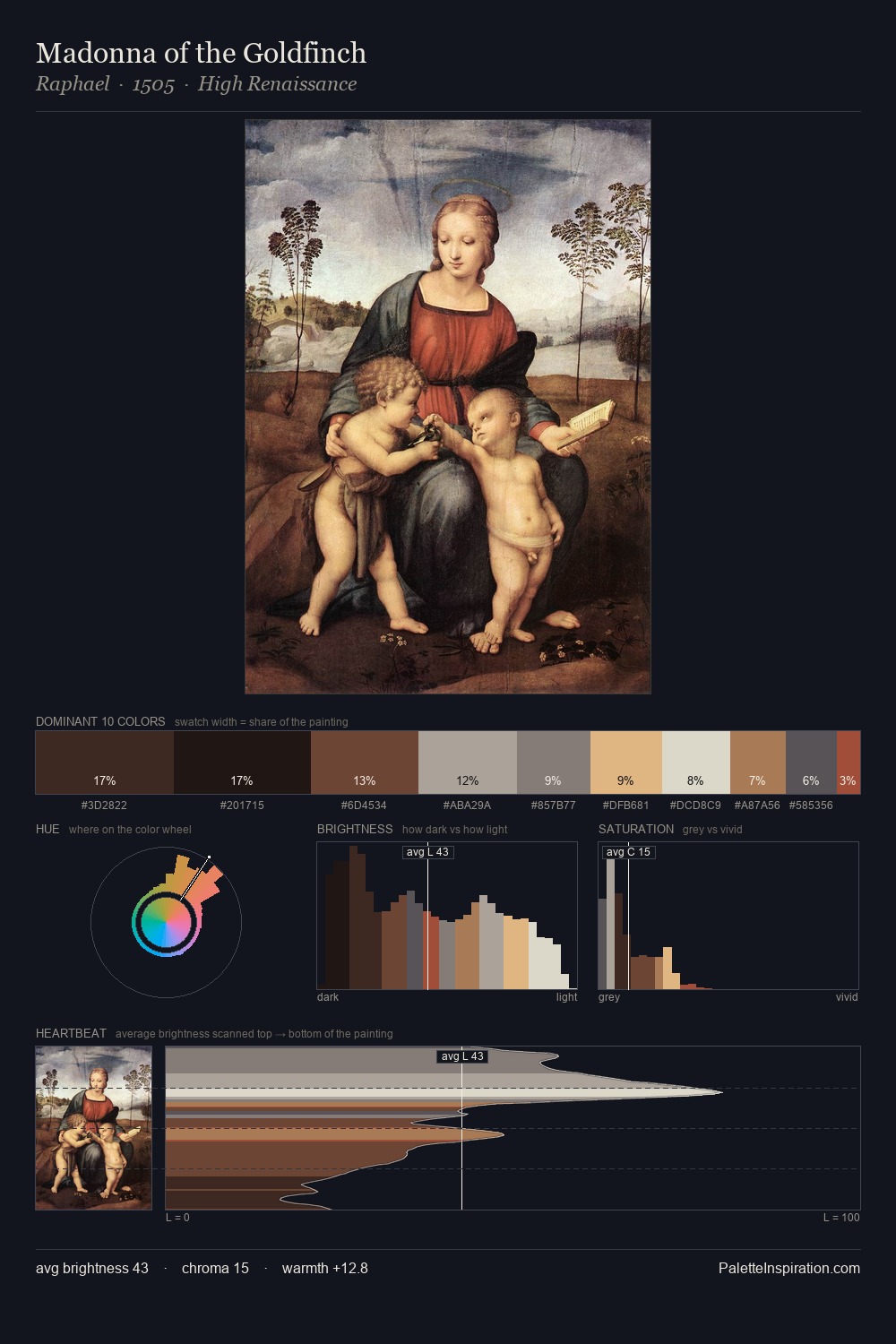
The high-key values of Giorgio Vasari give it an effulgent, almost bleached quality. Warmth dominates - the palette of Giorgio Vasari leans heavily on the yellow-orange-red arc of the colour wheel. The absence of saturated colour is itself an expressive choice: this is a palette of restraint and atmosphere. #BDB6AF claims 26.7% of the surface, functioning as the work's tonal foundation. At 4.7%, #A04C3E carries the palette's sharpest chromatic charge: an accent that earns its place precisely because it is withheld. From deepest dark to palest light, the palette traverses 67 units of the value scale - a span that creates natural depth. Giorgio Vasari's palette 3 carries its own internal logic while remaining in conversation with the artist's broader colour intelligence.
Example use cases
- exhibition design
- foundation branding
- estate management
- art education
- museums & galleries
I Love This!
Copy, export, or download for your project