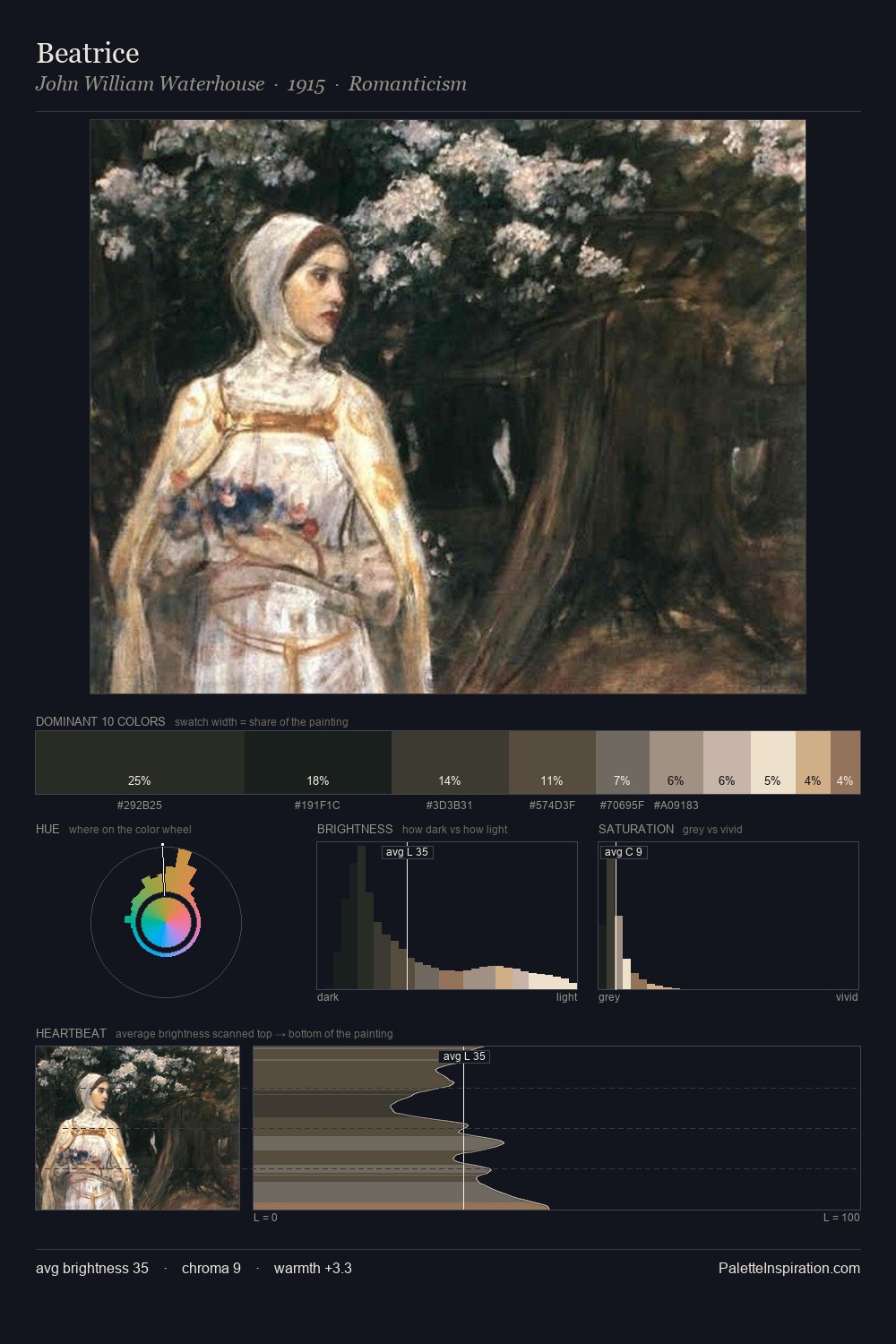
Giorgio Vasari Palette 4
Veiled Parchment
Veiled Partially obscured light - mid-dark with a hazy, scrim-filtered quality.
Parchment Aged warm neutral - the color of old manuscript parchment, tan and slightly yellowed.

Palette Analysis
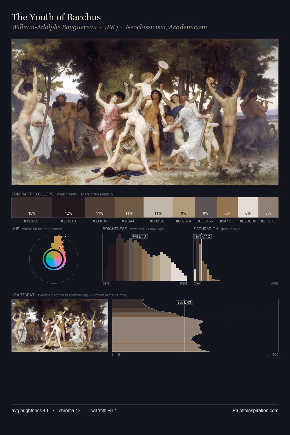
The value structure of Giorgio Vasari is mid-key: quiet, controlled, and cohesive. Giorgio Vasari keeps warm and cool in parity, a balance that lends the work a perceptual shimmer. Muted throughout, the palette achieves its effects through value and temperature rather than chromatic force. Only 2.9% is devoted to #C2A77C, yet that small allocation delivers the palette's entire chromatic tension. 71 units of value range underpin the palette's structural clarity: the eye always knows where light falls. Palette 4 sits within the larger chromatic argument that Giorgio Vasari's complete body of work advances.
Example use cases
- exhibition design
- foundation branding
- estate management
- art education
- museums & galleries
I Love This!
Use This Palette
Copy, export, or download for your project
Copy, export, or download for your project
Copy:
Download:
Share: